

Mindscapes Stress Less Narrative Website translates the didactic information found in QUT counselling’s blue sheet “Stress Less” into an interactive website taking the viewer through the common symptoms of stress and ways to fight them. Stress Less aims to encourage students studying at QUT to engage in conversation about stress and it’s effects, removing stigma, and freeing the silent sufferers. The final concept uses the model of the body to visually represent the highly physical impact of stress.
–––––––––––––––––––––––––––––––––––––––––––––––––––––––––––––––––––––––
Visual Interpretation of Concept
The primary form used in Stress Less is round due to the highly emotional and tense topic. Aiming to provide a comforting and calming shape when engaging in such a topic. The nurturing shape of circles and curves are used across the artwork, even down to the font chosen.
Darker tones are used to create a looming feeling. This dark tone is then contrasted against a light grey, that is then amplified at the climax. The strong contrast between dark and light tones clearly visually represents the tension and clash between dark and light elements, amplifying the struggle and joy to be free.
The simplistic drawing style is used to create a rough and authentic feeling, providing a more mature artistic style without being entirely professional. This balance is ideal for engaging with a young adult audience.


Monochromatic colour schemes are used to excentuate the minimalist art and draw the users focus to the details. The simplistic colour scheme and design was to push the user to reflect and focus in on the details rather than choosing to focus on whatever part suited them. With a minimalistic approach comes the increased need to perfect every detail and ensure nothing is lost and nothing is missing. This enhanced pressure pushed my design to be more and more focused on the user.
After user testing it was found that bursts of colour could be used to emphasise and enhance the experience. The somber blue was chosen for it’s cool, calming effect and it’s contrast with the monochromatic colours.


The dark, sombre music chosen for the first half of the narrative was to accompany the line drawings in creating an empty and solemn feeling. This mood is then strongly contrasted by the brighter notes in the music that follows after the climax. This change of music, like the other elements, reflects a stark difference between the dark, tormenting mood of stress and the bright relief as it leaves.
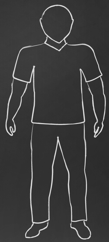
The choice to use the human body as the primary focus was based off the highly physical effect stress has on the body. Most people associate stress with the mind. However, from reading through the fact sheet and reflecting on my own experience, I found the physical impact of stress to be quite shocking and wanted to display this throughout the narrative.
–––––––––––––––––––––––––––––––––––––––––––––––––––––––––––––––––––––––
Wireframes
Wire-framing visually demonstrates the process of the story as it progressively works down the body, reaching the climax, then building again as strategies are presented. The final prototype took on a nodal structure to allow for greater agency and lower the emphasis on text. However, the wireframe still represents the upward climb these activities create, finally resulting in a call-to-action page with a three-stage call to action.
Aiming to make visual elements primary in all areas of the prototype, the call-to-action page was simplified in the final prototype to three icons with three words. This adjustment lowers the emphasis on text, and allows clear steps, maintaining the visual identity of the prototype in its minimalistic form.

Storyboard
This storyboard walks through the target user’s interactions with the website, highlighting reactions to particular screens. The user starts on the main screen and follows the arrow to continue scrolling down the body. When they reach the left shoulder, they relate to the text and recognise that they feel tense. Scrolling down to the foot, we see that the user has been tapping their foot.
Upon reaching the climax, the expected reaction is one of surprise as the screen suddenly becomes bright and on come the words, ‘But then I said, “No!”’. As the user works through the different solutions they make changes, we see in the next screen that they are throwing their takeout in the bin as they try to eat a balanced diet. Then the final screen takes them to next steps.

–––––––––––––––––––––––––––––––––––––––––––––––––––––––––––––––––––––––
Interfaces
Two screenshots of Stress Less. Left is in the first half of the story when the character is struggling with stress, surrounded by a dark looming background. The curved brush strokes on the character link smoothly with the rounded font. In this screen the user is able to hover over the word ‘TENSE’ and it will compress to create a visual appearance of being tense.
Right is in the second half of the story when the character transitions from a dark and looming background to this brighter and hopeful background. This screen makes use of nodal navigation to give the user agency and interaction with the content as they step through ways to combat stress.
The design maintains a consistent monochromatic colour scheme with a minialistic art style. There are slight additions of colour in the second half to add a greater sense of joy and vibrancy. Overall these screens aim to remain consistent in design while creating high contrast and amplify the difference between life with and without stress.