
写在前面的话:
中国的茶拥有丰厚的文化底蕴,我们爱茶,也深知它为世界带来了最感官和最美味的茶体验。一直以来,我们都想做一款既能传承传统的礼仪又能与现代文化相融合的茶,推动茶的变革,让茶走向年轻人。于是,我们开始了对茶的思考、探索与尝试,但这并不容易......
那又怎样,驶出了海港的千帆,不容回头,正像不甘平庸又勇敢倔强的我们乘风破浪也要在革新的路上听见回响,光芒万丈!
——
OCD甲古文创意首席创意官刘文先生Andy携手Asa联袂设计打造完美品牌形象- “ T HOUSE TIME ”。

▼ 关于T馆时间 | ABOUT T HOUSE TIME

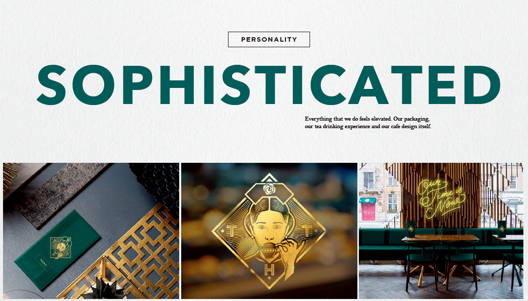
T HOUSE TIME的品牌理念是“倡导一种精致的、典雅的、时尚的现代生活理念,用国际化的视觉语言重塑现代茶文化美学。”
The brand concept of T HOUSE TIME is "Advocating a refined, elegant and fashionable modern life concept. Reshaping the modern tea culture aesthetics with international visual languages."

T HOUSE TIME 的使命是用创意与设计融合现代的文化元素来重塑传统茶的现代化或未来形象,从而推动传统茶的现代化、年轻化、潮流化的变革,让更多的年轻人关注茶、喜爱茶,打造新锐茶品牌。
T HOUSE TIME’s mission is to reinvent the modernization or future images of traditional tea, with the combination of creativity and design mused with modern cultural elements, thereby to promote the modernization, youthfulness, and trendy transformation of traditional tea. Getting more young people to pay attention to tea, to create a cutting-edge tea brand in the new national trend.


▼ 设计理念 | DESIGN DESCRIPTION
01/
品牌标识
Our logo
——
品牌Logo的灵感来自于清朝一位喜欢喝茶的年轻贵妃,以及她对生活健康的态度。通过重塑传统创造出令人难忘且与众不同的图标来讲述我们品牌背后的故事。
The idea behind our logo is to tell our brand story in a way that reinvents traditon to create a memorable and distinctive icon.We were inspired by a young female Nobleman of the Quing Dynasty, who liked to drink tea. Her fashionable and healthy attitude towards life.
————

传统头饰表明她是一位地位尊崇的贵妃;头饰上的花暗示我们产品的纯天然;“ THT”是T HOUSE TIME的缩写,直接展示了我们的品牌。以贵妃用英式茶杯喝茶的形象来表达品牌重新诠释传统的开放性。
Tradtional headwear cues that she is an empress and brings sophistication. Flower brings taste cues and implied the nautralness of our product. ‘THT’ letterforms make the logo truly ownable to our brand. The empress drinks from an English style tea cup to communciate the openness of the brand to reinterpreting tradition.
LOYALTY CARDS

MENU

CAKE BOXES

BAGS

02/
色彩灵感来源
The origins of our colour
——————
色彩是贵族居住环境中的一个重要元素,往往在贵族住所可以喝到最优质的茶。我们将这些颜色用作灵感,并重新诠释它们,带来别具一格的体验感。
Colour was an important element within the environment of the elite, where the best quality tea would have been served. We use these colours as inspiraiton and reinterpret them to bring a sense of Sophistication and creativity.


03/
插画灵感来源
The origins of our illustration
——————
插画的灵感来自于清朝的艺术品和装饰。
Our illustation is inspired by the art and decoration of the Quing Dynasty.


04/
纹样灵感来源
The Origins of our pattern
——————
我们在纹样的处理上重新诠释了中国传统,体现了中国古老建筑中的精致与匠心独运,同时也是我们品牌所代表的一切。
Our patterns reinterpret Chinese tradition. Patterns were an important motif within a tradional and sophisticated Chinese pavilion - the arhictecture inhabited by the Elite. We creatively reinterpret these traditional patterns to represent everything that our brand stands for.


▼ 产品设计 | PRODUCT DESIGN

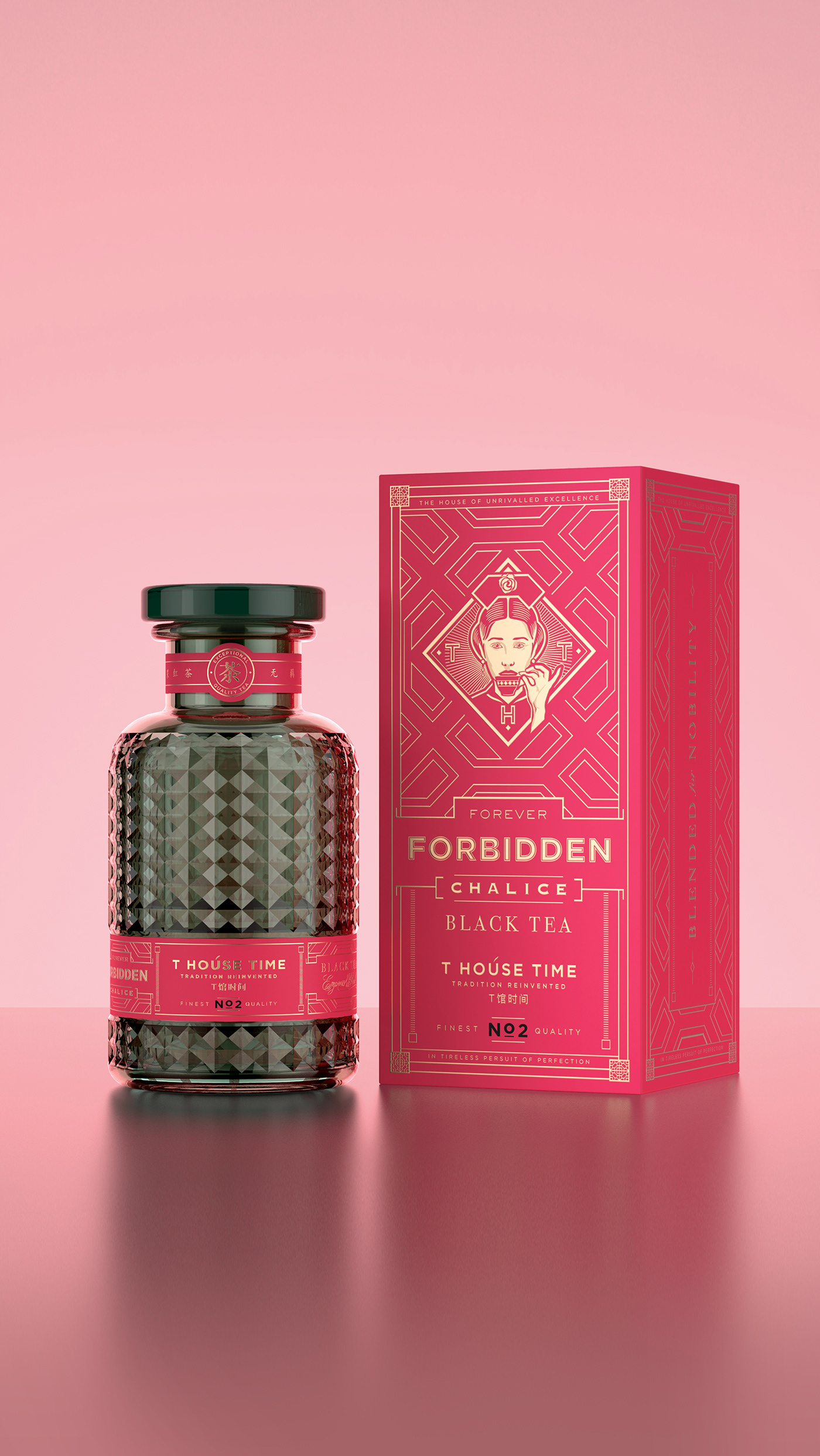
在产品设计时,我们选取了两种不同风格的字体,一种非常经典,另一种非常现代,经典与现代的碰撞更抓人眼球。在主标签中添加了更多的工艺和细节,每款茶拥有专属创意名称、编号和颜色,茶瓶是略带透明的菠萝纹瓶,强化了味觉的吸引力,瓶盖上印有品牌logo,品牌精神贯穿整个产品。菠萝纹玻璃瓶在阳光的照射下光彩熠熠,突出了品牌年轻与活力的概念。
In the spirit or reinterpreting tradition, we use a combination of two different typefaces, one which is very classical and one which is very contemporary. A more virbant design brings the bottles in line with the concept. Far more crafting and detail added into the main label. Each bottle now carries the creative names and the blend number - a simple way to connect the bottles to the boxes. Each glass colour is slightly translucent for more taste appeal. The stopper are slightly translucent too and match the colour of the main body of the bottle if possible. Our empress appears on our bottle lids, along with a close crop of pattern.


- NO.2 FORBIDDEN -
·BLACK TEA·

- NO.3 CONCUBINE'S -
·GREEN TEA·


- NO.4 BLOSSOM -
·FLOWER TEA·


- NO.5 MISSING -
·WHITE TEA·


- NO.8 ANCIENT -
·BLACK TEA·


OUR TEA IS OUR ART
OUR TIME IS NOW
