


Less is more...courageous
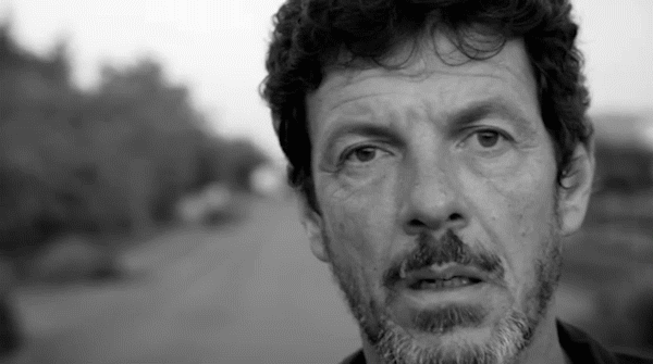
The French singer, Hugo Chastanet (1965, Algiers), is an established musician and composer, who -in his own words- creates “ultra-melodic pop with unsettling and symbolic lyrics”.
With a career spanning over twenty years and five albums released under the name Hugo, he decided to write and record, at a very timely moment, a very intimate and honest album, under his full name Hugo Chastanet.
This creative endeavour began just as France was going into Coronavirus lockdown, but this by no means hindered his determination - nothing could stop him in his tracks (pun intended!). He succeeded in incorporating this new challenging reality into his artistic process.
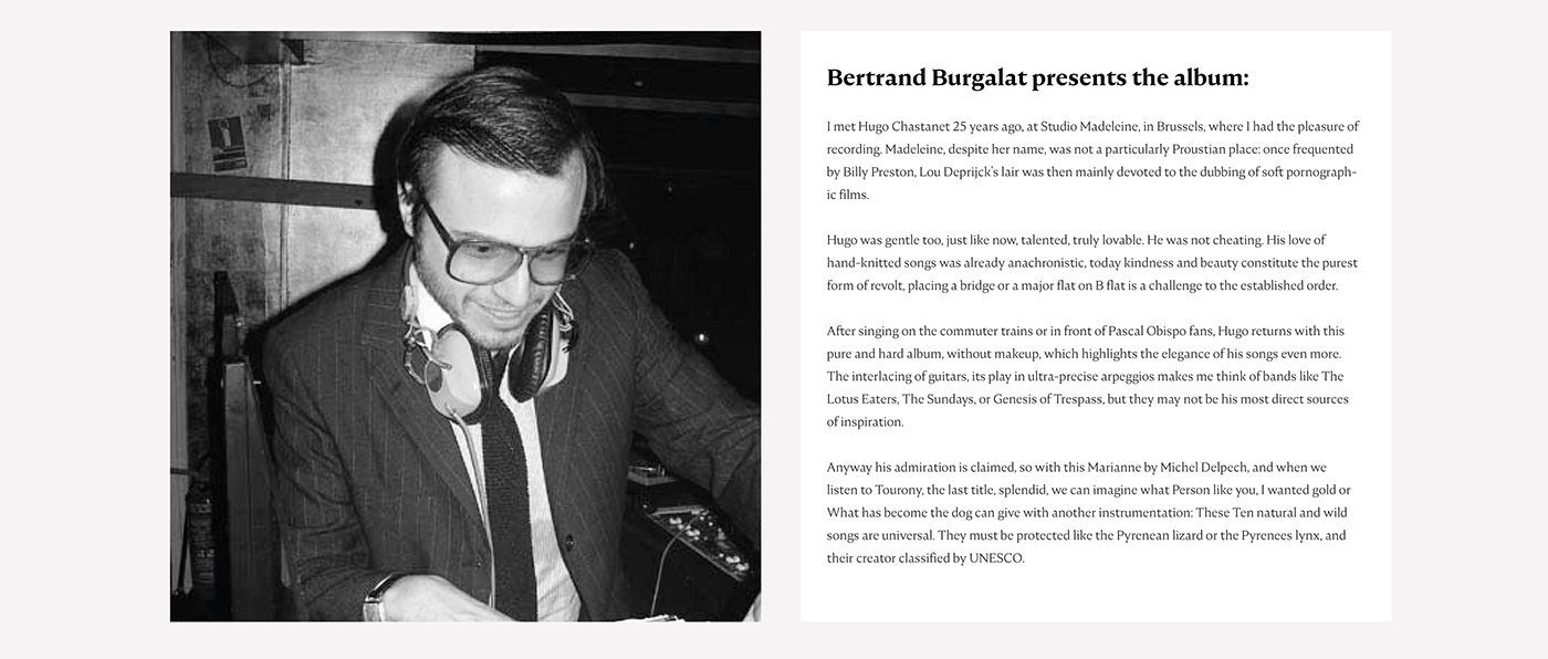
The result is -as the title suggests- an honest, authentic and introspective album that reveals the person and the musician. Here is a review of the album by one of France's most revered musicians, Bertrand Burgalat.
Searching for the right visual language
Once briefed, and under the spell of these 10 highly atmospheric tracks, I started by looking back at my most cherished and relevant album covers from the past and the most recent times. An overall introspective feel came immediately to mind with artists such as Belle & Sebastian, the early Bob Dylan and Nick Drake to only name a few. Their iconography being primarily quite simple with one main focus and a limited colour palette.
The Scottish band Belle & Sebastian have always had a strong visual language influenced by the French existentialist movement but also the Nouvelle Vague. The Glaswegian agency D8 has created all the visuals for the band since 2006.
The legendary album ‘The Freewheelin’ Bob Dylan’ released in 1963 is one prime example of spontaneity and authenticity. The mythical shot includes both the singer and his then girlfriend Suze Rotolo and was shot in front of their West Village apartment, one would struggle to be so effortlessly cool and honest at the same time. Today relevance of this spontaneous, unflattering type of photography is a testament to the art direction, one can also think of the classic Scorcese film Taxi Driver and its seminal anti-hero Travis Bickle walking aimlessly towards us.
All this initial research helped me setting the overall tone and understanding the visual codes that would help to confer it most effectively.
Creative process
I started sketching quite early on and also gathered portraits of Hugo, one photoshoot session stood out, it had a late afternoon quality that felt right. The red tones that dominated the photograph inspired me and would later become the red watercolour stain. Contrary to more commercial briefs, I allowed myself the mental space to be ambivalent and evoke a feeling more than a clearcut message.
Here is a mood board that includes some of my early thoughts.

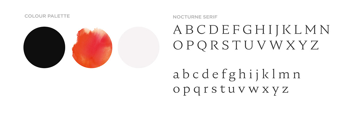
Typography and colour palette
I picked the Nocturne Serif from the Adobe Fonts for its classic serifs that have and extra sickness and sharpness to them, it seemed really appropriate with Hugo sensibility.
The colour palette is restrained with only three main colours this came quite logically, following my initial semantic research.
Hand-Drawing
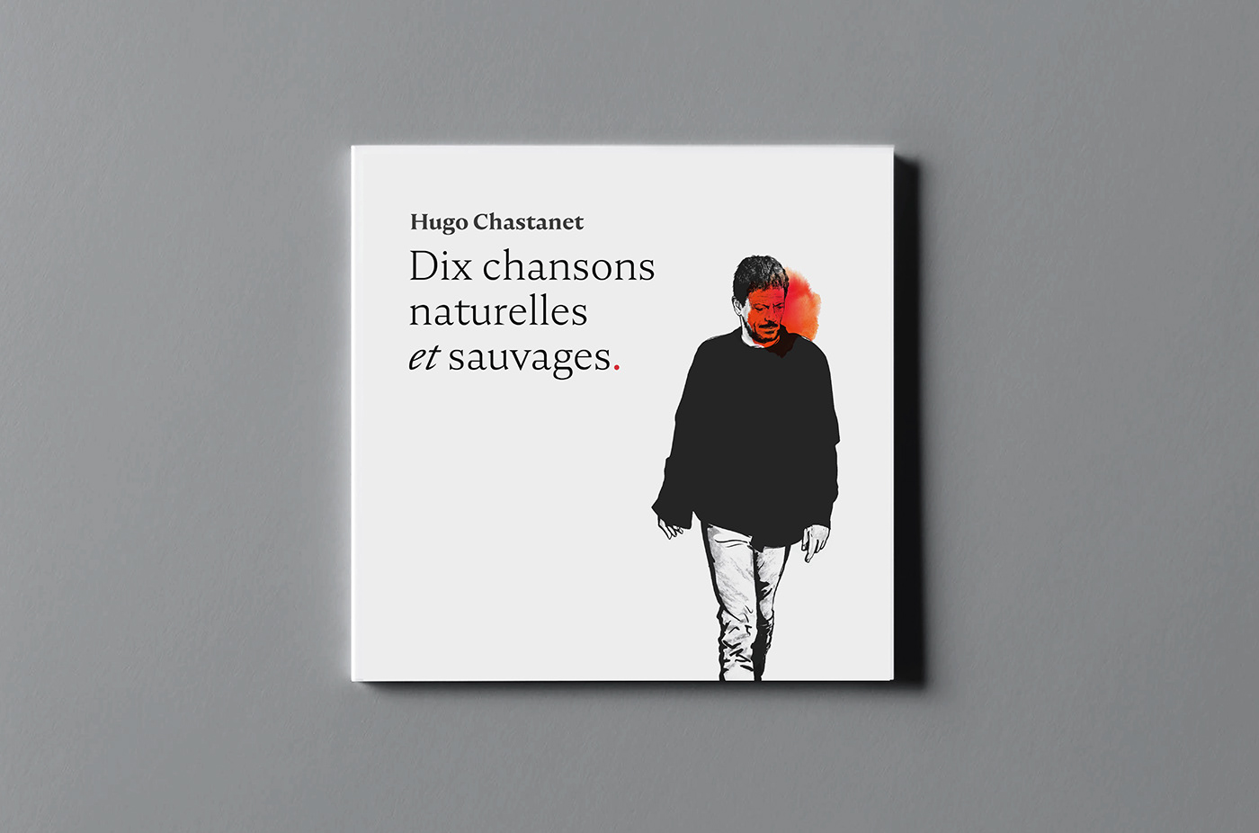
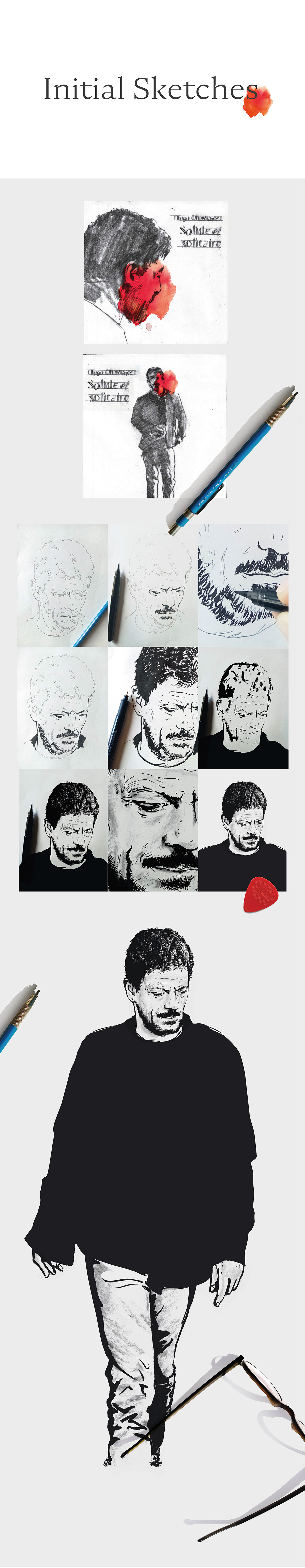
After a first stage, where I shared a spectrum of design propositions with Hugo, the preferred direction was a hand-drawn visual that would illustrate the singer quite realistically while keeping all the imperfections of the drawing.
I did several sketches, looking for the right posture and composition.
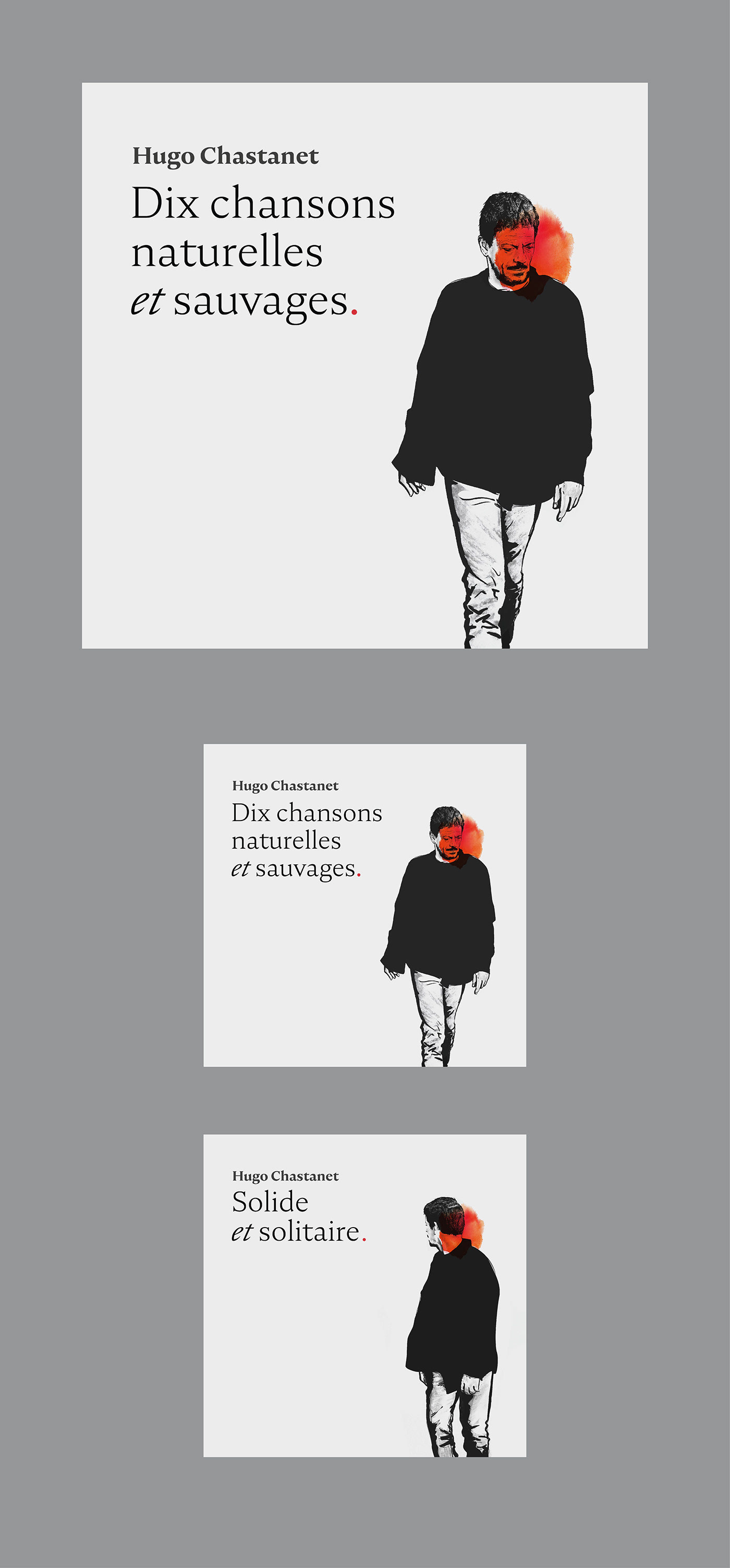
Quite early on, we liked the idea of having two visuals -one for the album and the other for the single- that would almost work together as a narrative, a sort of ethereal comic book.
The final illustrations are a combination of ink and charcoal drawings. I felt that these two techniques worked well together as the ink starkness contrasted well with the more subtle and modelling prime values added by the later charcoal touches.
Final artworks
The final artworks function in tandem for both the album and the single.
They immediately suggest a sequence and a rhythm that are also present in the single’s video.

Applications
The several touch-points (digital, merchandising, print etc...) were created with the objective to keep the same feel and the same contemplative mindset.


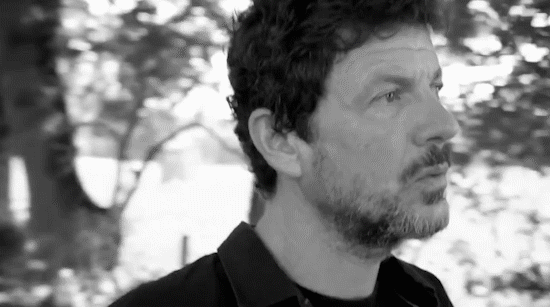
Live design process video
I have recorded one of the final stages of my design, it shows how my decision making functions, a little strenuously sometimes actually.


