


R21 Creative Agency
Brand Identity
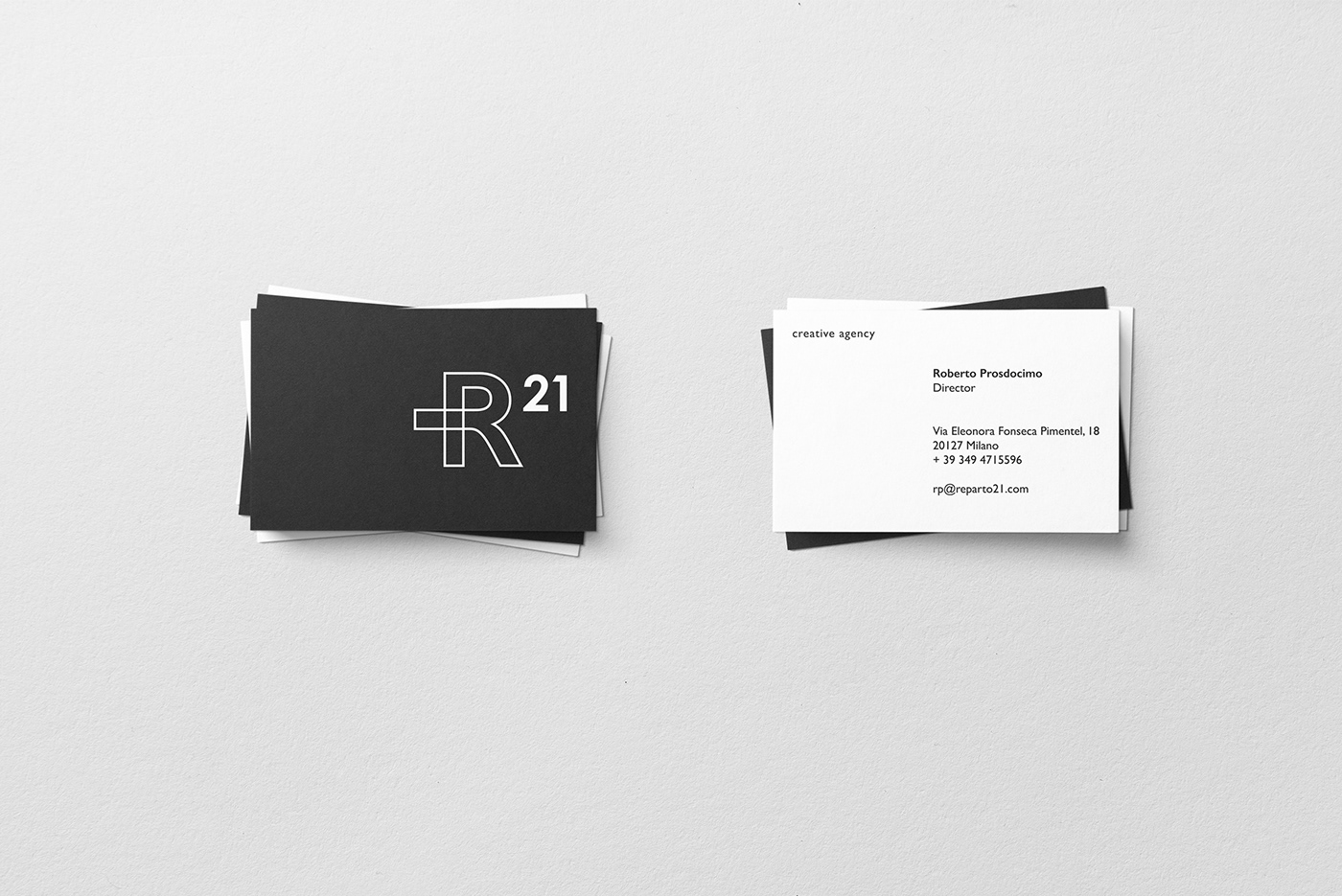
R21 is a creative agency specialized in various disciplines and communication solutions. Drogheria Studio made a rebranding and a restyling of the previous identity, which was characterized by a three-dimensional cross.
Playing with the "R", the cross was positioned interlocking with the vertical rod of the letter.
The outline logo helps the legibility of its different parts and intersections.
The black and white palette color is due to the concept of the lights and shadows in photography, which are essential notions.


Thanks!
follow us on instagram @drogheria_studio


