For this project, I did several scratchboard illustrations for beer labels. The client was Steamworks Pub & Brewery in Vancouver, Canada, and the design and marketing was handled by Brandever Strategy Inc., also located in Vancouver. It was Brandever's idea to use the steampunk art style as a play on the Steamworks name. Brandever states on their web site that, "Our design series feature whimsical steampunk interpretations of Vancouver's treasured buildings and icons."
Another artist was key to the success of this project. His name is James NG, and he lives and works in Hong Kong. James specializes in the steampunk style, and his work is highly regarded. However, James uses a digital painting method for his finished art, and the finished art for these labels needed to be done by pen and ink with a woodcut or engraved look. That's where I came in. I don't normally do the steampunk style, so James did the concept sketches, and I did the finished scratchboard illustrations based on his concepts.
The reason the finished illustrations needed to be done with pen and ink is that the labels were to be screen printed. The labels have three or four colors that print solid--no halftones or 4-color process. With my scratchboard style, I am able to make realistic images that have considerable detail and require only one color to print. In this case, though, my drawings didn't even need the one color. Instead of printing the lines of my drawings in a color, they were left clear, which allowed the color of the dark bottle to work as the color of the drawing.
The following videos and images show how many of the labels were done. You can see more of my work at www.inkart.com.
Video showing the rendering on scratchboard of steampunk-style pumpkins for the Steamworks Pumpkin label.

Concept sketch for the Pumpkin label by James NG.

My sketch based on the concept sketch and suggestions from the art director at Brandever.

Printed bottles and finished scratchboard art for Steamworks Pumpkin beer.

Closeup of the Pumpkin bottle. The line work for the drawing is not printed. The lines are left clear and the color of the bottle shows through.
Video showing the process of doing the scratchboard drawing for Steamworks Saison beer label.

Concept sketch for Saison beer label by James NG.
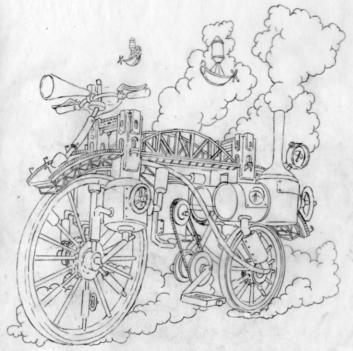
My sketch for Saison beer label.

My finished scratchboard drawing for Steamworks Saison beer label.

Printed bottles and finished scratchboard drawing for Steamworks Frambozen beer label.

Concept sketch for Steamworks Frambozen beer label by James NG.

My sketch for Frambozen label.
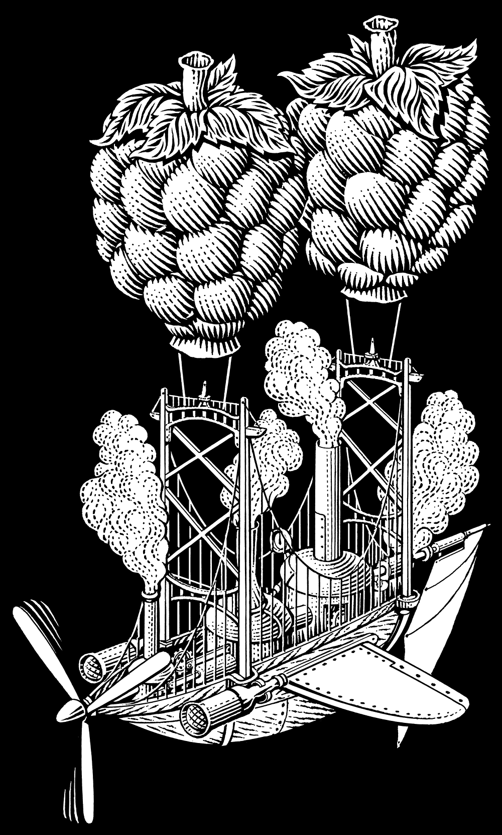
Finished scratchboard illustration for Frambozen beer label.

A version with black background and one with white background were both needed.

Printed bottles and finished scratchboard drawing for Steamworks Pale Ale beer label.

Concept drawing for Pale Ale beer label by James NG.
My sketch for Pale Ale beer label.

My finished scratchboard drawing for Steamworks Pale Ale beer label.

Printed bottles and finished scratchboard drawing for Steamworks Wheat Ale beer label.

Concept drawing for Wheat Ale by James NG.

My sketch for Wheat Ale.

My finished scratchboard drawing for Wheat Ale with black background.

My finished scratchboard drawing for Wheat Ale with white background.

Printed bottles and finished scratchboard art for Steamworks Pilsner beer label.

Concept sketch for Pilsner beer label by James NG.

My sketch for Pilsner beer label.
Finished scratchboard drawing for Pilsner beer label.

Finished scratchboard drawing for Steamworks Blitzen beer label. Santa was later changed to another character.
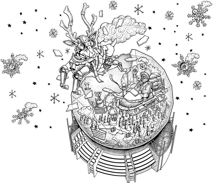
My sketch showing the changed character. I can't recall now why Santa had to be changed.

Finished scratchboard drawing for Blitzen.

Finished scratchboard drawing for Steamworks Oatmeal Stout beer label.

Concept drawing for Oatmeal Stout by James NG.

My sketch for Oatmeal Stout.

Finished scratchboard drawing for Steamworks Oatmill Stout beer label.

Finished scratchboard drawing of a flying clock/kettle to be used as part of the Steamworks logo.

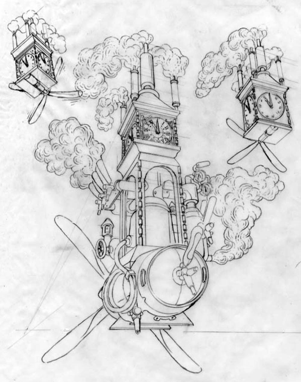
My sketch for Steamworks logo.

Finished scratchboard illustration of Steamworks logo. The lettering was also drawn.

This drawing was never used. Not sure why. There was nothing wrong with the drawing.

Scratchboard drawing for bottle return. It prints on the back of the bottle.

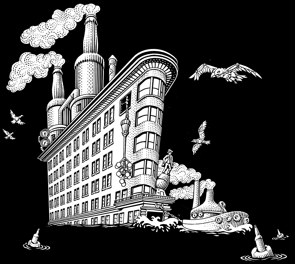
The drawing was adapted to work with the Steamworks in-house menu.

One of the main concerns of the client was the look of the steam in the drawings. Since beer is a food product, he wanted to make sure the steam looked clean and inviting. I did four renderings of the steam to show different ways that might work. The client picked the third on down. It has a whimsical and clean look.

