
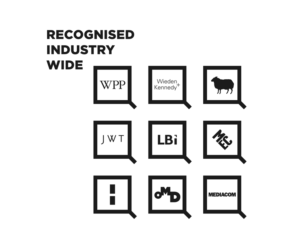
SQUARED
‘Squared’ (sometimes referred to as ‘Google Squared’) is a new education initiative developed by Google in London and piloted in 2012. I discovered Squared in February of last year, when I met some recent graduates from another advertising agency who had been invited to join the first, in house pilot round of the programme.
I instantly resonated with Squared, as I’ve never embraced our slow and outdated educational system. I joined the creative and advertising industry when I was 17, having skipped college and University; so I’ve spent my life learning by doing. I’ve followed Squared since it’s inception, watching it evolve into the refined and respected educational programme that it is today. However, I’ve always felt that something was missing.


Every brand needs a reason to exist. Squared’s mission statement is to “Empower the leaders of today and tomorrow.”. I started by coming up with 10 words that embody that statement and the essence of the Squared brand.


Next, I spent some time sketching a custom typeface, inspired by Bank Gothic and Square’s current use of Square Slabserif 711 by Bitstream. ‘Squared’ is now styled as ‘SQUARED’ to make the letterforms appear stronger and more confident.

After experimenting with variations on Bank Gothic and similar typefaces, I realised that they looked like they belonged on an old Sci-Fi movie poster. They were generic and forgettable.
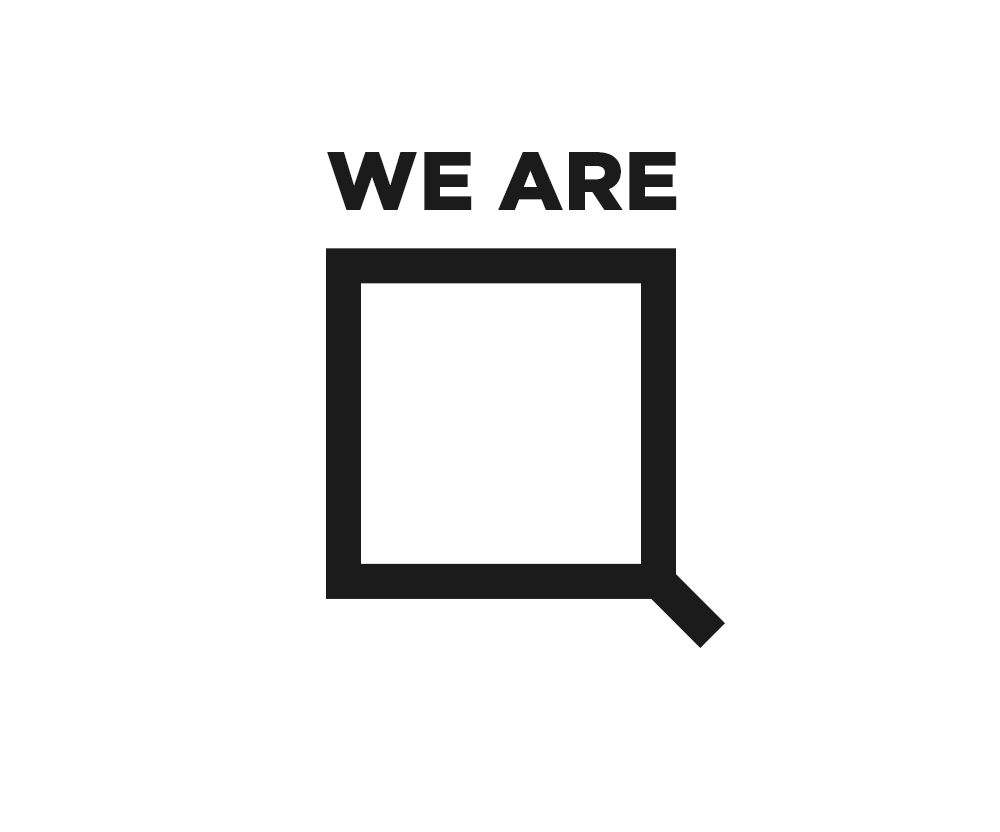
I decided to drop the word mark completely and focus solely on the Q, the letter that bears the closest resemblance to a square while retaining it’s legibility.

After more sketching, I quickly settled on what would become the new symbol for SQUARED.


The new logo is modern, minimal and instantly understandable. It bears a striking resemblance to a mortarboard, after the tassel has been flipped to the wearers left to signify graduation. This is the reason the tail is aligned to the right instead of the center.

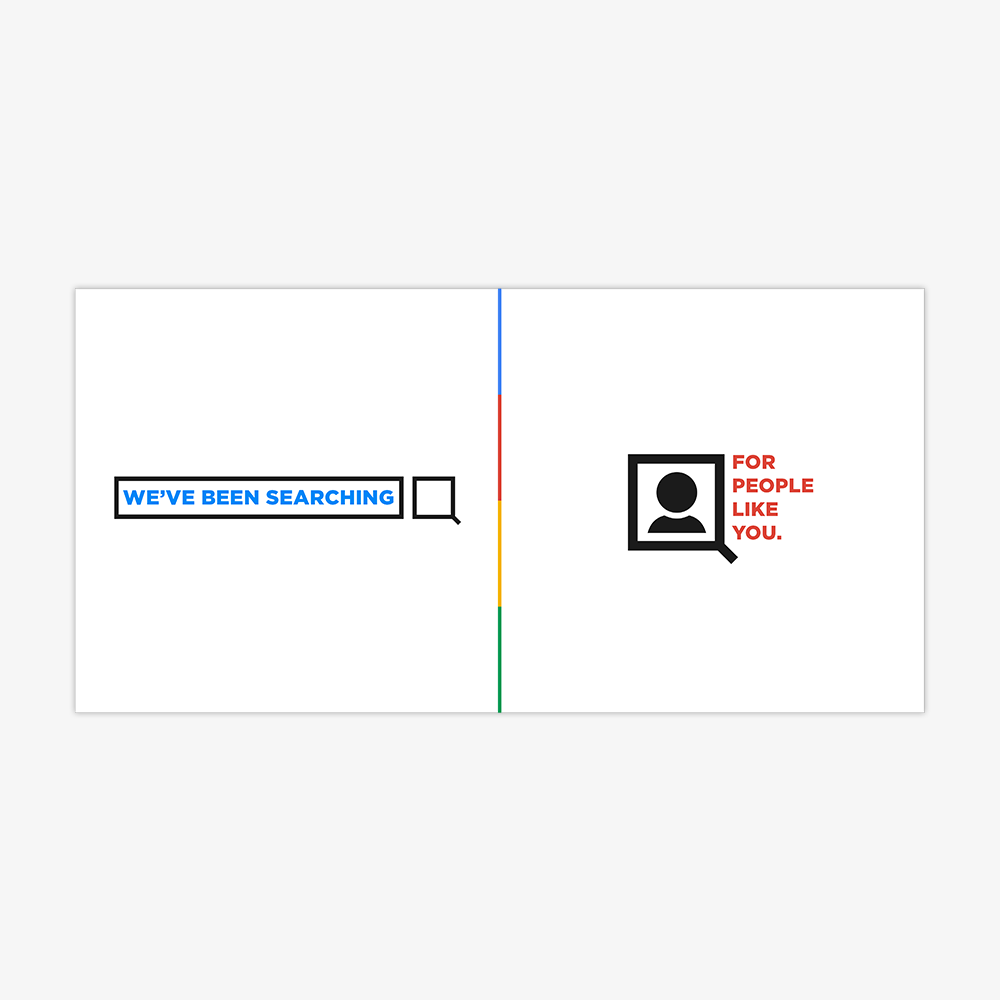
The logo also resembles a magnifying glass, a subtle nod to Google Search.


A strong and simple sans-serif was needed to complement the new logo. I chose a personal favourite of mine and the typeface I use in my own Identity; Gotham.

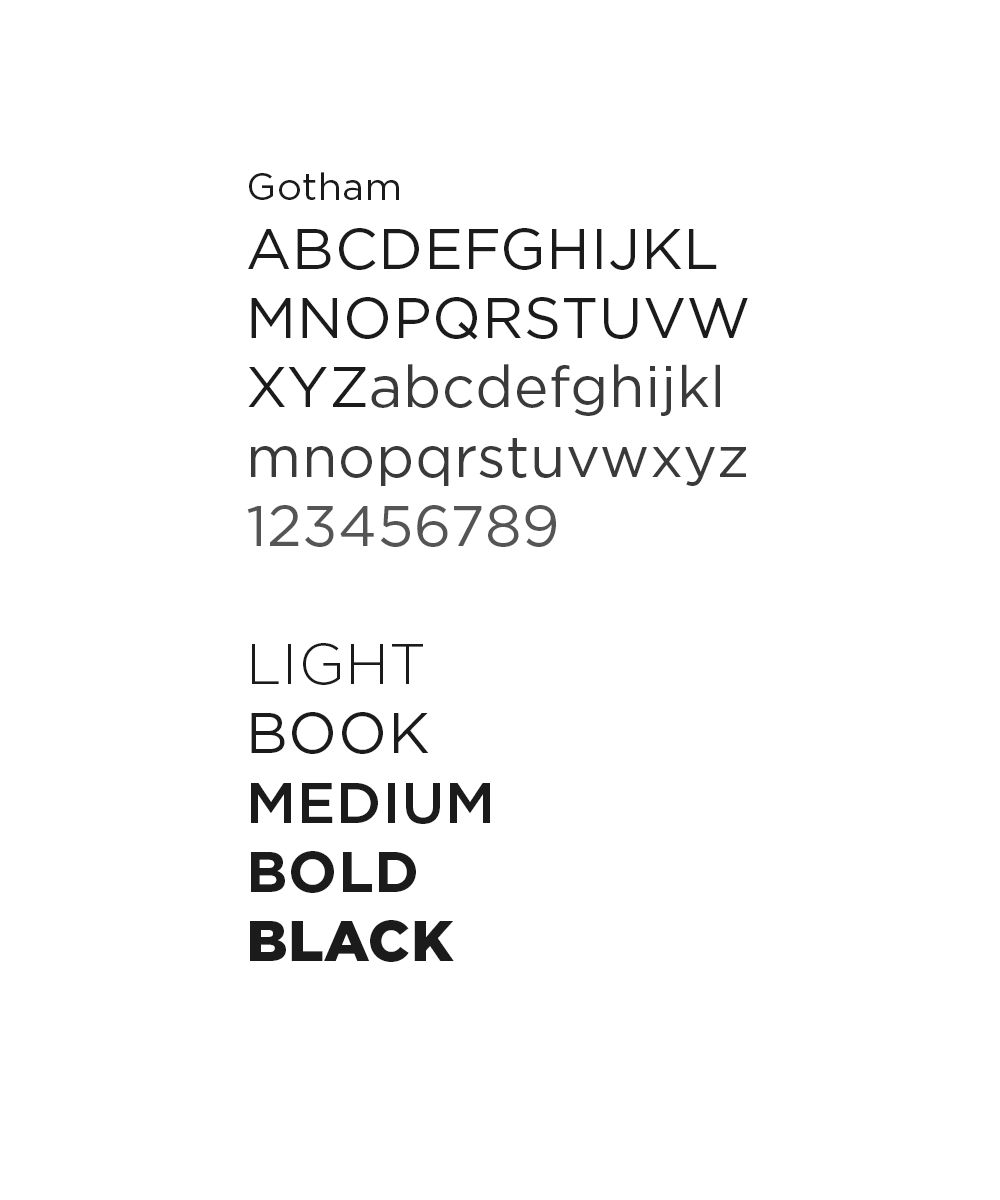
Gotham is sensible, bold and modern. It has great proportions and omits the friendly curves found in Helvetica. Like the new logo, it’s also incredibly versatile. It’s various weights make it applicable virtually anywhere.


Arial is used as the secondary typeface, because it renders well on web and mobile and is frequently used by Google as their default sans serif.


The SQUARED tone of voice is loosely inspired by modern military recruitment ads. Bold, direct statements placed alongside a clear call to action and minimal visuals.


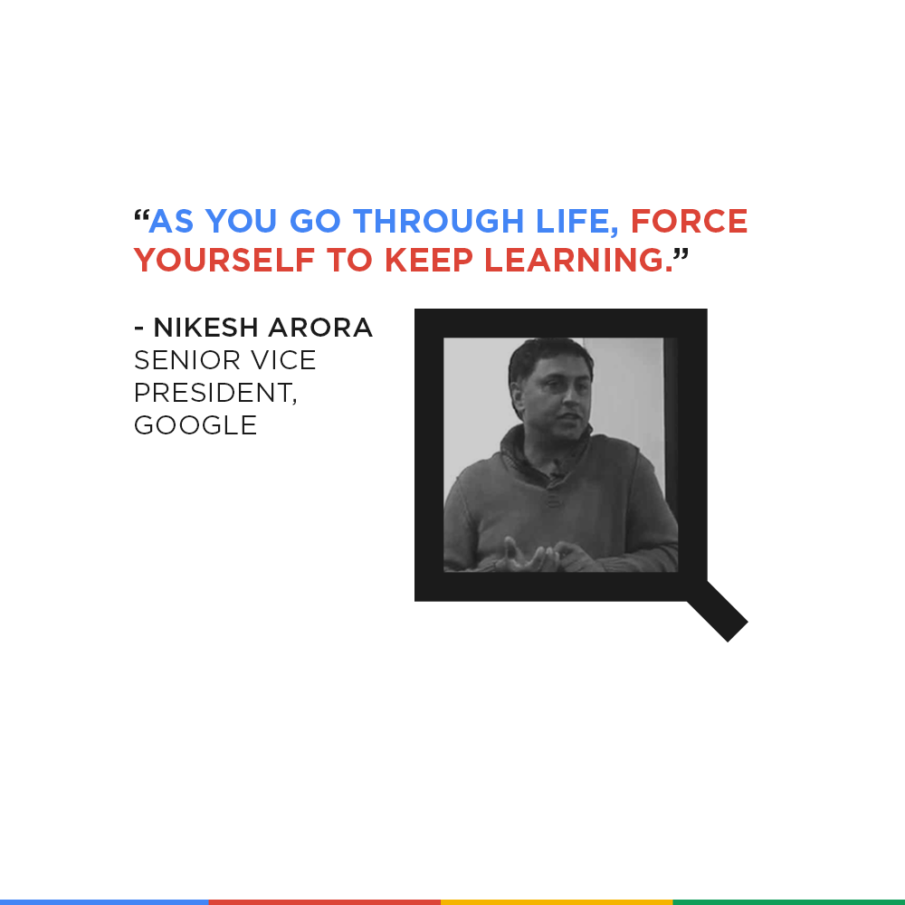
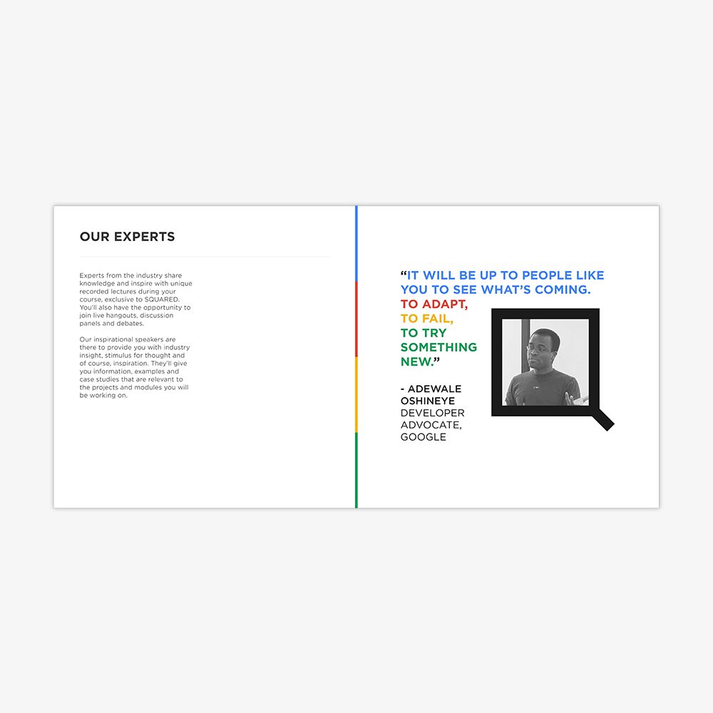
Framing features prominently in the SQUARED brand identity, adding depth and helping to drive focus towards key emotional elements of the images. The logo itself is a frame, both literally and metaphorically. It can contain your memories and experiences as a SQUARE, or be used to represent a blank canvas for your future.


SQUARED features a largely monotone and neutral palette. The entire identity has been designed to look beautiful in black and white.

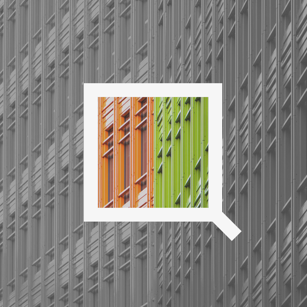
Where necessary, the brand utilises Google’s four hue colour palette. This brings energy and youthfulness to the brand while aligning it with it’s parent company. It also allows for the use of what I’m calling the ‘Google accent’, which is a thin, striped line containing Google’s primary brand colours.


The use of colour is primarily inspired by Central Saint Giles, a beautiful, striking complex containing Google’s primary advertising and sales office in the heart of West Central London.

The complex was designed by legendary architect Renzo Piano (designer of The Shard) who once said that “…the idea of colour represents a joyful surprise.”, a sentiment carried throughout the SQUARED brand.

This is where SQUARED was born. I’ve visited the office many times and it never ceases to inspire me. Both the interior office design and exterior complex design meld the essence of Google, London and the creative and advertising industry perfectly.


The SQUARED website was designed with impact and clarity in mind. It uses SQUARED’s loud, direct tone of voice to put the brand’s mission statement at the front and center, above a bold, over-sized call to action, while the Google accent sits subtly at the bottom of the unit and footer of the page.


The website features a fully responsive design, providing the same impactful experience across all devices.


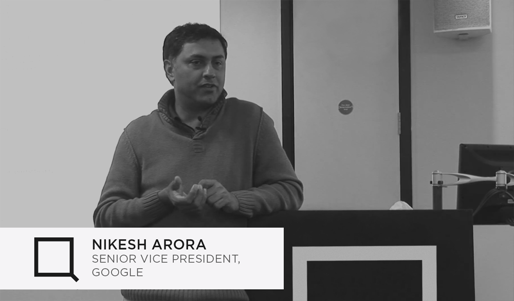
Also included is a HD video archive of past SQUARED talks, given by well known industry experts.


A blog containing the thoughts and experiences of current and past SQUARES is also publicly available. The title, author and opening paragraph are overlaid onto the posts featured image, utilising the same direct and impactful style as the homepage.


Being invited to join SQUARED should carry with it a sense of occasion. It should be a personalised and emotional experience, akin to being accepted to your dream university or gaining admission to an exclusive club.
Until now, the majority of SQUARED applications came from professionals already working in the creative and advertising industry. Now that SQUARED is available online, a more direct response to applications is needed as some of the candidates may not work in Central London. In all instances, new SQUARES are now sent invitations by both email and post.


Both the digital and print invitations are designed with an air of mystery. It’s likely that the recipient will know immediately who the message is from, but they won’t know for sure. This creates a feeling of positive uncertainty, not unlike opening a gift on your birthday.
This is represented by the email subject line ‘You’re in.’ as opposed to ‘Welcome to SQUARED!’ and the print invitations subtle, barely noticeable use of the SQUARED logo and Google accent, featuring no explicit branding or mention of the programme.


The invitation is brief and minimal. It feels more like a concise brand book than a formal invite to join an educational programme. The subtle Google colour accent is painted in between pages, only appearing once the book has been opened fully. “A joyful surprise.”.

The invite’s purpose is to delight, to invoke excitement and the feeling that you’re about to become a part of something bigger than yourself.

The design was cut and refined from over 40 pages to around 20, while remaining a largely visual experience that won’t overwhelm the reader.

Using simple language, the invite explains modules in short and easy to understand paragraphs, while featuring framed visual elements that further align the course with Google London and it’s home at Central Saint Giles.


View the full, page by page invite/prospectus below.


Also supplied with the print invitation is a basic personalised merchandise package. This contains a lanyard for SQUARES to wear when they’re on site, along with name cards for exchanging contact information and some stickers and badges for representing SQUARED at meetings and events.


The back of a SQUARED name card. The front features a portrait photo of the SQUARE, taken from their Google+ profile. The cards are designed to encourage interaction between SQUARES during and after events by establishing a common ground and helping to inspire conversation.
They contain only the essential information you need to make a connection with someone: a face, a name, an identifier and a casual piece of contact information.

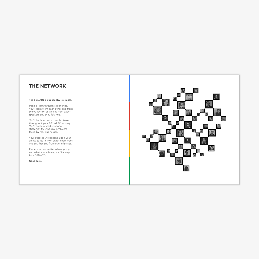
The SQUARED brand acts as a symbol that the SQUARES can wear with pride throughout their journey together. It’s a distinguished mark that you can carry with you throughout your career – one that instantly conveys experience, individuality and a commitment to learning by doing. The SQUARE represents quality, simplicity, versatility and above all, unity.

You can find the original project here.
To find out more about SQUARED, head over to the official course website.
Thanks for reading. I’m @jckmgn on Twitter.
DISCLAIMER
This project, titled ‘SQUARED’ was designed purely for personal, non commercial use. These conceptual works were created during weekends and evenings without the prior knowledge of Google, Squared, or any of their respective subsidiaries, affiliates or employees.
This project may not strictly follow the Google or Squared brand guidelines and does not necessarily reflect the views or plans of Google or Squared. Google, Squared, the Google logo and the Squared Logo are the property of Google Inc.
Some content including text copy, photographic and vector images are © Copyright Jack Morgan 2013.


