


"Be daring, be different, be impractical, be anything that will assert integrity of purpose and imaginative vision
against the play-it-safers, the creatures of the commonplace, the slaves of the ordinary."
- Cecil Beaton
A streetwear brand dedicated to the dreamers and the rule-breakers,
inspired by hip hop fashion and the surf skate culture from New York and downtown California.
It has the hype, the rhythm, and the flow.
finesse. - voice of the street.


Finesse Visual Identity
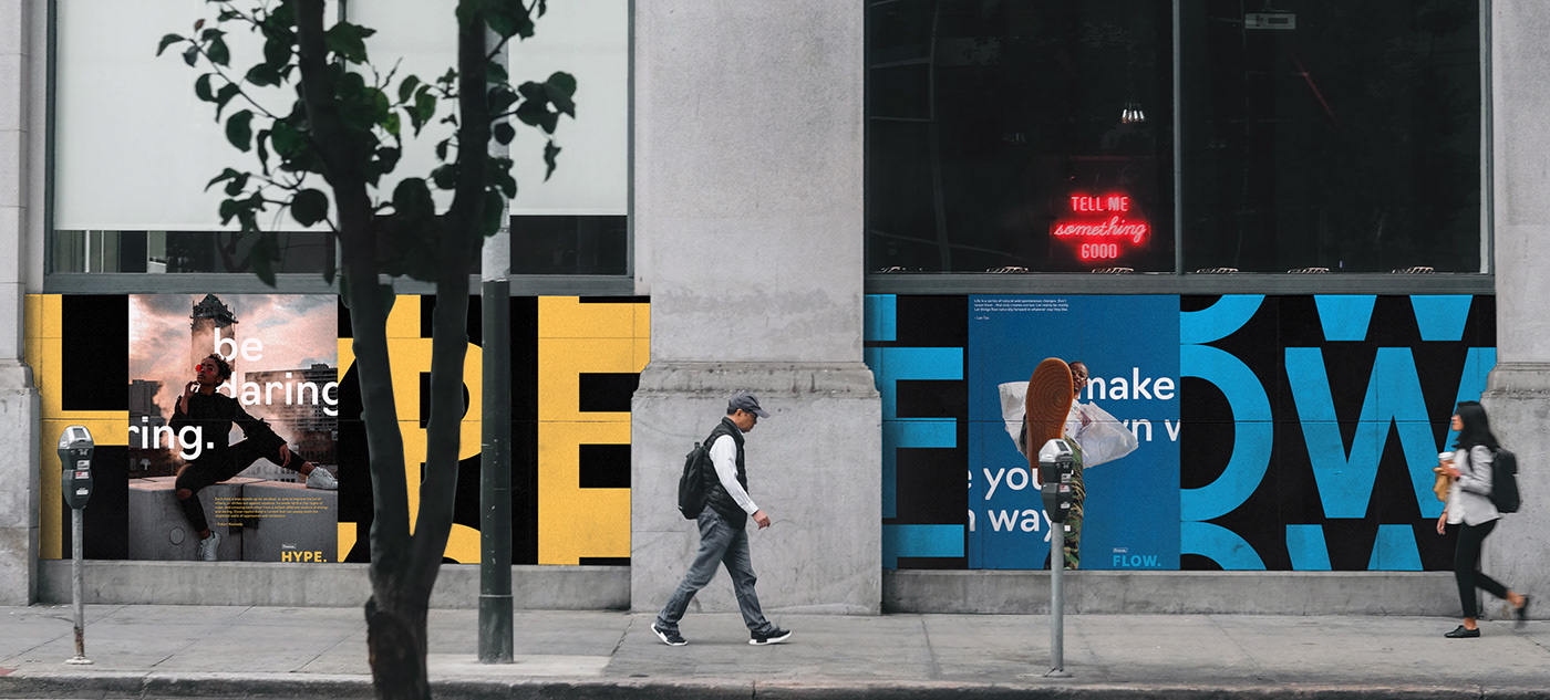
"Voice of the streets" is the motto of Finesse, and to develop a visual identity based on the company's motto, it's necessary to understand the brand image. Skateboards, Hip Hop, Sneakers, Bicycle, Jump, Hypebeast. A visual image of a streetwear brand conveys these keywords.


Photography
The key ingredient in the identity system of a brand like Finesse is Photography. "Voice of the Streets" is a pretty strong statement, and to visualize it, the brand language of Finesse needed a medium, and that's where photography came in. The idea behind developing the photo aesthetics for Finesse was to give life to the company's motto and to communicate the emotions behind the brand's origin.
So the photo aesthetics of Finesse is the combination of two core ingredients, taken from the company's motto and the keywords for the brand image. These two ingredients are Style & Sport.
Style shows the people or an individual wearing Finesse's clothes. It shows the bold attitude, emotions, and soul of street life. Sport deals with the drive and the energy of street life. It tells that Finesse is made for the dreamers and rule-breakers by showing the powerful imagery of street sports.


Logo Process
The process behind the logo of Finesse was to make a mark that can bring out the elements of street life. After analyzing the keywords for a streetwear brand, three essential elements appeared, which gave the groundwork of the logo process.
These elements were: skateboards, zebra-crossing and the people of the streets.


Logo Applications


Color Palettes
Colors describe the general mood of the brand. Being inspired by the hip-hop culture of the 90s downtown California and New York City,
Finesse's primary colors are in the monochrome, The Blacks, and The Whites. This primary color palette is not just essential to the brand image
but also for its motto - Voice of the Streets.
For the secondary palette, the brand required stability to show different emotions behind its fundamental character. Apart from its motto,
Finesse needed colors for its organic style. For its HYPE, RHYTHM, & FLOW.
HYPE = Energy.
RHYTHM = Movement / Journey.
FLOW = Freedom.
In other words, the primary palette defines the character, and the secondary palette reveals its behavior.


Typography
Typography helps a brand to communicate, and picking the right typeface, which will become the crucial element of brand language, is a very relevant process. For a streetwear brand like Finesse, typography should include a prominent primary typeface, which can be the face of brand language, and a substantial secondary typeface, which can be the voice of the brand.
For Finesse, the primary typeface is Navigo by Type.Today and the secondary typeface is DIN Pro by Paratype.


Website


Instagram


Facebook

Twitter


