Wide cupped serifs, flexed and tapered stems, wide round shapes. Not a straight line to be found. What if you put a bunch of historical details together without trying to make a historical style? Some would say you would get get a post-modern typeface. Is Moraine a post-modern typeface?
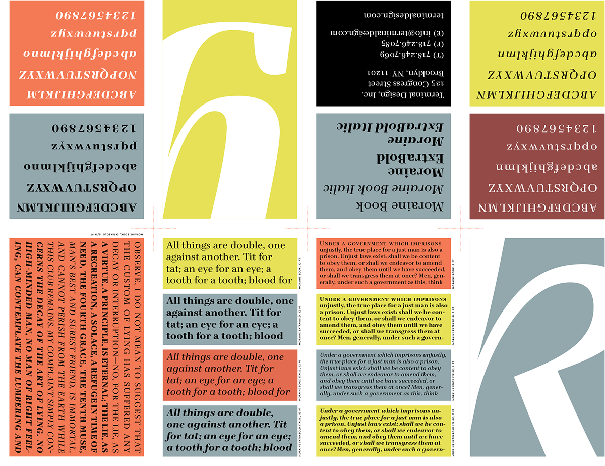
Originally this design was drawn over a weekend to embarrass a class of underperforming typeface design students into working harder. (It didn't work). The design sat in a drawer (so to speak) for a couple of years, and got dragged out in early 2009. The original design was too contrasty and fragile, so I beefed it up a bit and added a nice range of weights. The italics were fun and the whole project was complete in three months or so. What I find really appealing about the design is it's width. In these days of condensed space saving fonts, these wide forms are a pleasant contrast.
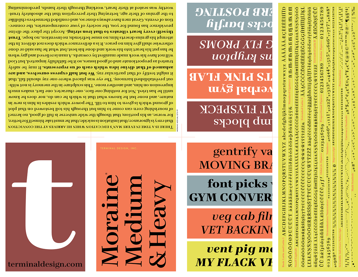
Moraine is available exclusively from Terminal Design