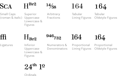
This optically sized family emerged from the Mayeur design I did for Mens Vogue magazine. That display font was incredibly, one might say painfully, contrasty. The original idea came from looking at some Didot designs in the type specimen catalog of the 19th century Parisian printer Gustav Mayeur. The Mens Vogue designs were certainly no revival, but these old specimens did give me something to show the art director to get started. Thoughts of expanding that display design into a useful text design finally got the better of me and I spent most of 2008 working on it. I call it a French Modern, my friend Charles Nix calls it a Scotch Roman. Charles is probably on to something since the design features a nicely British Q. The drawings are full of flex and curves, and soft points on the serifs. Again, hardly a straight line in the design. Four optical sizes for Caption, Text, Deck, and Display. (Deck is large text or small display for all you non-magazine types). The italics are on a very severe angle and provide a strong textural contrast to the roman.
Consul is available exclusively from Terminal Design


