Design and production of commanding icons (aka ribbon icons) for Microsoft 365 apps (subscription release)
In my role as lead designer, I approved icon designs for production ensuring design quality and detail.
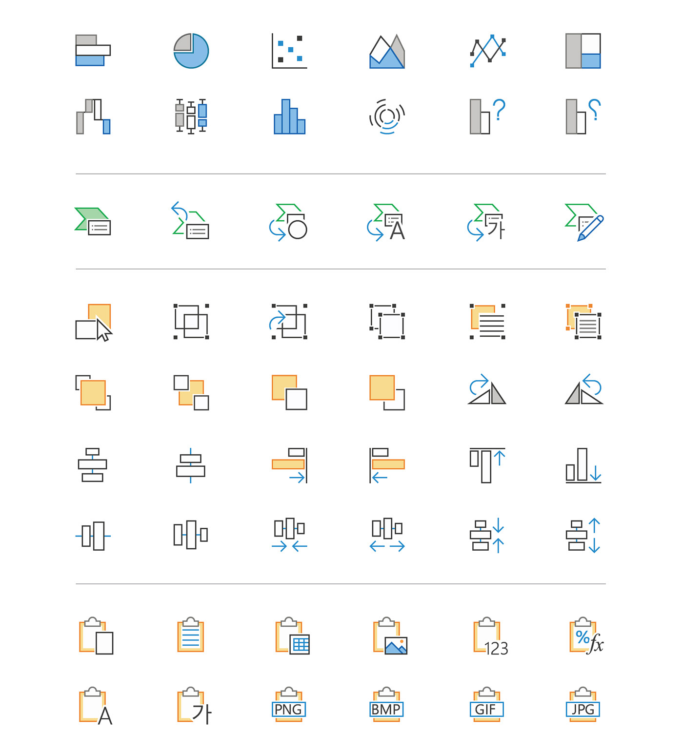
The mission of the project was to refresh all existing commanding icons to a simplified, modern style (monoline). We following in-depth guidelines, and aligned to a system of commonly used elements. Final designs went through a process to be converted into a font file. Once consumed, a single assets had the ability to support multiple states and themes. A variety of accessibility concerns were considered in the design and capabilities of the icons.
As lead I provided guidance to production designers, managed consistency in both design concept and development, and made updates to our style guide to keep everyone on the same page. I oversaw icons added for new features by advising app teams on our established concepts and how to best align.
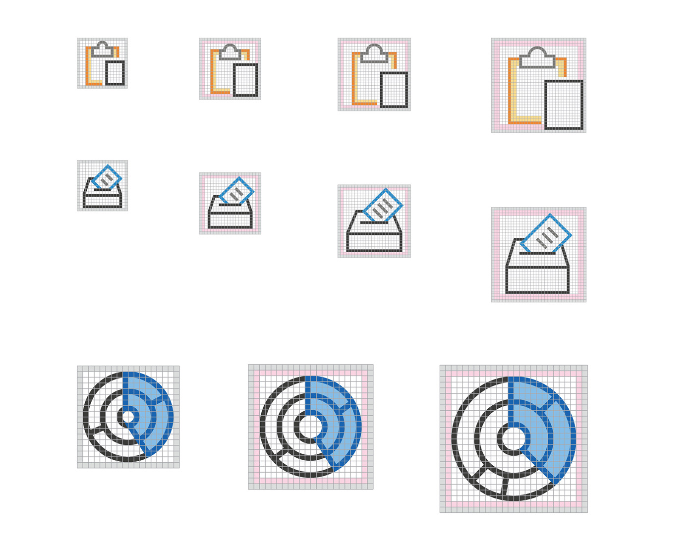
Size ramps showcase pixel perfection
To accommodate screen resolutions, all icons were designed in a variety of sizes and ensure optimal clarity.
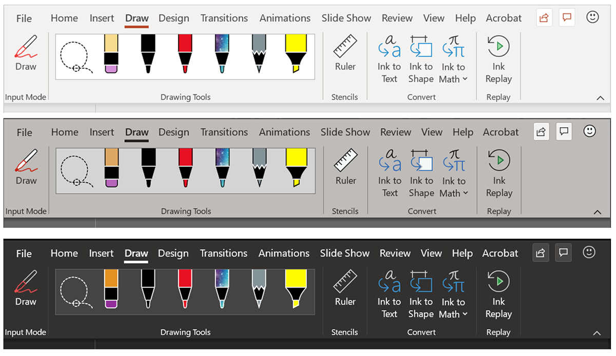
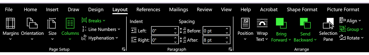
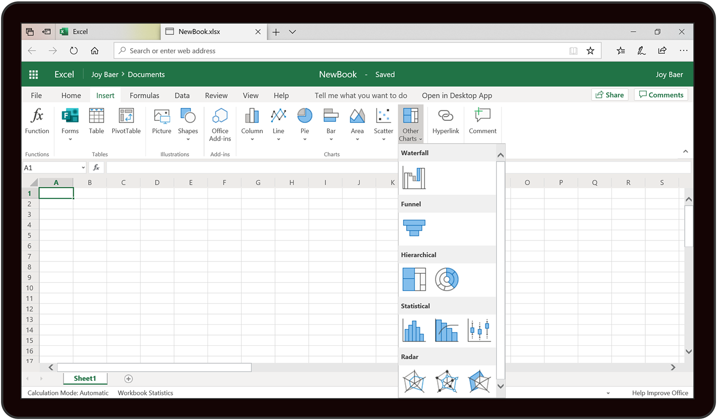
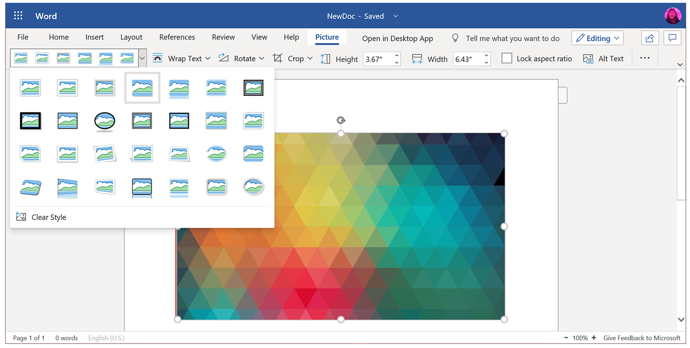
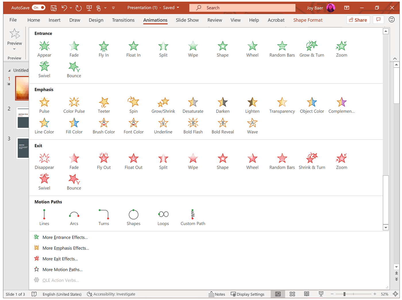
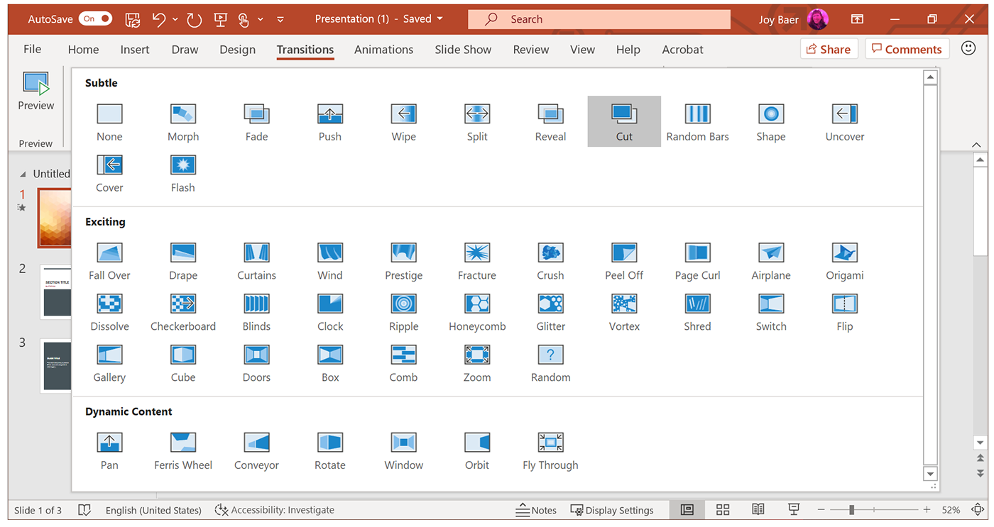
Icon galleries and sets
These emphasize additional style alignment within the general guidelines.
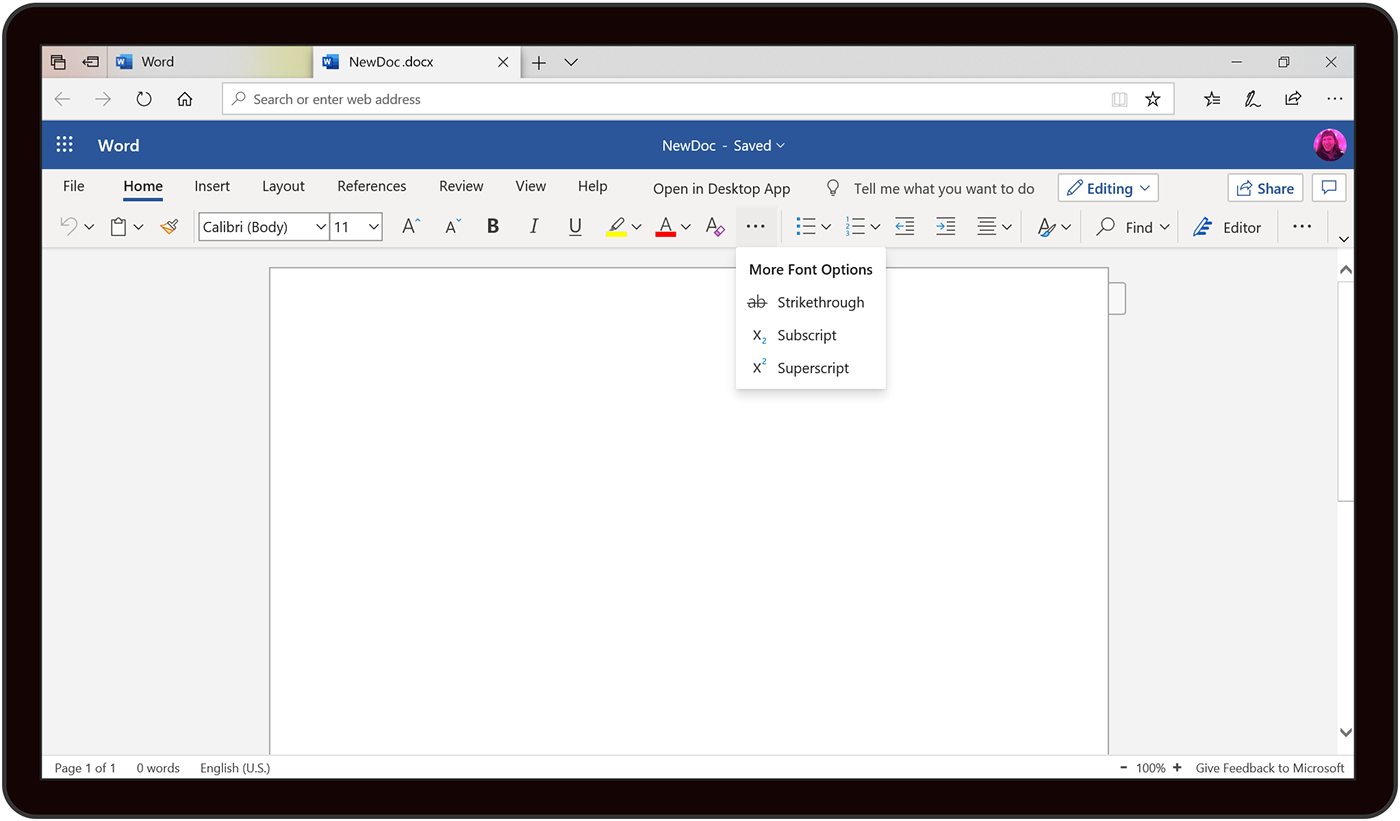
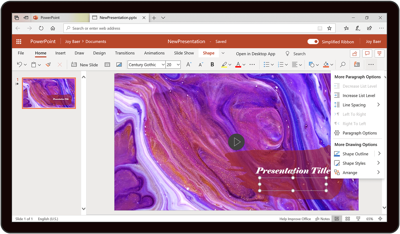
Themes and accessibility
White, Dark and Black modes were accommodated, and ensured all color combinations in each mode met an optimal contrast ratio for best visibility. Single color design accommodations were made for high contrast modes.