

TICK & TALK
Project
Brand Identity
Year
Year
2016
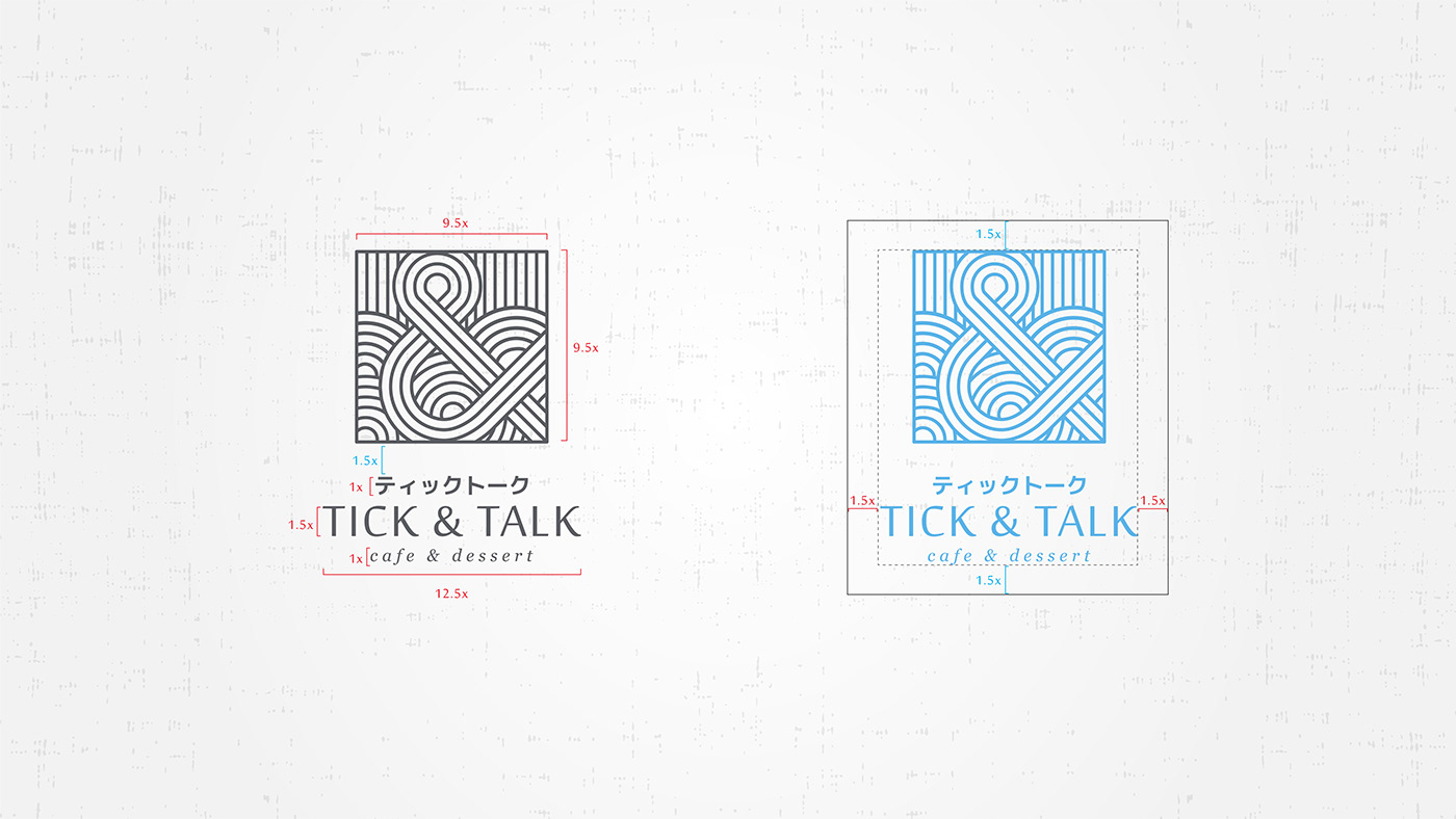
The brand name ‘Tick & Talk’ is originated from Tick & Tock, the imitative ticking sound of a clock. With a homophone of ‘tock’ to ‘talk’. Tick & Talk communicates a space and community where you can spend quality time in interaction and conversation with your pals.
Tick & Talk which concept draws its influence from Japanese coffee time experience, capture its logo in the form of the Ampersand symbol inspired by the Modern Japanese Wave framed in a square like a Hanku Stamp.


Credits
Creative Director / Yenny Heriana
Direction / Yenny Heriana
Direction / Yenny Heriana
Design / Achlul Fikri


