Brand concept
They created vegan "ice creams" and were targeting those interested in artisan desserts at the higher end of the frozen novelty market. The feeling that they would like to come across through my branding is one of a summer night frozen treat. Love a sunset on the beach, warm from being in the sun all day, and you grab a frozen dessert to top it off.
The word dream was included because this scene is like a dream for them, plus the ice cream was a "dream" in that. It is dairy free but tastes like ice cream. They were also open to more simple clean logos or more whimsical ideas.
Art Direction
Other than that, she provided some references from other designers. Even though it should be sophisticated, feminine, also a bit mature and classic for its logo, besides ‘dreamy’ at the same time. In order to visualize correspondingly, I made myself a mood board from style guidelines.
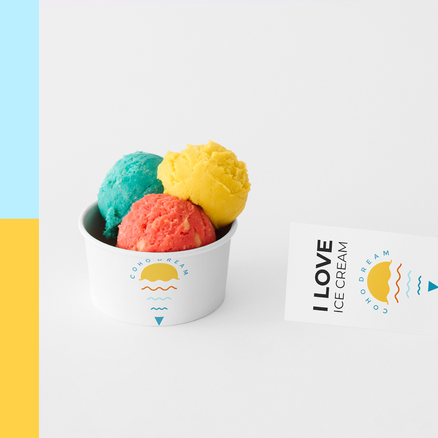
Branded visual
Things to do first are develop color pallet and typography. The client had a color preference with blue and orange spectrum as her preferences, while my role here was to find the best match color for a dream-ice-cream logo design.
Some blue colors were giving a bit of a dreamy nuance when combined with warm tone colors. Here I put the clear beach and seashore colors. On the other hand,orange hue colors were added such as sun rises and tangerine. Those colors were made up of sunny vibes for the vegan ice cream logo. Its typography need not be a complex one, rather a minimalist and light font, Montserrat Regular.
Logo
From briefs and the brainstorming process, she needed her vegan ice cream logo to be simple, clean or more whimsical. Hence, when creating a ‘dreamy’ logo I was thinking about sunset, clouds, sunny sunday noon, and breezy beach. It was warm from being in the sun all day, and buyers could grab a frozen dessert to top it off.