"TSUH" Taiwan Cultural Festival Project

Logotype Design Concept
The logotype is based on the Chinese word "厝," which is a traditional way to say “home” in Taiwan. The main reason I choose this word is to remind the Taiwanese, this beautiful country with so many wonderful things to be seen, is where they are from and where they belong.
The color palette in the design consists of nine colors, each of them represents different natural resources in Taiwan. The first color represents the abundant of rivers and water resources in the land. Following with four colors with a darker green base, they symbolize the color of the mountains in Taiwan, which is one of the countries with the most high-altitude mountains in the world. Finally, the last four colors indicates the fertile lands in Taiwan, where the best rice and fruits are produced.
I hope this design can have people think about how much they have in this small island, and to cherish these natural resources and this homeland where they belong.
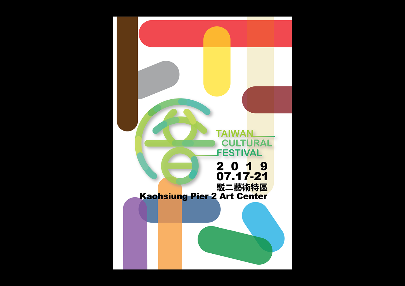
Main Poster
The poster combines the colors from each section, crossing and mixing together. This design is to represent the diversification in Taiwan, and the playful look is to let the audience understand that this country is not a place of chaos, but an island full of wonderful memories and joys.

Poster Design - Culture
Taiwan has always been a multi-cultural country. It was colonized by Spanish, Japanese, and Chinese for years, which brought the island different styles of buildings, arts, cuisines, and languages. Additionally, the aboriginal culture has already been living on this island for centuries. With more than ten tribes throughout the island, they provide a more diversified culture to the country, which is the reason I chose to use different colors. All of these four colors do not seem to match with others, but they mix in a smooth way when combining together. This is how the society in Taiwan looks like, people with different cultures works perfectly well with each other, and even create something fascinating out of it. Also, I believe that culture is something ever-changing, which is why I chose to use cursive strokes. Culture should not be a strict and fixed element, it will always be shifting to adapt the society.
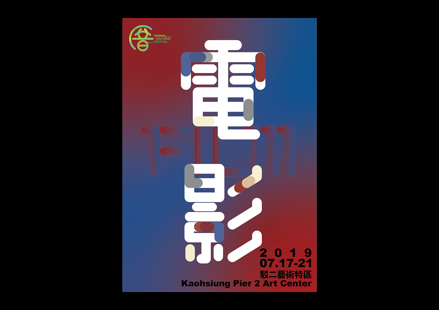
Poster Design - Film
The film culture in Taiwan has a long history. I believe that movies are reflection of the culture itself, which is why it was chose as one of the sections in the festival. On the other hand, films always come with machines. Without the mechanical techniques, they are impossible to be produced, which is why the stokes are more industrial and mechanical. The reason I used darker and moodier colors is because of the topics discussed in Taiwanese movies are often issues in the society or family. The brighter color is used to represent the joy and happiness a film brings to its audience.

Poster Design - Food
In Taiwanese cuisine, the most common ingredient is soy sauce. It is crucial to maintain colorful in a dish, where the Taiwanese often cook with green onions, carrots, and eggs. We eat noodles and rice very often, that is why I chose the beige color in this poster. The other four colors symbolize the color you will see in a traditional Taiwanese cuisine. I aimed to remind the audience the taste from their homeland, and to remind how wonderful the Taiwanese cuisine culture is.
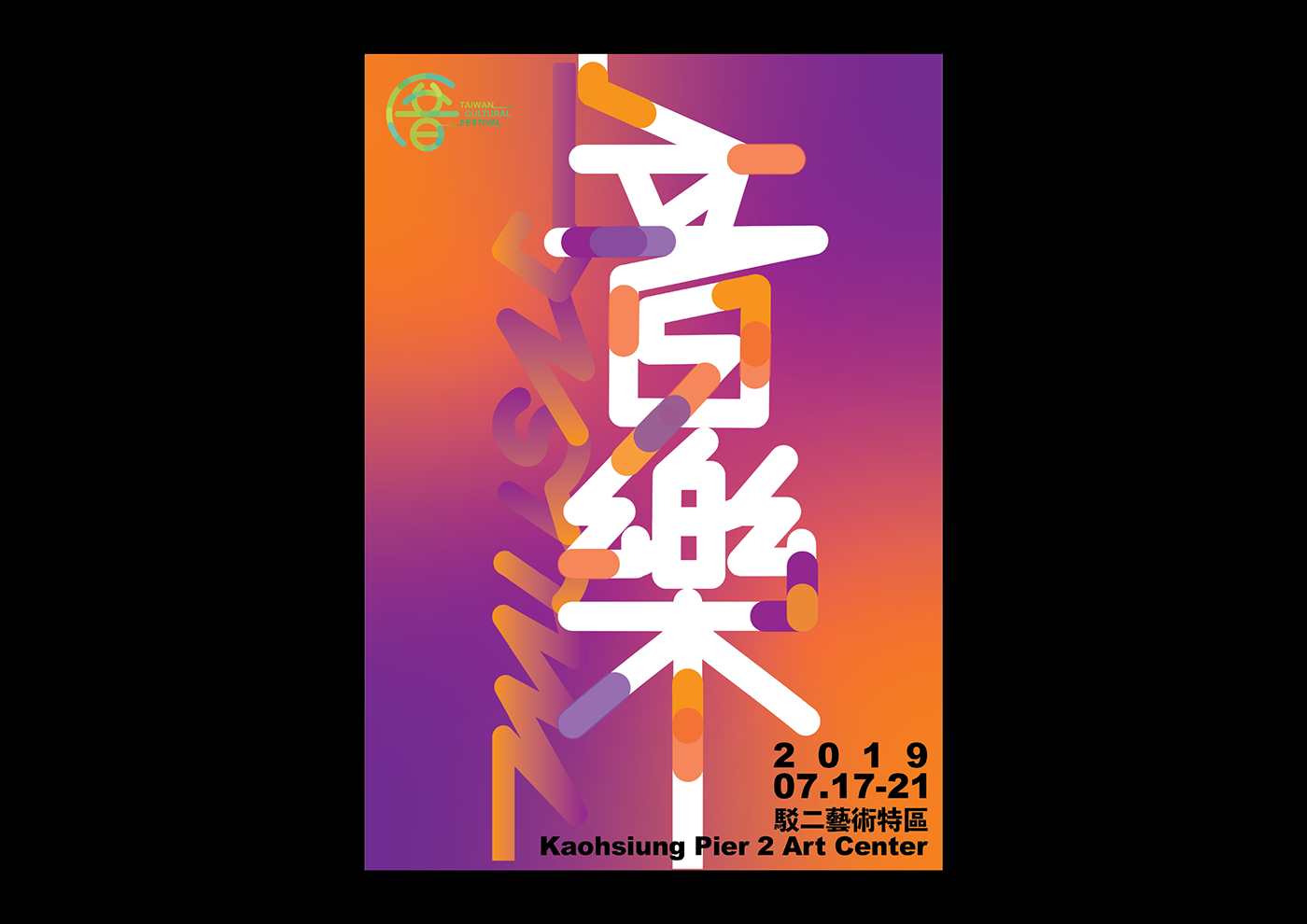
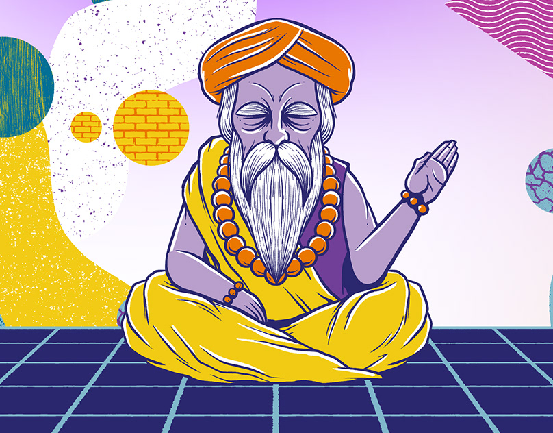
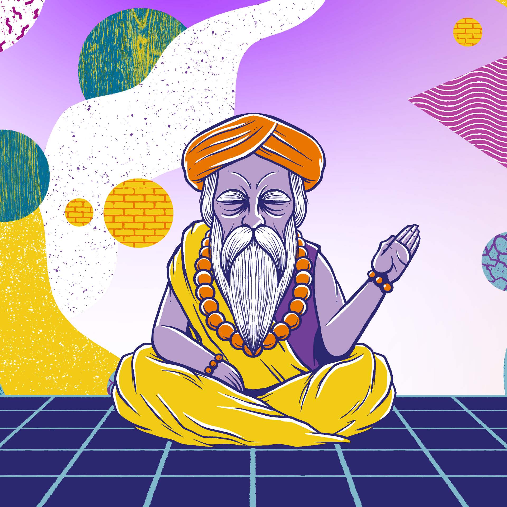
Poster Design - Music
In this section, I presented the concept in a surreal way, reflecting the concept of independent music, which is usually about escapism and the idea of a subculture. Orange indicates the intense emotions, alongside with purple, representing the dark, depressed emotions. The strokes I chose are trying to present the notes in a song, moving continuously when the song is playing.