

Summary
Gohelp is an app that allows users to get help from professionals in any field. It allows users to get professional help in any field provided from art, business, school, and etc. The goal for Gohelp is to help the people reach their full potential in whatever they are trying to pursue. Gohelp allows users to get help on the go.
Role: UX/UI Designer, User researcher
Course: CareerFoundry UX Design program
Tools: Axure, Balsamiq, Figma, Invision
Duration: 7 Months
Design Process
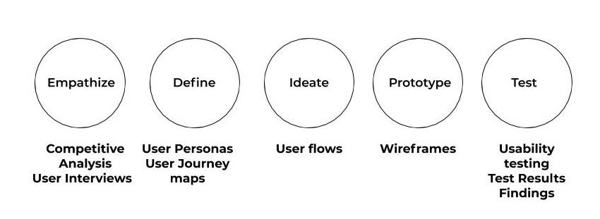
1. Empathize
How will I get the information for the app?
To gather all the information for the app I decided to do a competitive analysis and user interviews to help me figure out what I like about the other apps and what would be useful for users.
Competitive Analysis
To get a better understanding of the competitors that are similar to my app I did a competitive analysis to compare the strengths and weaknesses from each of those apps. It gave me the opportunity to see what I liked from the other apps and possibly get inspiration from it. I analyzed two apps and created a SWOT profile for both of them. I really had a tougher time finding apps like GoHelp. The only apps that I really found were either international apps or some that were not very good. On a good note there were some really good things I did take away from these two apps. Some of the things were how easy the usability was on both apps, the features got main to the point, and also helped me add things to my app that these didn't have.


Conclusion
After doing the competitive analysis I decided what audience I want to target and what problem I wanna solve for my users.
User Research
During the user research phase I interviewed three potential users. All of different age, background, and occupations. I analyzed of their behaviors & attitudes, needs & goals, and frustrations. After I interviewed the participants I created an affinity map. I found a total of three clusters that gives me insight of Filters & Organization, Credibility of Experts, and Feelings about Education & Experience. This user research helped me learn what users wanted in my app and what would really be useful in the GoHelp app.


2. Define
User Personas
Based on the information I gathered from the user interviews I created two user personas. Liora represents my younger audience who is currently in school. Barbara represents the old audience who is currently has a job. Both of these user personas were important to the design process a good amount of the design decisions were based on these personas.


User Journey Maps
After making the user personas I created user journey maps. I built these maps to gain a better understanding of my personas. It helped me visualize the process of how the user will accomplish the objectives. This helped me get ideas early on how I should make the app.


3. Ideate
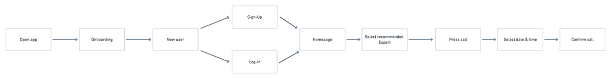
User flows
After the User Journey Maps I laid out the three objectives. My three objectives is to book a call with a Expert, message an Expert, and submit a review for an expert. Later on in the design process I redid my book a call user flow. This really helped on how the flow of the app was going to be.


4. Prototype
Wireframes
After doing the user flows and having the three tasks laid out I created wireframes I designed my first low-fidelity wireframe on paper. The first low-fidelity was not as good but it still showed how I want my app's layout to be. Once I was done with the low-fidelity I started to do mid-fidelity on Axure. Before user testing I started to do my high-fidelity wireframes and making the prototype interactive. At the point I was done with the high-fidelity my UX was fine but my UI design could have been better. Below are the main pages from low fidelity to high fidelity.
Sign up screen

Homepage

Messaging page

5. Test
Usability Testing
After competing my prototype I did a usability test with six participants to help me find where I can improve with my app.


Usability test results
After gathering all the test results, I analyzed the feedback and created an affinity map to find my errors and observations. After I created a rainbow spreadsheet to analyze my finding and rate my errors.
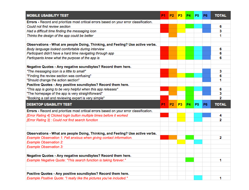
Usability test findings
Issue #1: While doing the usability tests I noticed that the users were having a tough time finding the review section. It was a little confusing to find where to review the past experts since it was in a section called actions. So what I did was take away the whole actions section and replaced it with a review section.

Issue #2: This issue was with the messaging icon. It was not a big usability problem the only issue was that some of the users wanted the messaging icon slightly bigger.

UI Design
Style guide


Final Mockups & Prototypes
After talking with my tutor I decided to do my whole app design over again. I transitioned to Figma. I decided it was a better software for me. It took me a while to learn but I ended up learning it. I went through a lot of trials and errors even having to redo my app design again. After a lot of trials and errors I finished my final design.


