Visualizing Ageing People
DensityDesign is one of the members of the European research project ‘Electronic Maps to Assist Public Science’ (EMAPS). From the 22nd to the 24th of May (2011) we organized a workshop with nine of our best students to work with the staff for the creation of several visualizations on the population ageing topic.
Workshop coordinator was professor Paolo Ciuccarelli (DensityDesign’s Scientific Director), with PhD students Michele Mauri and Azzurra Pini. Participants were: Benedetta Signaroldi, Carlo De Gaetano, Federica Bardelli, Francesco Faggiano, Gabriele Colombo, Giulia De Amicis, Stefania Guerra, Stefano Agabio and Valerio Pellegrini.
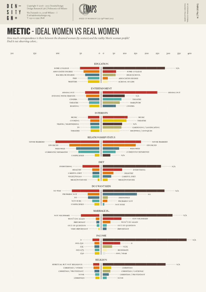
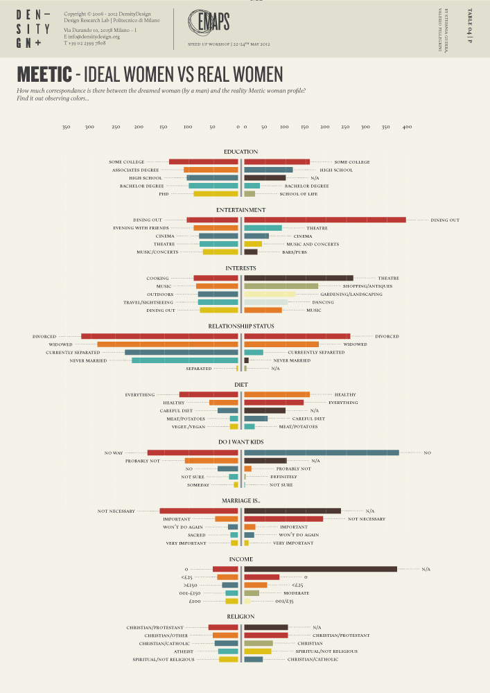
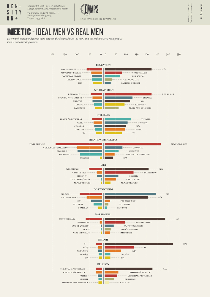
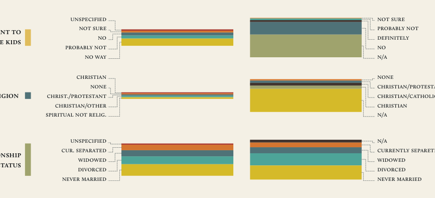
These visualizations show how elder people describe their selves on a popular dating website (MEETIC) and how they describe their desires.
QUESTION:
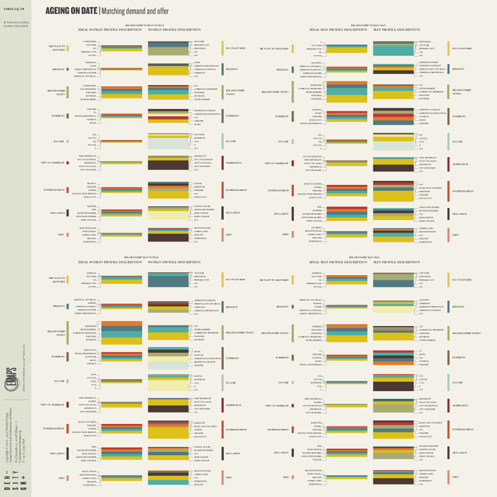
How elder people describe themselves for a possible date? How do they describe their wishes? Is there a matching between available characteristics what people seek?
DATA:
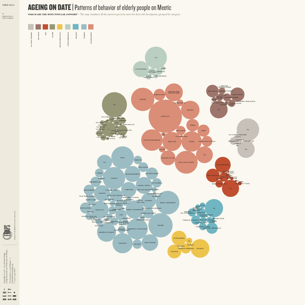
2,000 profiles of elder people (65+) have been taken from the dating website meetic. These profiles are proportionally divided in four categories: men looking for women, men looking for men, women looking for men, women looking for women.
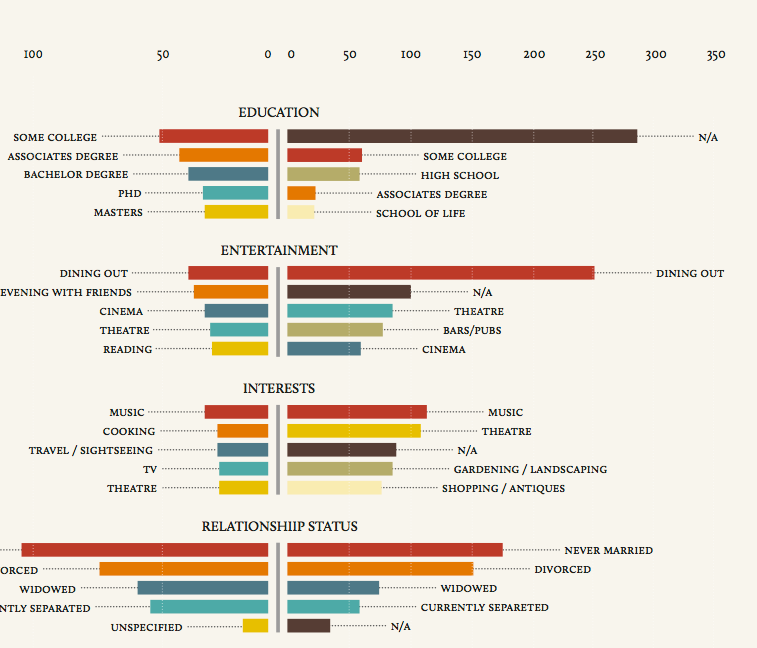
For each profile have been taken 22 main characteristics (e.g. relationship, nationality, entertainments…) and 16 additional ones (e.g. sports, my pets, political views…).
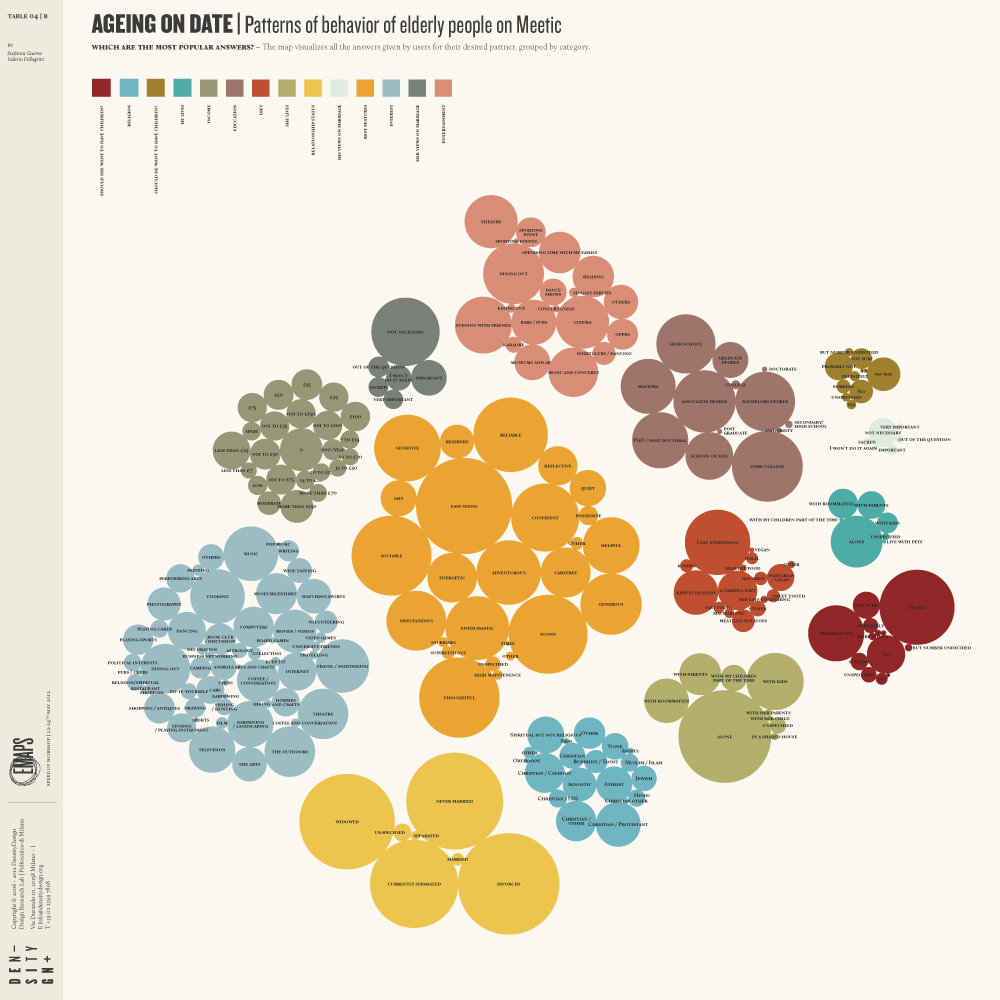
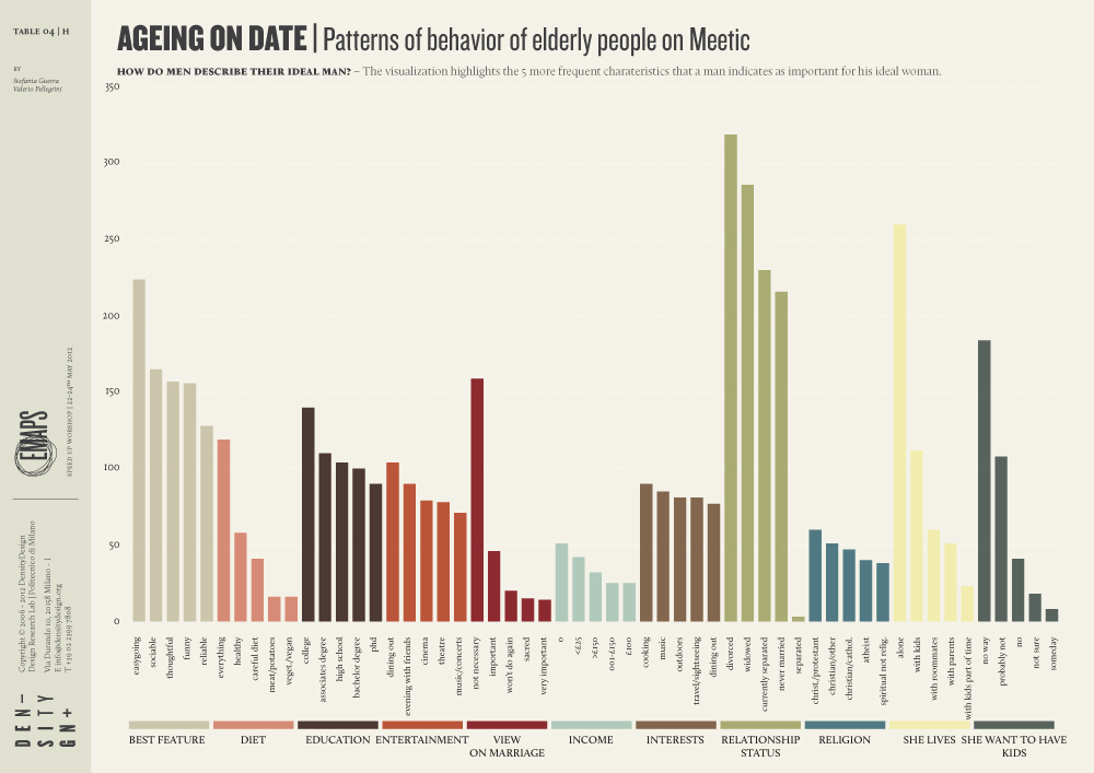
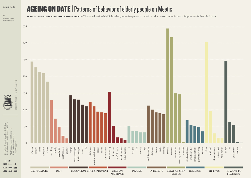
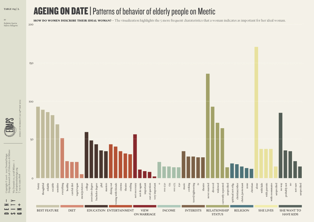
For each personal profile has been also taken the description of the man/woman the user is looking for. This description is described in 37 characteristics.
VISUALIZATION:
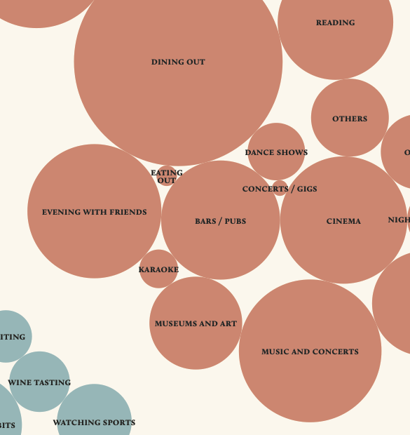
Two first visualizations describe which answers are more used by overall profiles. Chart 4A shows how elder people describe themselves. Each circle represents an answer, while the colour represents the question. By looking at this chart it is possible to understand which are the most used characteristics. Chart 4B uses the same visual model to show how well is described the ideal partner.
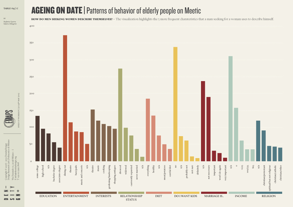
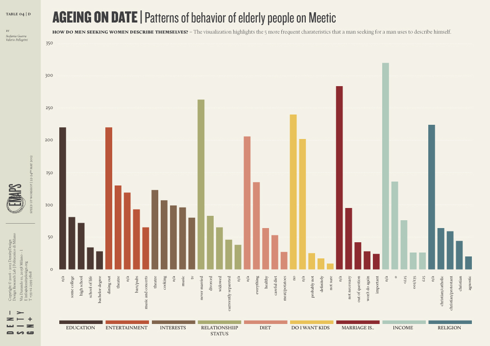
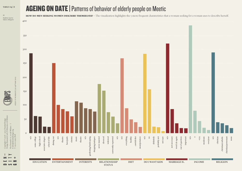
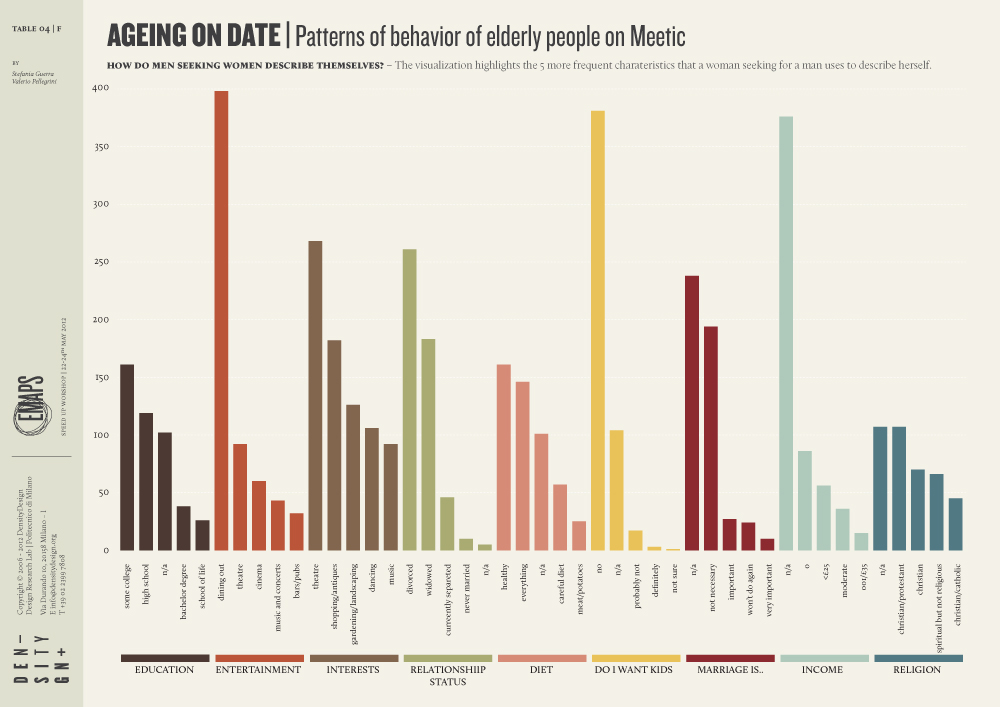
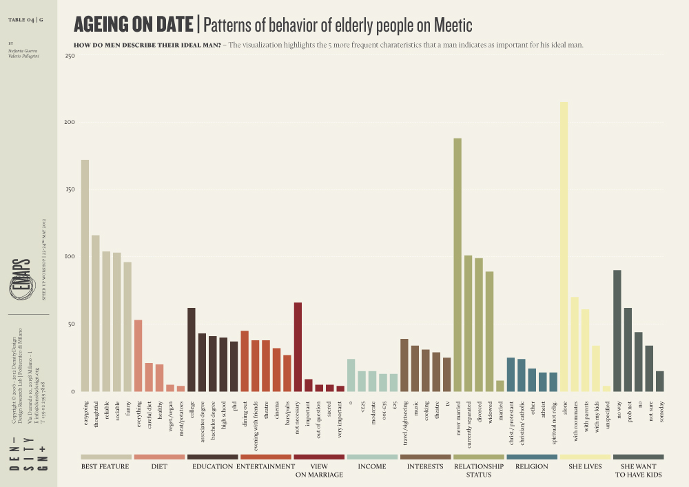
Chart from 4C to 4F show similarity and differences between the four typologies of profile. In each chart it is shown the most frequent answer for each question. Charts from 4G to 4L show how the ideal profile is described.