

Client: Lion Match Company
The redesigned and reformulated range of shave foams, gels and razors.
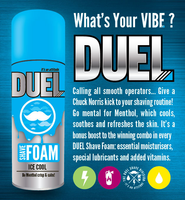
With an eye on the male teen to twenty-something market, the new packaging – and trade presenter – had to retain the spirit of DUEL’s payoff line, “It’s an Attitude.”
It started with a Logo Evolution:
Introducing a slick and appealing sheen instantly modernised the logo in a way that recalls the metallic texture of razors. We also subtly referenced the act of shaving with the introduction of a triple-blade device in the corner of the L.
Introducing a slick and appealing sheen instantly modernised the logo in a way that recalls the metallic texture of razors. We also subtly referenced the act of shaving with the introduction of a triple-blade device in the corner of the L.
We then re-designed all the Packaging Variants:
Overall, we injected funky, youth-centric attitude into both the pack visuals and copy. Vibrant colours. Original iconography for each variant. Cheeky, go-getting product descriptions… The end result is serious stand-out on shelf!
Overall, we injected funky, youth-centric attitude into both the pack visuals and copy. Vibrant colours. Original iconography for each variant. Cheeky, go-getting product descriptions… The end result is serious stand-out on shelf!
Full page ads were placed in FHM, Mens Health and Zigzag Surfing magazine, a Facebook page was also launched in conjunction with the media adverts. www.facebook.com/DuelShaveDivision


