Frenche Beauty Care
Cosmetics Visual Branding

About
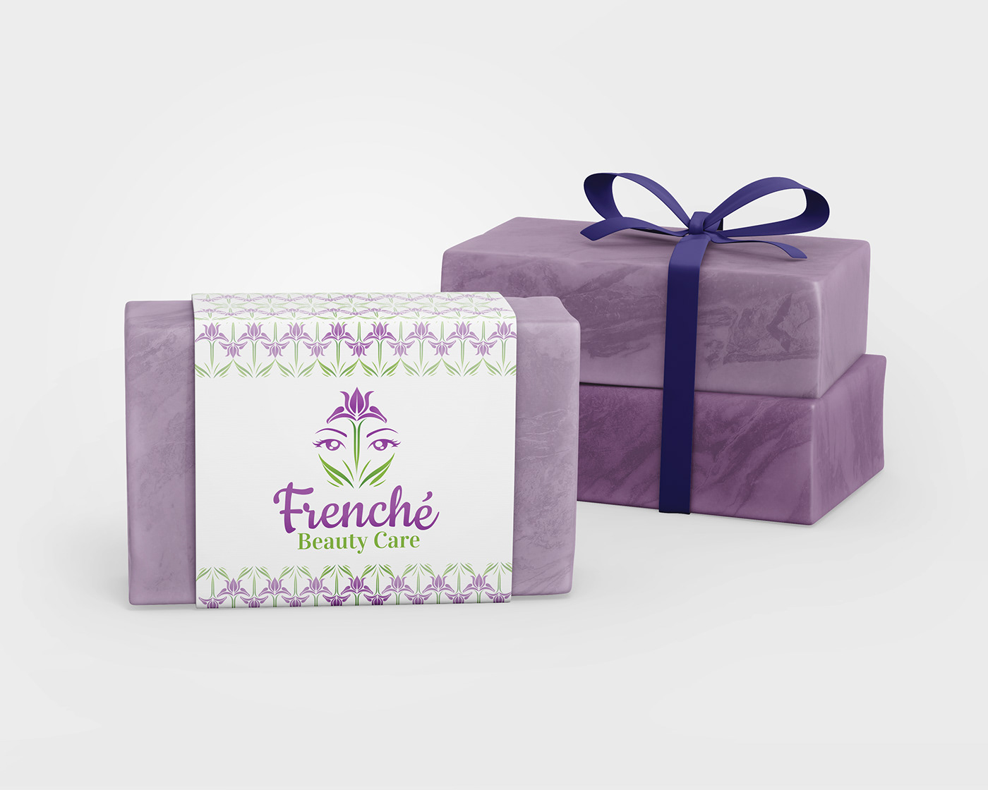
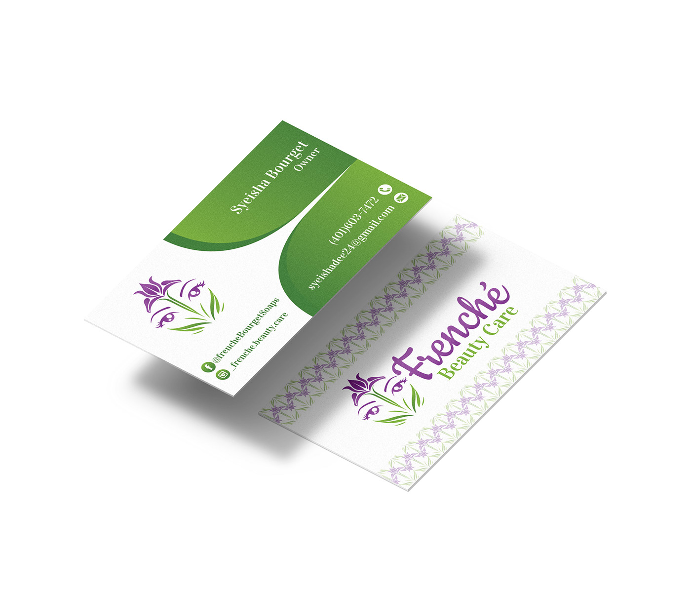
Frenche Beauty Care is a line of all-natural and organic cosmetic products. It is a very small business serving the local area of Rhode Island. Customers are able to have personalized skin-care products based on their specific skin-type or conditions. All the products are handmade and based on research into ingredients and how they are beneficial to customer needs as well as one on one discussions about ingredients, colors, etc. All the products were ready to be made but the first step was creating a visual identity for use in advertising, product labels and social media to allow for easy recognition.

Design Approach
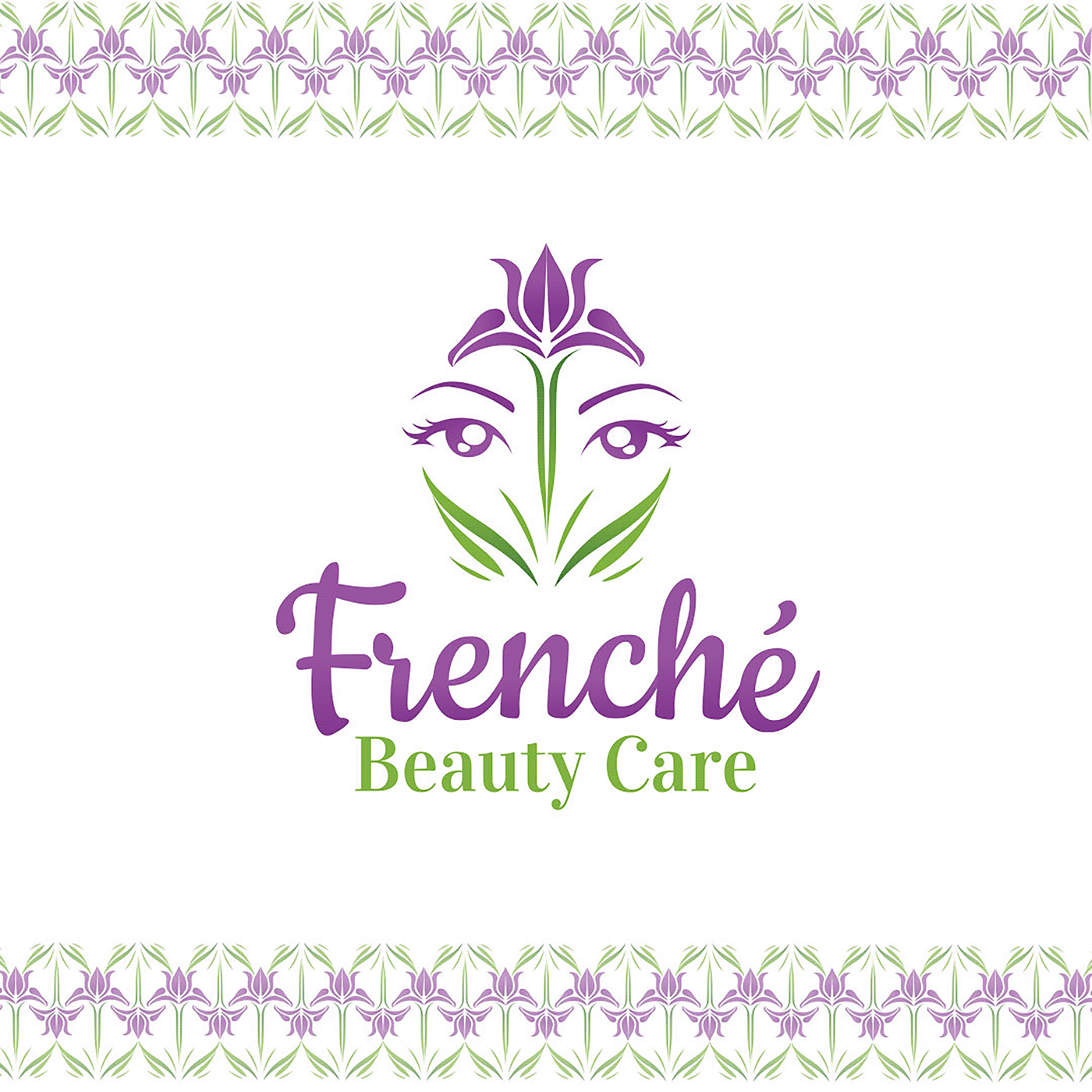
After discussing the brand in depth with the client she wanted to really emphasize the all-natural aspect of the products. The brand revolves around calmness, balance and natural elegance. I also tried to incorporate French themes into the design. That is why the purple Iris was chosen as the main symbol because of that association as well as how it has been used for skin treatments for many years.
The symmetry in the design also helps to create a sense of calmness and balance while the green tones represent nature. The client initially wanted to incorporate a tree but we decided a flower would work better because of how it works more easily at smaller sizes. The purple Iris also forms very interesting and elegant patterns that could work nicely for labels and packaging. If the logo is engraved into soap then it would also work well. The font was also slightly customized to make it more unique.