Design Agency: Network of Creative Thinkers (NOCT)
Designers: Mrudula Patankar, Nikhil Shrestha
Designers: Mrudula Patankar, Nikhil Shrestha
Brief
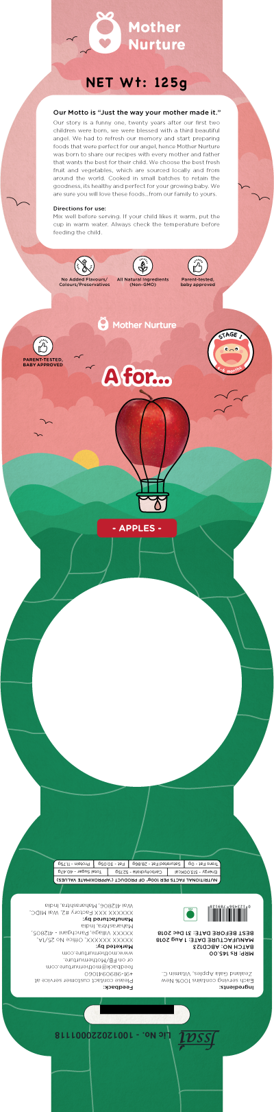
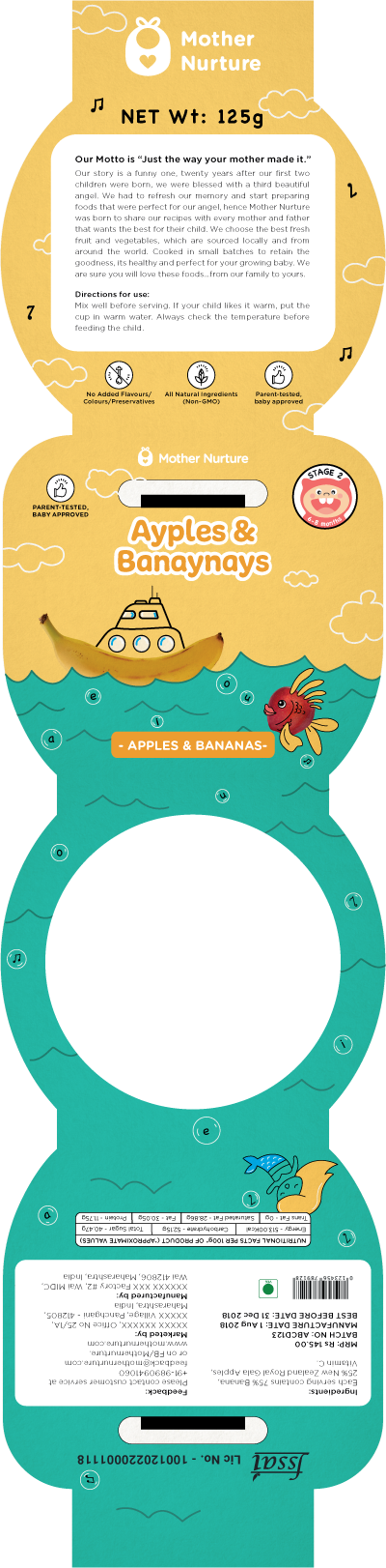
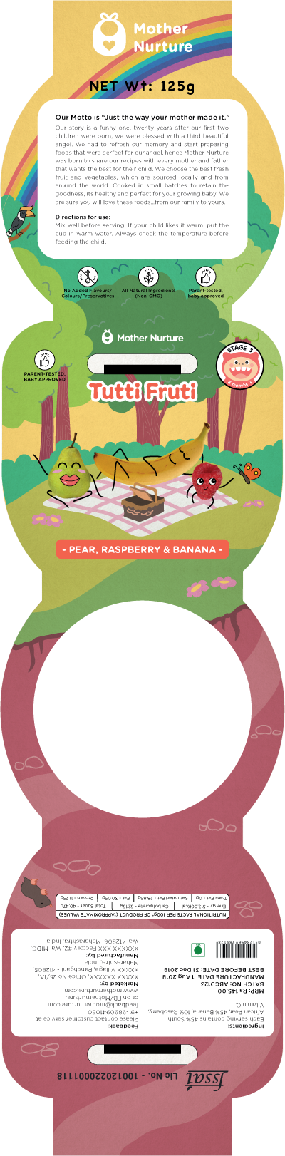
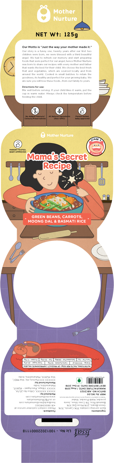
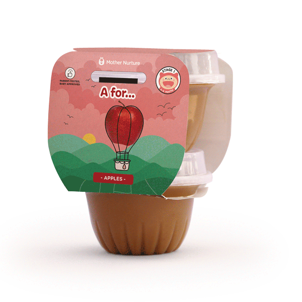
The project brief given was to redesign the packaging for 6 baby food products, making it more playful and fun for both the children and parents.
Concept
Reimagining the ingredients of each variant into different imaginative visuals using a
combination of photography and line illustrations to create interesting visuals. This approach is playful
and fun and generates interest and the focus is on the ingredients. Since the product is meant for babies,
the primary target is parents and so the design is visually attractive for adults though it displays a child-like imagination.
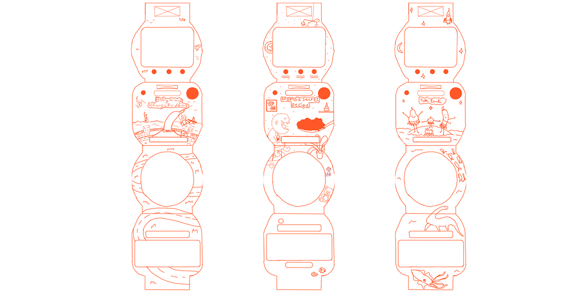
Initial Sketches
These sketches were based on the existing Key Line Diagrams to which we made minor edits to fix issues that would come up during the printing stage.
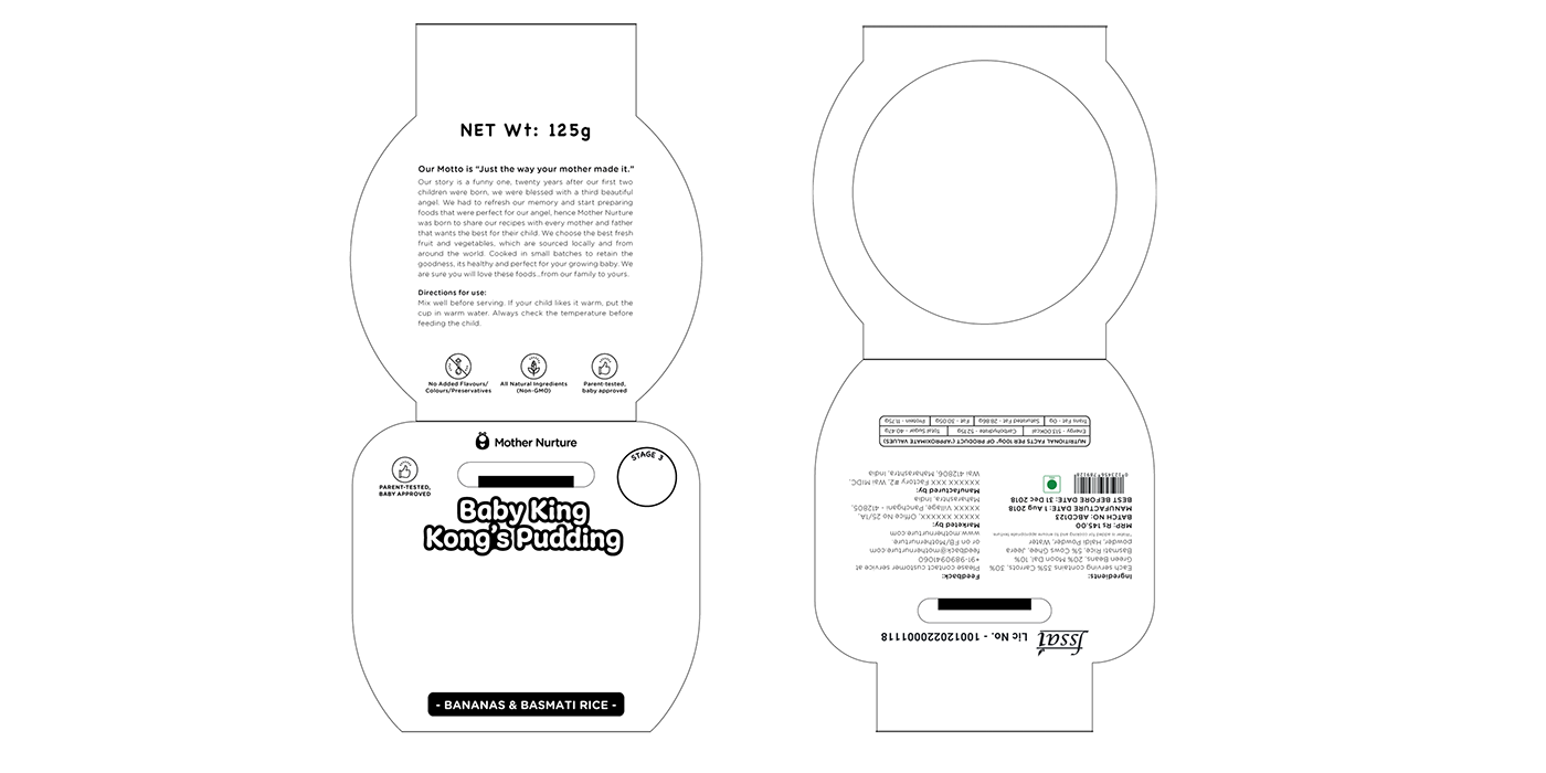
Key Line Diagram
The main KLD was provided by the client as a prerequisite but minor changes were done to minimize errors that previously occurred during the printing stage.
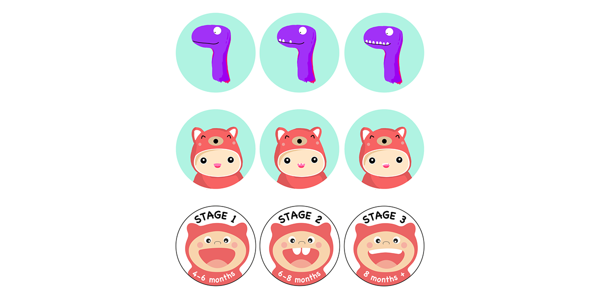
Stages Icons - Explorations
The 6 products were grouped into 'Stages' according to the age of the child. This was to be a prominent icon printed in the front of the label to let potential customers easily figure out the appropriate product to choose for their child.
Label Designs
The illustrations for the labels were treated as one spread with a 'horizon line' to distinguish between the bottom and top half of the label. Due to the way the label would fit around the product, the illustration at the bottom was flipped to be in the same orientation as the text in that section.