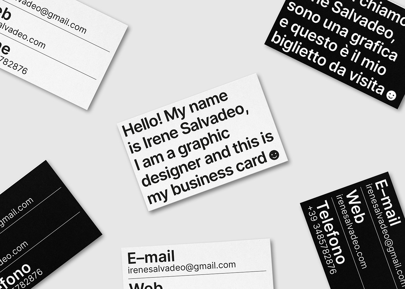
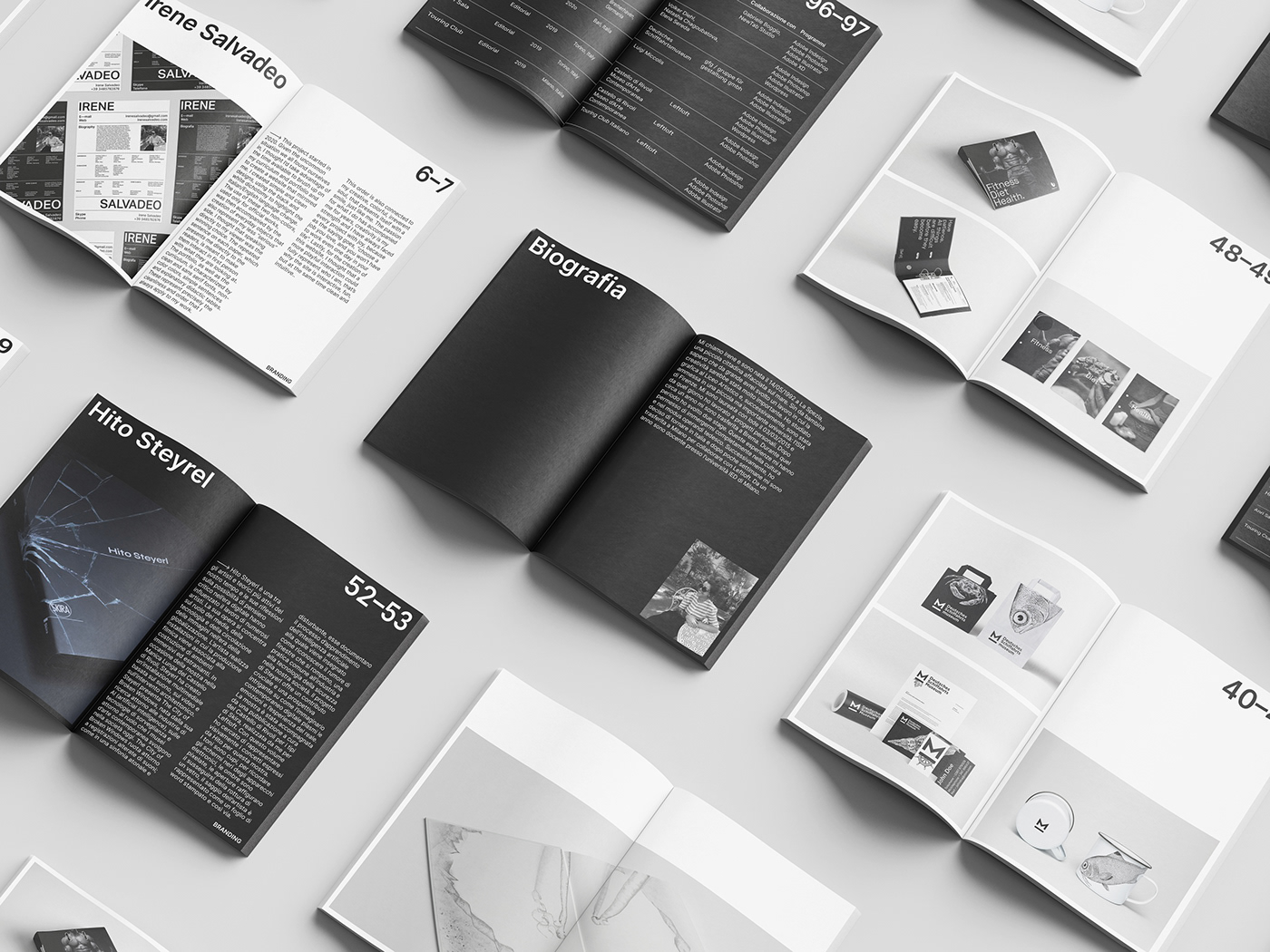
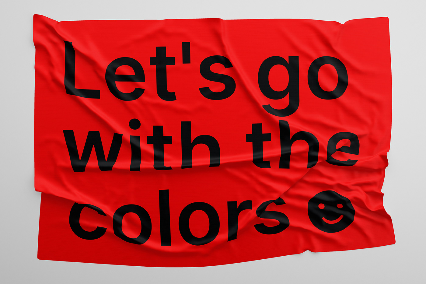
🡒 This project started in 2020. Given the uncommon situation we all found ourselves in, I thought I’d take advantage of the time available to brush up on my curriculum and portfolio and to create a website that mirrored me. I created simple and clean designs, using the black and white dichotomy to highlight the Italian/English language change. The use of these two non-colors, used only for official works, was then accompanied by the creation of everyday objects that also represent my less “serious” side. I thought that speaking directly to my viewer was the winning choice. The repeated sentence on each paper, which presents me directly to the readers, is meant to make them interact in first person with what they are looking at. The portfolio, as well as the curriculum, is characterized by clean and sans serif fonts, non-color colors, simple sentences and explanatory didactic tables. These represent precisely the cleanliness and order that I always apply to my work. This order is also connected to my creative, colorful, irreverent soul, that presents itself with a smile, just like me. The passion for what I do has accompanied me for years, creativity is my strength and I have always faced every project with joy, because as the saying goes, "choose a job you love, and you won't have to work even one day in your life". Lastly, for the creation of this website, I thought that a more playful interaction could fully represent who I am, that’s why the site is interactive, fun, but at the same time clean and intuitive.