

Project:
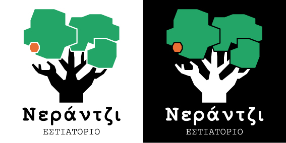
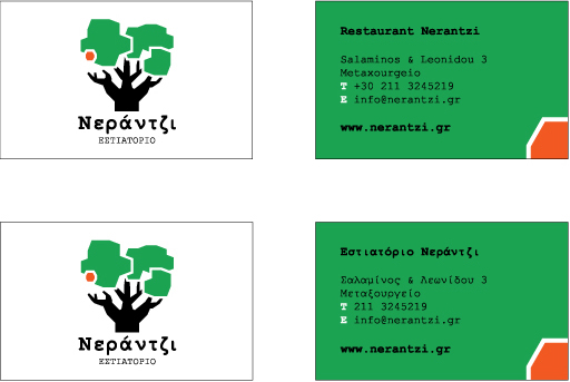
The logo consists of a bitter orange tree, a bitter orange fruit and the name "Nerantzi", which means Bitter Orange." A part of the restaurant's philosophy is: "... we want to combine raw materials from Greece and with our culinary expertise to offer new flavors that remind of tradition...". The design of the logo wasn’t based only on this concept, but also on the fact that the bitter orange fruit is typically used in the kitchen of the restaurant. The choice of this specific citrus attaches intensely the Greek element, since its cultivation as an ornamental plant and its usage as a traditional sweet (spoon sweet) is well known in many regions of Greece.
The logo consists of a bitter orange tree, a bitter orange fruit and the name "Nerantzi", which means Bitter Orange." A part of the restaurant's philosophy is: "... we want to combine raw materials from Greece and with our culinary expertise to offer new flavors that remind of tradition...". The design of the logo wasn’t based only on this concept, but also on the fact that the bitter orange fruit is typically used in the kitchen of the restaurant. The choice of this specific citrus attaches intensely the Greek element, since its cultivation as an ornamental plant and its usage as a traditional sweet (spoon sweet) is well known in many regions of Greece.
Project:
Το λογότυπο αποτελείται από το δέντρο μιας νεραντζιάς, τον καρπό της και το όνομα "Νεράντζι". Ένα μέρος της φιλοσοφίας του εστιατορίου είναι το εξής: "…θέλουμε να παντρέψουμε πρώτες ύλες από την Ελλάδα και με τις γαστρονομικές μας γνώσεις να προσφέρουμε καινούργιες γεύσεις που να θυμίζουν παράδοση…". Ο σχεδιασμός του λογοτύπου δεν στηρίχτηκε μόνο σε αυτή τη φιλοσοφία, αλλά και στο γεγονός ότι το νεράντζι χρησιμοποιείται χαρακτηριστικά στη κουζίνα του εστιατορίου. Η επιλογή του συγκεκριμένου εσπεριδοειδούς αποδίδει έντονα το ελληνικό στοιχείο, αφού η καλλιέργειά του ως καλλωπιστικό φυτό και η χρήση του καρπού του ως παραδοσιακό γλυκό (γλυκό του κουταλιού) είναι γνωστή σε πολλές περιοχές της Ελλάδας.
Το λογότυπο αποτελείται από το δέντρο μιας νεραντζιάς, τον καρπό της και το όνομα "Νεράντζι". Ένα μέρος της φιλοσοφίας του εστιατορίου είναι το εξής: "…θέλουμε να παντρέψουμε πρώτες ύλες από την Ελλάδα και με τις γαστρονομικές μας γνώσεις να προσφέρουμε καινούργιες γεύσεις που να θυμίζουν παράδοση…". Ο σχεδιασμός του λογοτύπου δεν στηρίχτηκε μόνο σε αυτή τη φιλοσοφία, αλλά και στο γεγονός ότι το νεράντζι χρησιμοποιείται χαρακτηριστικά στη κουζίνα του εστιατορίου. Η επιλογή του συγκεκριμένου εσπεριδοειδούς αποδίδει έντονα το ελληνικό στοιχείο, αφού η καλλιέργειά του ως καλλωπιστικό φυτό και η χρήση του καρπού του ως παραδοσιακό γλυκό (γλυκό του κουταλιού) είναι γνωστή σε πολλές περιοχές της Ελλάδας.
LOGOTYPE

INSPIRATION

BLACK & WHITE

COLOR GUIDE

TYPEFACE
PATTERN 1

PATTERN 2
PATTERN 3
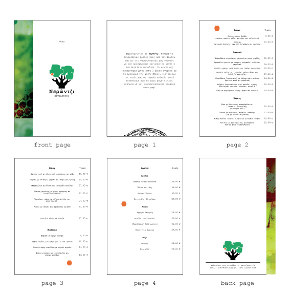
MENU
BUSINESS CARDS

SOUSPLAT 1

SOUSPLAT 2

WHITE T-SHIRT

BLACK T-SHIRT
SPECIAL THANKS:
Thomas Koumarianos
Thomas Koumarianos


