FF Tisa
Designed by Mitja Miklavčič, initially created in 2006 to fulfill the requirements for the MA in Typeface Design, University of Reading, Department of Typography and Graphic Communication. Versions released in June ’08 for FSI FontShop International: Regular, Italic, Medium, Medium Italic, Bold, Bold Italic [Thin, Thin Italic, Light, Light Italic released 2009]. Selected by the TDC judges to receive the Certificate of Excellence in Type Design for the year 2007.
Designed by Mitja Miklavčič, initially created in 2006 to fulfill the requirements for the MA in Typeface Design, University of Reading, Department of Typography and Graphic Communication. Versions released in June ’08 for FSI FontShop International: Regular, Italic, Medium, Medium Italic, Bold, Bold Italic [Thin, Thin Italic, Light, Light Italic released 2009]. Selected by the TDC judges to receive the Certificate of Excellence in Type Design for the year 2007.
FF Tisa in Fontlab
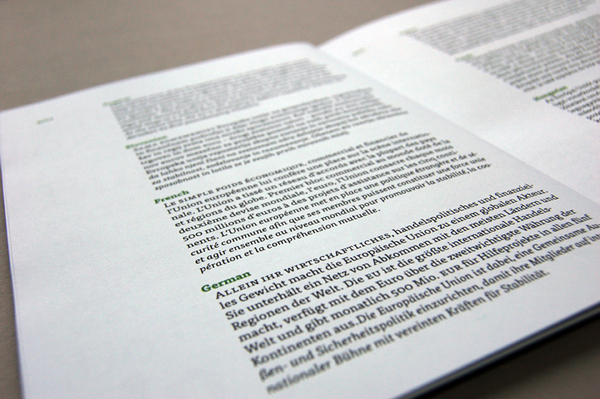
A typeface for magazines
FF Tisa is a typeface created while studing in the MA Typeface Designcourse at the University of Reading. The typeface was primarily createdfor use in various magazines that are either printed by web-fed offsetor gravure printing techniques. Nevertheless, the typeface can also besuccessfully used in other printed media, such as newspapers, annualreports etc.
It is rather hard to define the characteristics of a ‘conventionalmagazine typeface’ and how a magazine typeface differs from othergroups of typefaces, particularly from newspaper typefaces. In manyways the closest relative to a magazine typeface is a newspapertypeface. The text length should be fairly close, although in magazinesarticles tend to be shorter and more frequently interrupted by other elements onthe page, such as illustrations or photographs. On the other handnewspapers tend to look more and more like magazines.
However a magazine typeface doesn’t necessarily need the roughcharacter of a newspaper typeface. The reason may lie in printingtechnology differences. Magazines are often printed on different kindof web-fed offset presses using paper of better quality and differenttypes of printing ink. On the other hand, quite a significant number ofmagazines are printed with gravure printing. Gravure printing isprincipally used for very long print. A detailed description of thisold and interesting printing technique would go beyond the subject ofthis showing. But one has to be familiar with the key peculiarity ofgravure printing: everything, including letterforms, is ‘rasterized’.
In order to meet the technological and aesthetic requirements ofmagazine use a typeface with a relatively low contrast and fairlypronounced serifs was designed. From this point of view a group oftypefaces usually labelled as Slab serifs or Egyptians (or sometimesEgyptiennes) was chosen as a model. Slab serifs normally have a rathersolid style and somewhat simplified character. They were traditionallyused in newspaper printing and were a good choice for a suitabletypeface in early typewriters. Many typefaces from this group also havea relatively large x-height, which is advantageous for newspapers andmagazines. The main goal of this project was to design a softer and amore dynamic version of a slab serif typeface. The idea was to create atypeface that would have good legibility in text sizes while showinginteresting characteristics when used in larger sizes.
FF Tisa in use
FF Tisa in use
FF Tisa in use
FF Tisa in use
Basic characteristics
FF Tisa is a low contrast slab serif typeface. It is an attempt tocreate a contemporary version of the nineteenth century woodtype slabserif typefaces. Some ‘humanist’ characteristics, such as asymmetricserifs and slightly oblique stress, might make it easier to read inlonger texts. Due to its low stroke contrast FF Tisa is alsosurprisingly legible in small sizes and works fine in demandingprinting techniques, such as gravure printing or low resolution laserprinting. FF Tisa has a relatively large x-height which makes itsuitable for use in publications such as magazines or newspapers. Smallcaps are visibly taller compared to lowercase letters, and can be usedeffectively in emphasizing parts of text.
FF Tisa is a low contrast slab serif typeface. It is an attempt tocreate a contemporary version of the nineteenth century woodtype slabserif typefaces. Some ‘humanist’ characteristics, such as asymmetricserifs and slightly oblique stress, might make it easier to read inlonger texts. Due to its low stroke contrast FF Tisa is alsosurprisingly legible in small sizes and works fine in demandingprinting techniques, such as gravure printing or low resolution laserprinting. FF Tisa has a relatively large x-height which makes itsuitable for use in publications such as magazines or newspapers. Smallcaps are visibly taller compared to lowercase letters, and can be usedeffectively in emphasizing parts of text.
FF Tisa: Basic Features
Italics
The italic version was not primarily created to have the role ofemphasising - it is more a secondary typeface to the regular version.From this reason a fairly upright ‘hybrid’ italic was designed which isslightly lighter comparing to the regular version. However, the angleof slant is mathematically not the same in all glyphs and variesroughly from 7 to 5 degrees. In order to achieve an optically uniform angle of slant,taller and wider letters were slanted less. Small caps are comparing tolowercase less and comparing to uppercase more slanted. Anotherpeculiarity of the italic version is that the main strokes are slightlywider on the baseline (this adjustment was more applied on lowercaseletters). This characteristic gives the italic typeface some stability.
The italic version was not primarily created to have the role ofemphasising - it is more a secondary typeface to the regular version.From this reason a fairly upright ‘hybrid’ italic was designed which isslightly lighter comparing to the regular version. However, the angleof slant is mathematically not the same in all glyphs and variesroughly from 7 to 5 degrees. In order to achieve an optically uniform angle of slant,taller and wider letters were slanted less. Small caps are comparing tolowercase less and comparing to uppercase more slanted. Anotherpeculiarity of the italic version is that the main strokes are slightlywider on the baseline (this adjustment was more applied on lowercaseletters). This characteristic gives the italic typeface some stability.
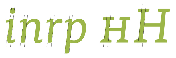
FF Tisa: Italics
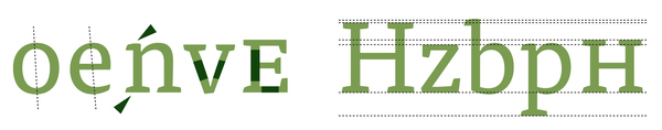
Ink traps and diagonals
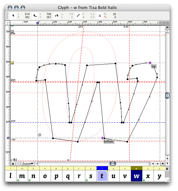
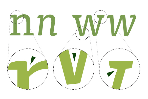
In letters where a round stroke meets a straight one, such as thelowercase ‘n’ or ‘p’, or in letters where two diagonals meet, forexample lowercase ‘v’ and ‘w’, a dark area results. To reduce thisunwanted effect some inspirations from phototypesetting were used. Dueto small openings in some parts of the letters less light penetrated inthese areas when exposed to light and the inside angles had to bestrongly opened. Although the process of reproduction in digital workflow is very different a similar optical adjustment wasmade in a more subtle way. A similar, though much less obviousadjustment is made when a serif and a diagonal stroke meet (e.g. letter‘w’). The diagonal stroke was thinned in a similar and even more subtleway.
In letters where a round stroke meets a straight one, such as thelowercase ‘n’ or ‘p’, or in letters where two diagonals meet, forexample lowercase ‘v’ and ‘w’, a dark area results. To reduce thisunwanted effect some inspirations from phototypesetting were used. Dueto small openings in some parts of the letters less light penetrated inthese areas when exposed to light and the inside angles had to bestrongly opened. Although the process of reproduction in digital workflow is very different a similar optical adjustment wasmade in a more subtle way. A similar, though much less obviousadjustment is made when a serif and a diagonal stroke meet (e.g. letter‘w’). The diagonal stroke was thinned in a similar and even more subtleway.
FF Tisa: Ink Traps
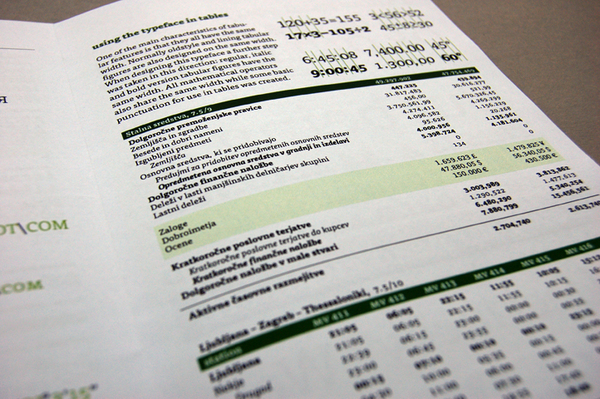
Typeface in tables
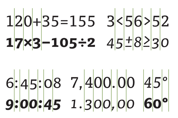
One of the main characteristics of tabular features is that they allhave the same width. Normally oldstyle and lining tabular figures arealso designed on the same width. When designing this typeface a furtherstep was taken in this direction: figures in all versions have the samewidth. All mathematical operators also share the same width while somebasic punctuation for use in tables was created.
One of the main characteristics of tabular features is that they allhave the same width. Normally oldstyle and lining tabular figures arealso designed on the same width. When designing this typeface a furtherstep was taken in this direction: figures in all versions have the samewidth. All mathematical operators also share the same width while somebasic punctuation for use in tables was created.
FF Tisa: Tabular Figures

FF Tisa: Case Sensitive Forms

Have a closer look at FF Tisa, a perfect typeface for magazines, reading the entire Specimen, trying it out at the FontShop or on the FontFont Library’s Website.

