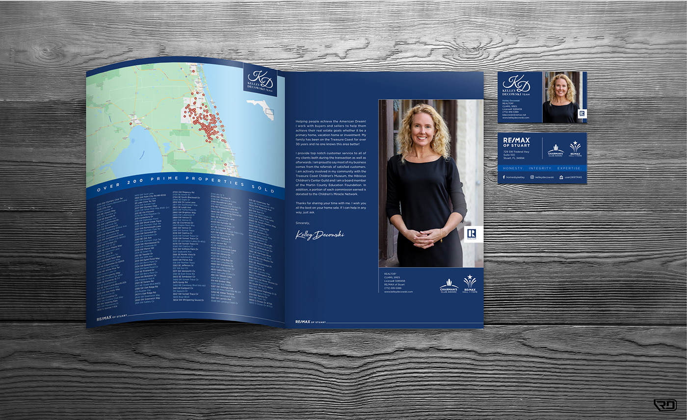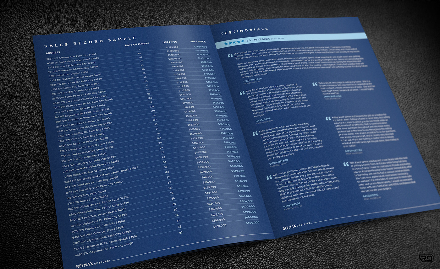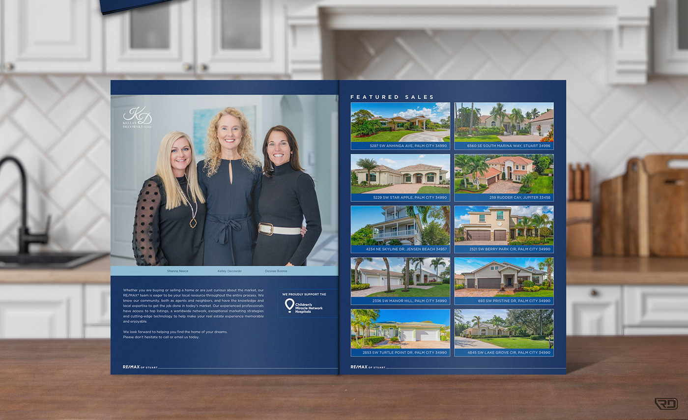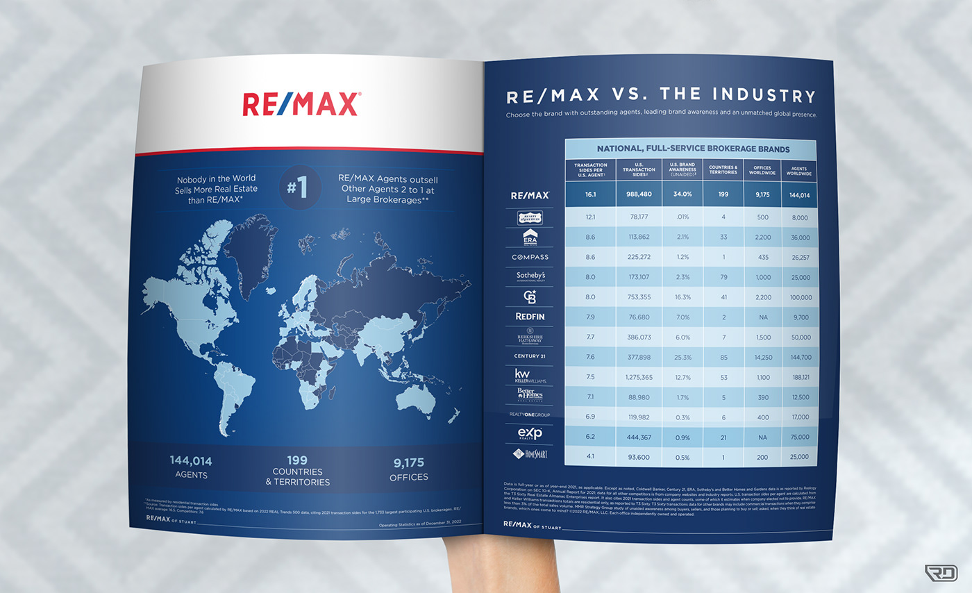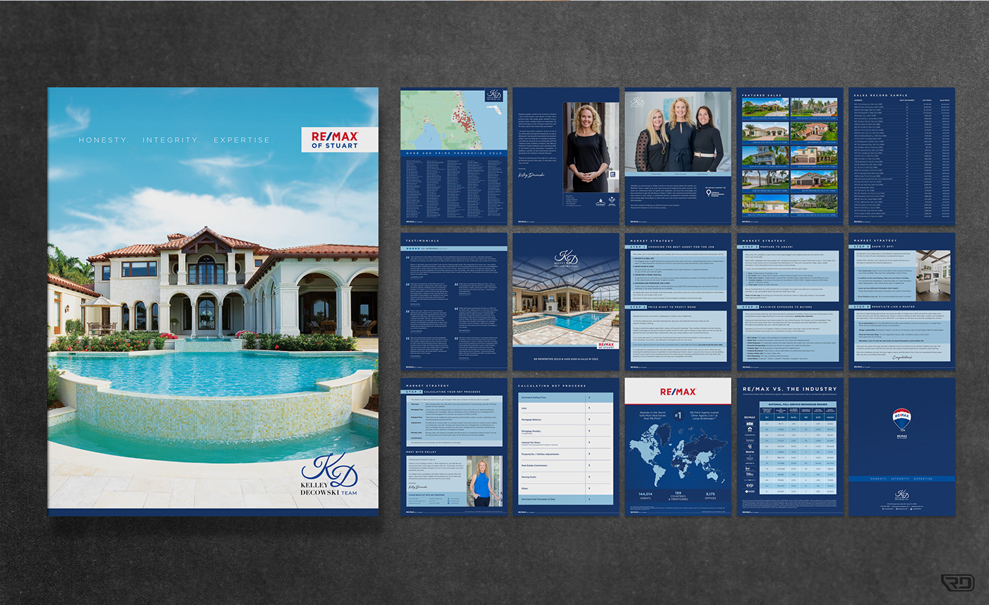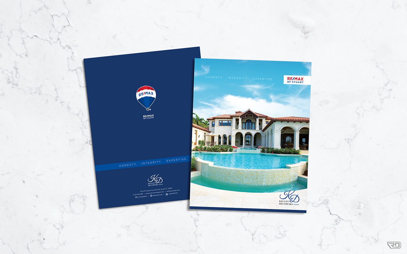
The Problem:
Elevate the perception potential customers have of a RE/MAX® sales team to help them break into a higher end market of clients as they have started to sell more expensive houses.
The Solution:
Use existing RE/MAX branding, but leveraging the elements and design principles that speak to the luxury market vs. the standard visuals used by the brand. The focus was narrowed down to the darker and more monochromatic colors with clean, simple design elements and finer details throughout.