8 And A Half Miles
STUDENT PROJECT 2014
STUDENT PROJECT 2014
This project looks at Germantown Avenue, an 8 and a half mile street in Philadelphia, America and how it starts with well to do people and rapidly changes the further down the street you travel. This is compared to an 8 and a half mile distance in the North East of England from Wynyard to Hartlepool through interesting typographic detail and structure.


MORE ABOUT THE PROJECT...
RESEARCH
RESEARCH
I researched many urban areas and particularly found interesting a book based on Germantown Avenue, an 8 and a half mile street in Philadelphia America called ‘Code of the street’ by 'Elijah Anderson' due to the amount of dialogue straight from the people living in the area. It was particularly interesting that in such a short distance, a place could change so rapidly. I looked at places I could compare this too and decided to look at an 8 and a half mile distance in the North East of England from Wynyard to Hartlepool due to the vast difference of the two areas, again in such a short distance. This also enabled me to get some primary research, observing the area myself, day and night.
I found that people often change the way they act according to the area that they are in so they fit in with the people around them.
-
In the wealthier area in England, it seams to be more spacious with larger spaces between buildings, giving them more exclusivity and becoming more separated from the poor. The poor areas seem to be cramped, as if builders have tried to cram as many buildings into one street as possible. Cars are bumper to bumper along the pathway. In America, this is the opposite. Poor areas seam to be surrounded by a lot of space, but for different reasons, the buildings have been torn down, collapsed or burned and now leave heaps of rubble and trash strewn lots that children play in.
TYPOGRAPHY
Four separate typefaces were chosen to reflect the two areas. Two for England and two for America (A serif for the welathy side and a sans serif for the poor). Baskerville and Gill Sans were chosen to reflect England as they are seen as typical British typefaces and designed by British type designers. Minion Pro, and Myriad Pro were chosen as the American typefaces, also very American type styles and type designers.
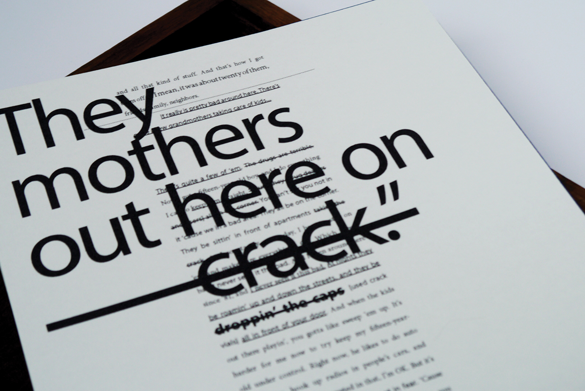
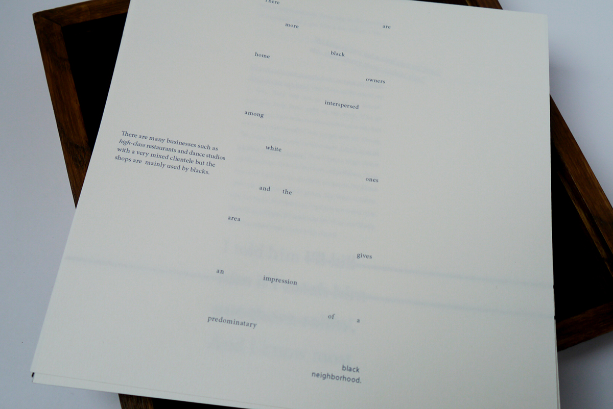
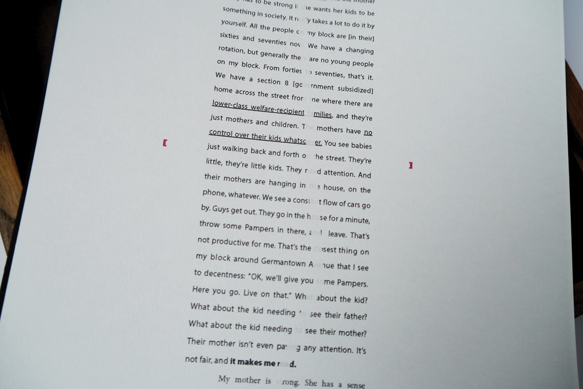
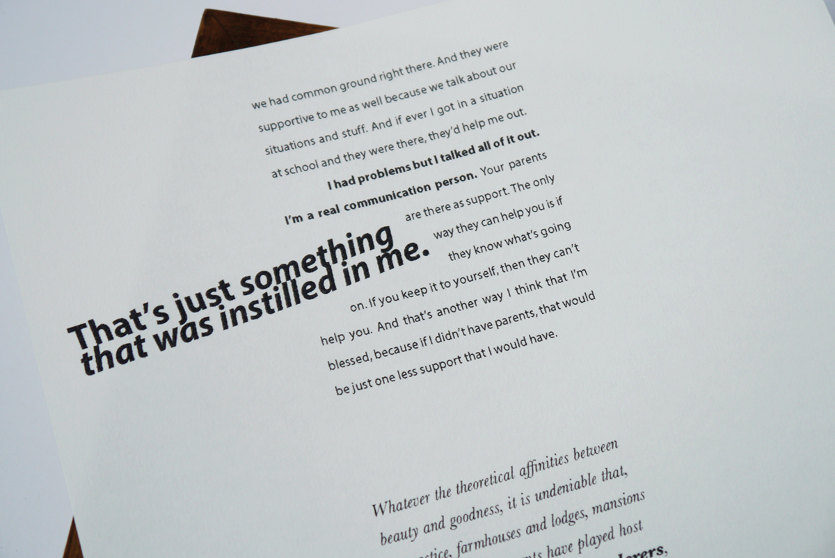
The leading throughout the publication represents the spacing of the houses, and the overlapping and turned text suggests code switching and house positions. Transparent paper also reflects this code switching and helps two pages merge together
DESIGN
Colours are used as a coding system. Blue is used for any text belonging to America and red for England, these colours also reflect the colours of the flags.
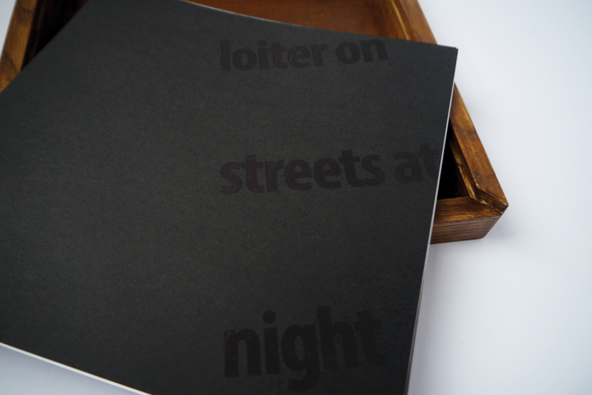
The box itself reflects the length of the street. 8 and a half inches instead of 8 and a half miles. Dialogue runs through the middle to allow a structure of more descriptive text to run along side of the dialogue, left for America and right for England, which is also often challenged towards the end
I found that Wynyard starts off a lot wealthier than in the wealthy side of Philadelphia and Philideplhia is also far more deprived than in England. This is reflected in the structure of the piece, with the American dialogue starting later and ending last.
All American dialogue and descriptive text is written in the American spelling, and English dialogue and descriptive text is written in the English spelling, this is just another subtle quality that adds depth to the project.

