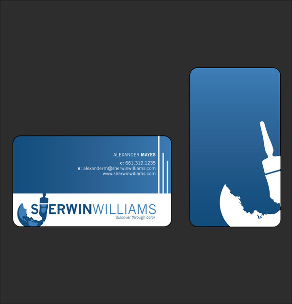
So after seeing and realized how horrible the Sherwin-Williams logo was (In my mind it looks like the are covering the world in blood . . .) I decided to take it on to rebrand their logo.
My original concept was to change the overall approach to it. Instead of a "Cover the Earth" I went with a more "Uncover the Earth" approach. As in uncover the earth with Sherwin-Williams paint.
I thought their color scheme was ok, so I kept and when you're rebranding a company that has had the same logo for a long time, I believe it's good to include some of the elements of the previous logo. But I thought the red didn't fit so I threw it out.

Orginal Sherwin Williams Logo

Sherwin Williams - Logo

Sherwin-Williams - Business Cards

Sherwin-Williams - Letterhead

Sherwin-Williams - Identity Package


