

Visual Finance
A financial visualization tool for the iPad
A financial visualization tool for the iPad
While working at Four Clouds, Andromeda Training, a client who is known worldwide for their business finance training programs asked us to make an iPad app. Income/Outcome is their flagship program, simulating the financial statements of businesses using real financial data in a group session board game. They have an internal tool that recreates that experience online but wanted an iPad app to further their brand and increase their exposure to potential clients.
Since the iPad would present a completely new paradigm for their existing system, I started at first principles to redesign the simulation system’s user experience. The resulting app brings the relationships between a company’s income statement and balance sheet closer to the forefront, with a unique aesthetic that combines classic pinball machine graphics with board game design.
If you’d like to try the app out for yourself, the basic version, featuring the financial data of over a dozen companies, including Apple, Inc., is free on the app store:
Visual Finance on the App Store
If you’d like to try the app out for yourself, the basic version, featuring the financial data of over a dozen companies, including Apple, Inc., is free on the app store:
Visual Finance on the App Store
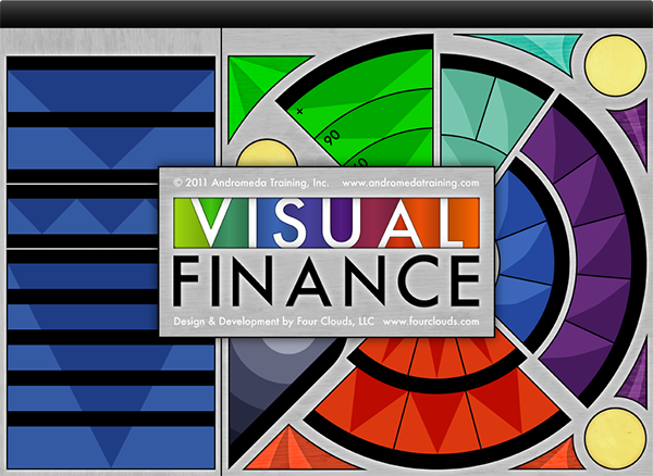
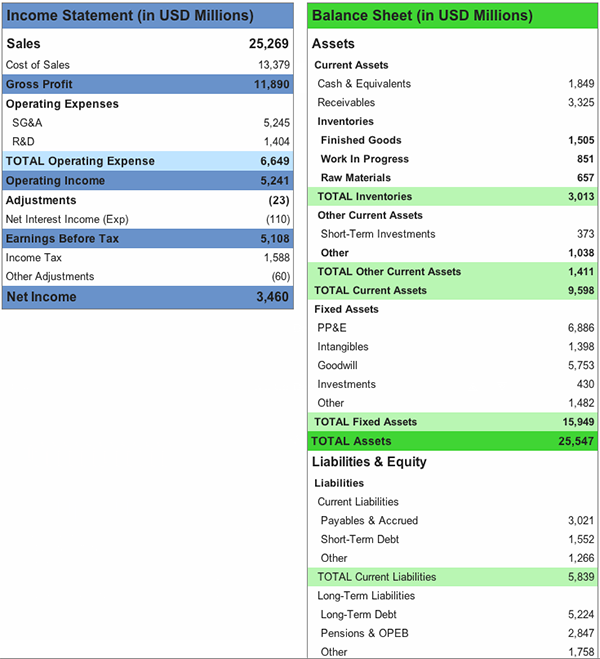
The following is ©2012 Andromeda Training and is used with permission.
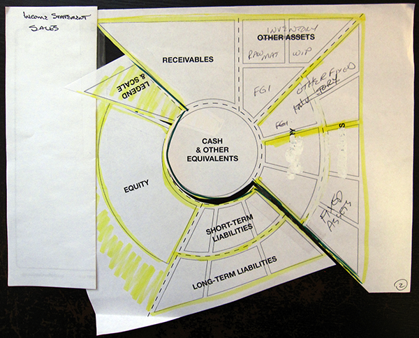
UI Sketches
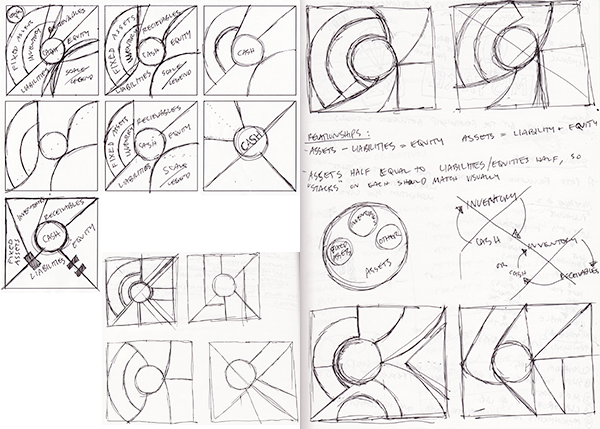
Sketches for the Balance Sheet portion of the app’s main screen. We knew the Income Statement portion would be designed as a vertical list, so this part of the UI was the main design problem.
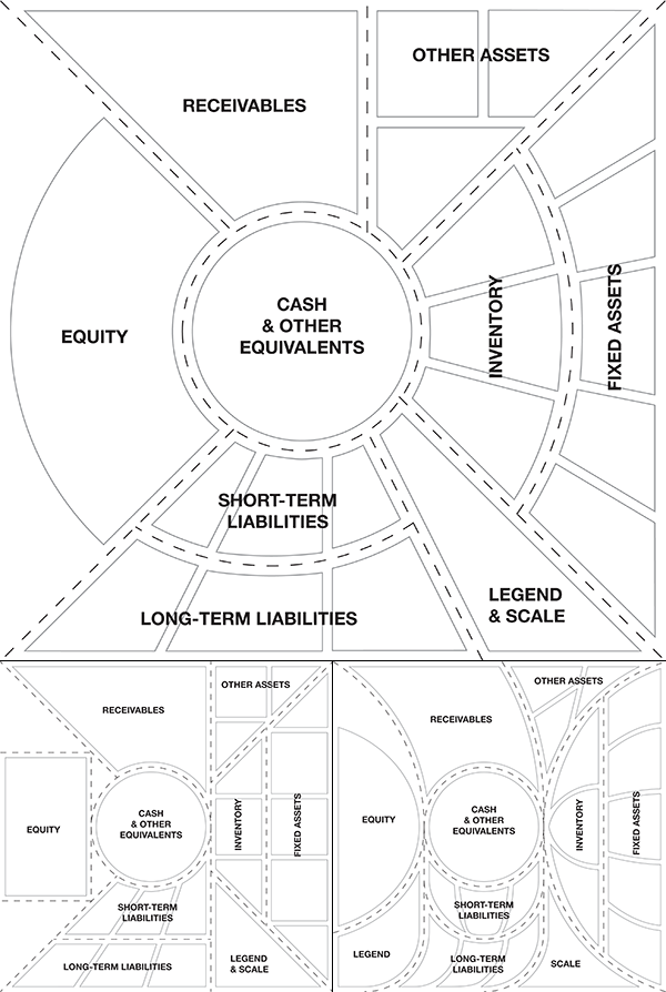
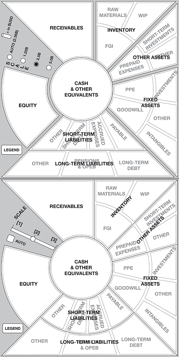
Wireframes

Phase 1
Phase 2
Phase 2 - Client Manipulated; as an aside I want to make sure to mention how much I love collaborating with clients that aren’t afraid to get their hands dirty. The feedback from this session was invaluable.
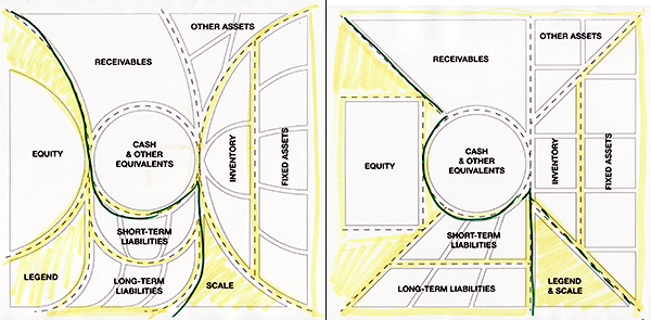
Phase 3

Phase 4

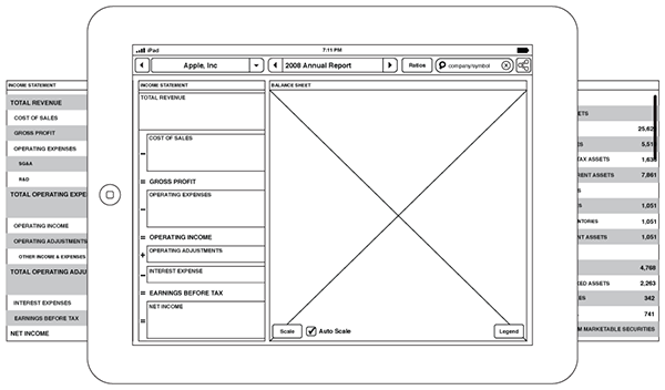
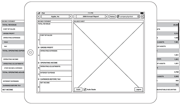
Phase 5 Wireframes
Phase 6
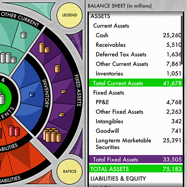
Final Wireframes - the last one in this set shows the financial ratios overlay
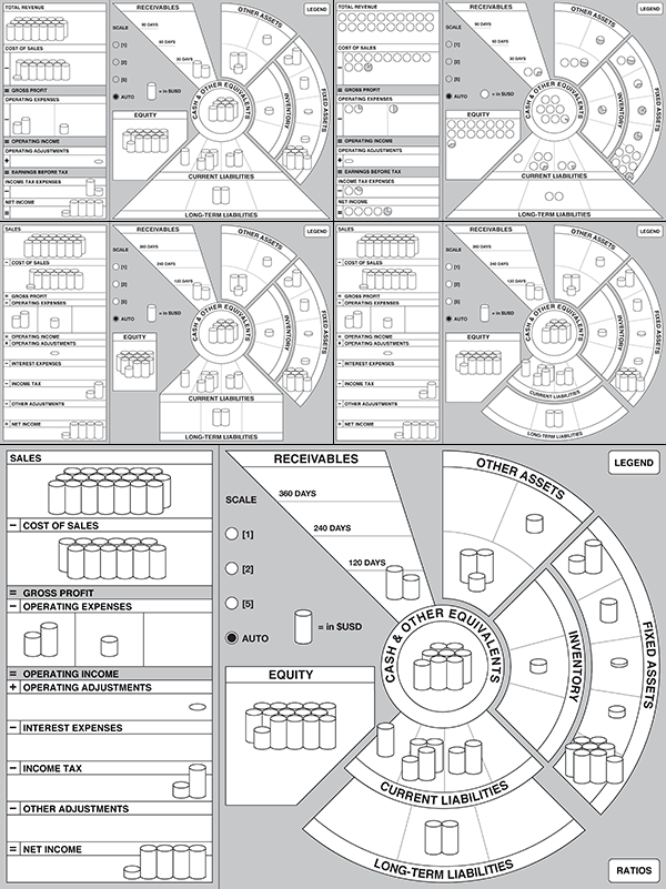
Prototypes
In total the project took just over six months. Since we didn’t want to spend most of that time making design decisions throughout the project, all of the major decisions about layout and interaction were completed during the wireframing and prototyping phase. As a design check and to get more in depth client feedback, I created prototypes based on the wireframes. Once the client signed off on this phase, it made it that much faster to start on the actual visual design.
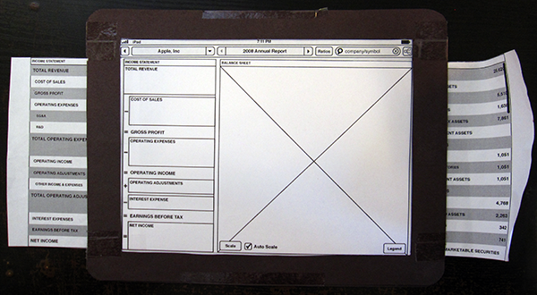
Before the start of the wireframing process, since neither our office or the clients had an iPad on site, the first set of prototypes were paper-based and printed from the general layout of the app. The iPad frame was made to 1:1 size out of black construction paper. I love making paper prototypes!
Phase 1 Screens

Phase 2 Screens
Pattern Sketching
After the wireframes and paper prototypes were created in Illustrator, they were recreated in Keynote for each further prototype phase so they could be output as interactive PDFs and uploaded to an iPad.
It was incredibly useful at this early stage to have a working prototype on the intended device that a client could manipulate directly. Even though the interactions and animations were primitive, compared to the finished app, it was great to be able to try out interaction ideas so quickly.
At this point, with all of the major design decisions made, it was finally time to start on the visual look and feel of the app.
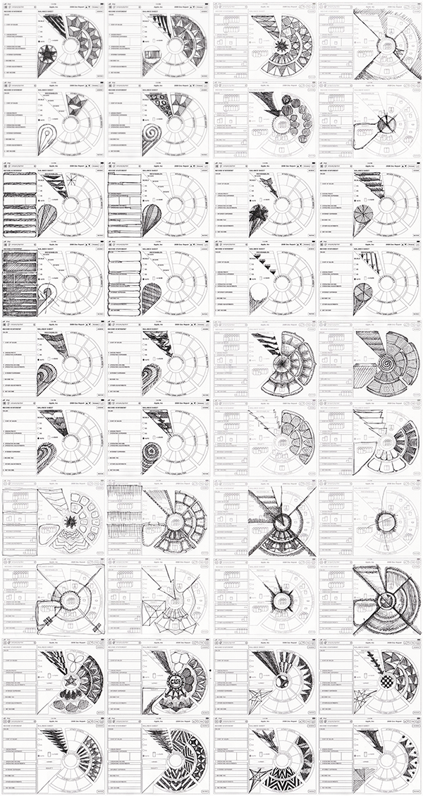
Pattern Sketches
Mockups
Pattern Mockups
Since the visual style of the app was to draw on the metaphors of vintage boardgames and vintage pinball machine graphic art, another round of sketching was completed to viscerally research patterns. Based on the final wireframe, the visual style needed to both be eye-catching and direct the user’s sightline through the app to emphasize the relationships that are at the core of the simulation mechanic. A round of mockups based on those sketches got the design closer to its ideal and then it was time to get started on the final look and feel of the app.

Phase 1 - Right away I wanted the app to have a tactile look, almost begging the user to touch it. The green background from the pattern research phase was one of the first elements to go, even though it was based on the physical game board. It made the app look too much like a gaming table, which was the wrong direction.


Phase 2 - This phase was largely concerned with getting the color scheme right.
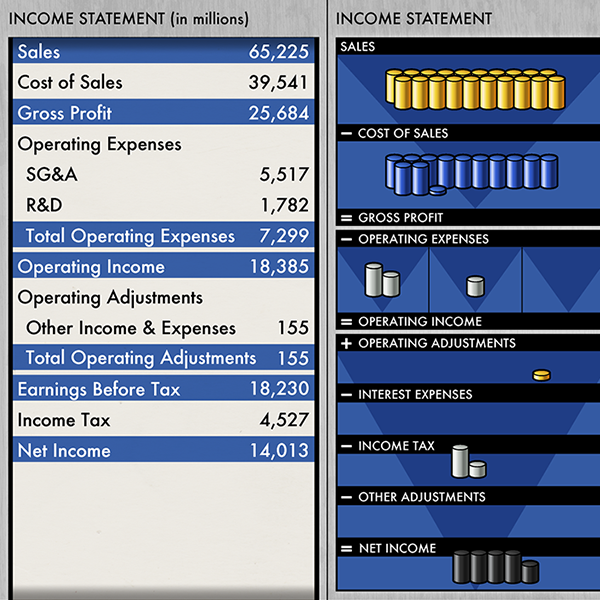
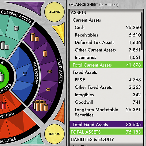
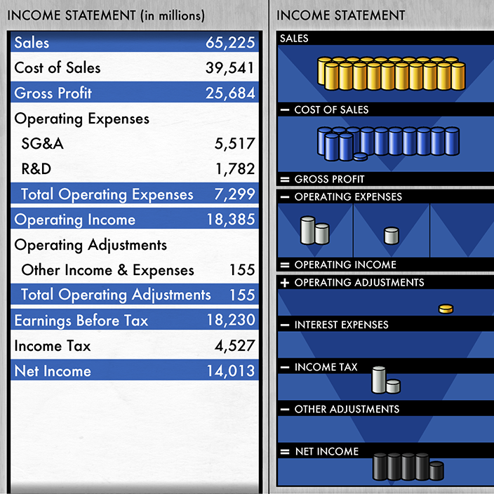
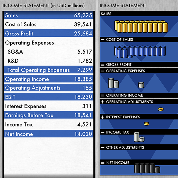
Details of Phase 2, including the table views of both the Income Statement (first) and Balance Sheet (second).
Phase 3 - Part 1
Details and Full Board of Phase 3 - Part 1

Phase 3 - Part 2
Details and Full Board of Phase 3 - Part 2
Phase 3 - Part 3


Details and Full Board of Phase 3 - Part 3

Alternatives for Phase 3 - Created based on client feedback that they were concerned about visibility of the stacks.
Phase 3 - Highlights; this mockup shows what the highlighted styles for each section would look like if pressed.
Phase 4
Design Prototype Screens
Section Highlight Prototype Screens
After the final phase of mockups was complete, one final prototype was created to bring it all together to test the design before it was implemented in software.
App Promotion

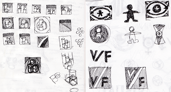
Logo/Icon Sketches

Logo/Icon Concepts
After the user interface design was complete, it was time to start creating the icon for the app. The client initially wanted the icon to function as part of a logo for the app as well as the icon used in software and on the app store. After going through all the concepts it was ultimately decided that the icon would serve as the primary brand for the app. The only vestige of the logo that remains is in the design of the name that shows up on the app's launch screen.
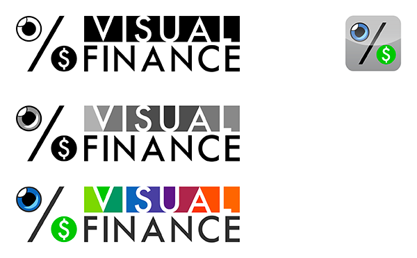
Phase 1 App Icon

Phase 2 App Icon With Options
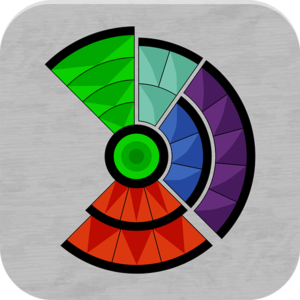
Final App Icon

App Logotype
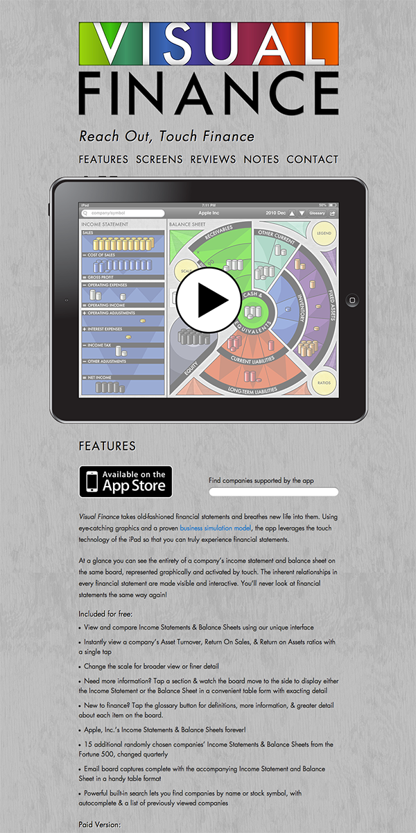
Partial View Of The Visual Finance Brochure Site
With the app icon and logo complete, and the projected release date approaching, I created a small brochure site to promote the app and to collect feedback from potential and future users. The brochure site was live in the form seen above for a short time before the client decided to bring that aspect of the project in house. The current site for the Visual Finance app bears no relation to the work I did for the brochure site.
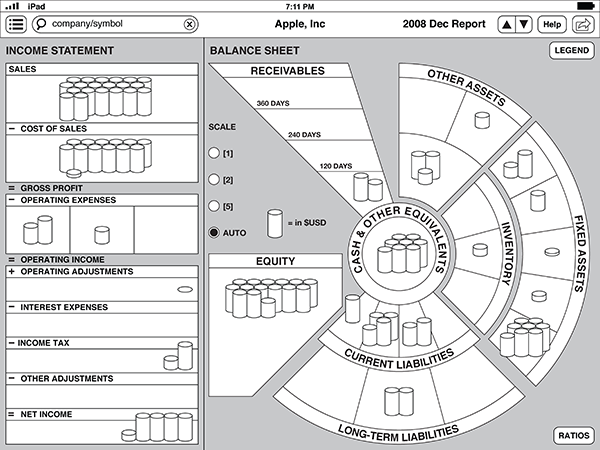
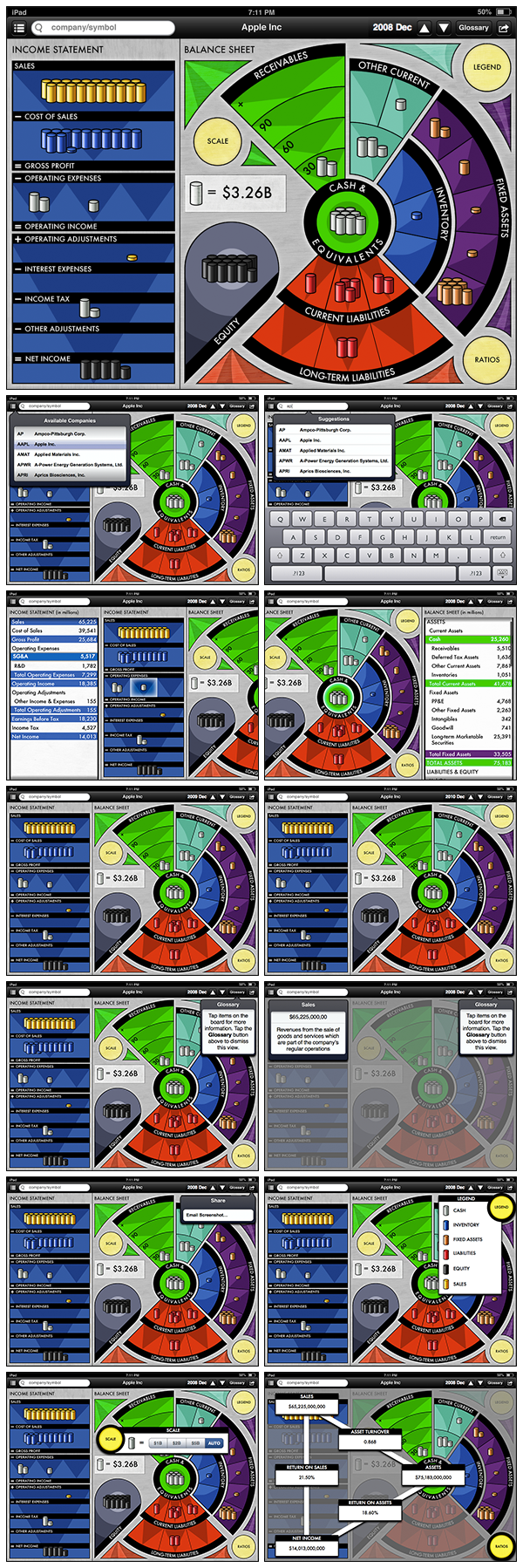
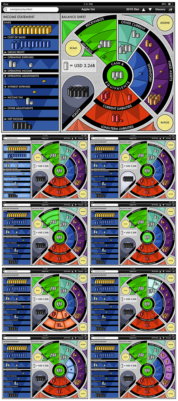
App Screens
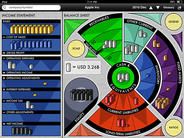
Launch Screen

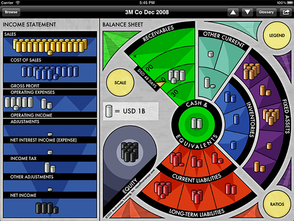
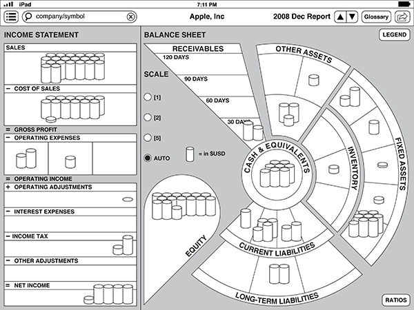
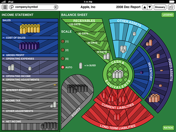
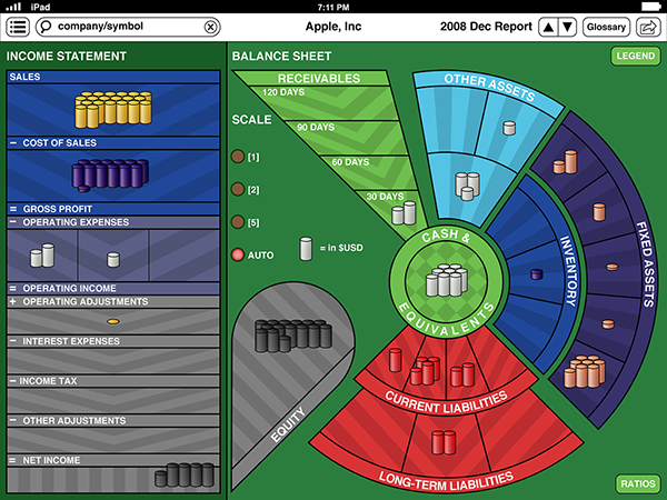
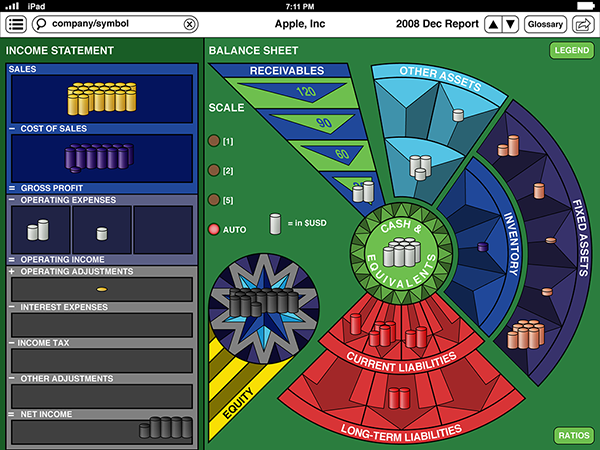
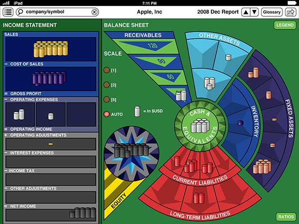
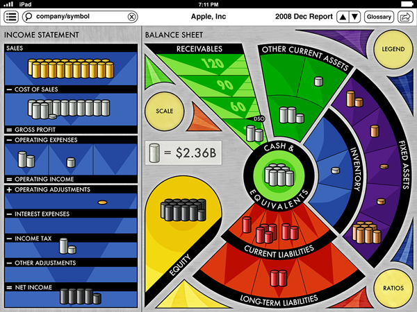
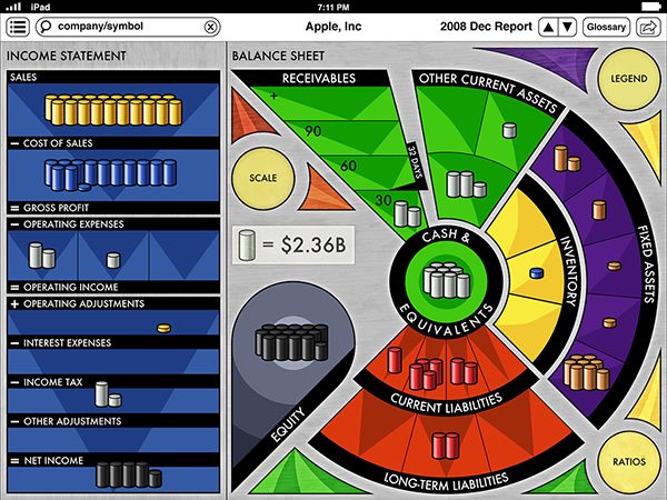
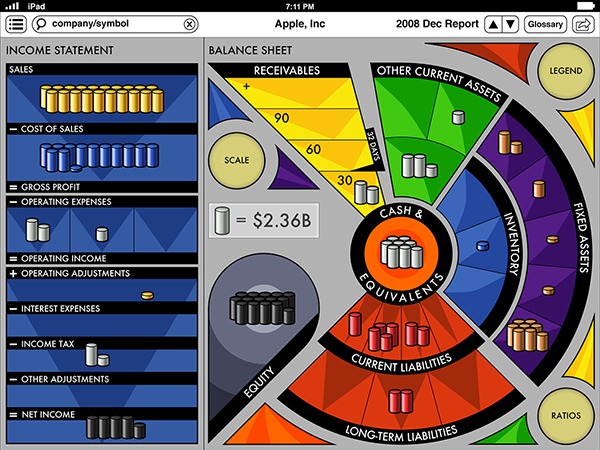
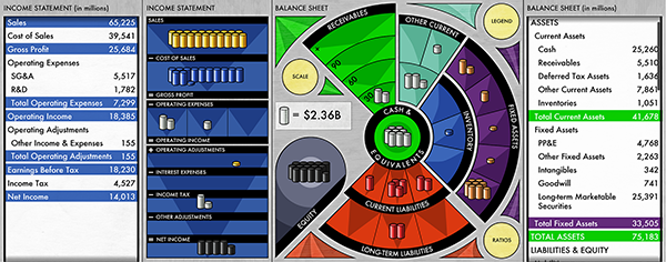
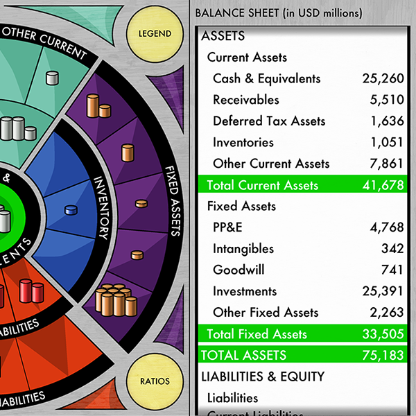
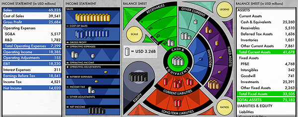
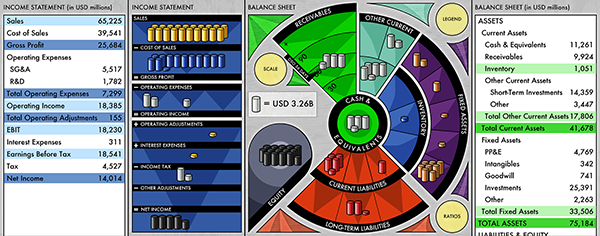
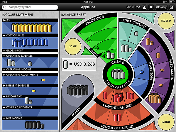
Main Board
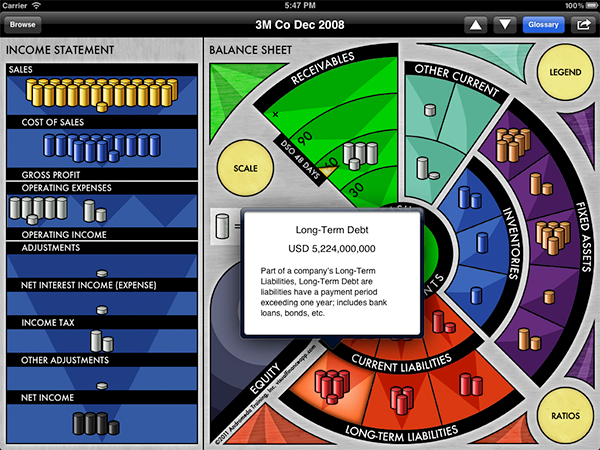
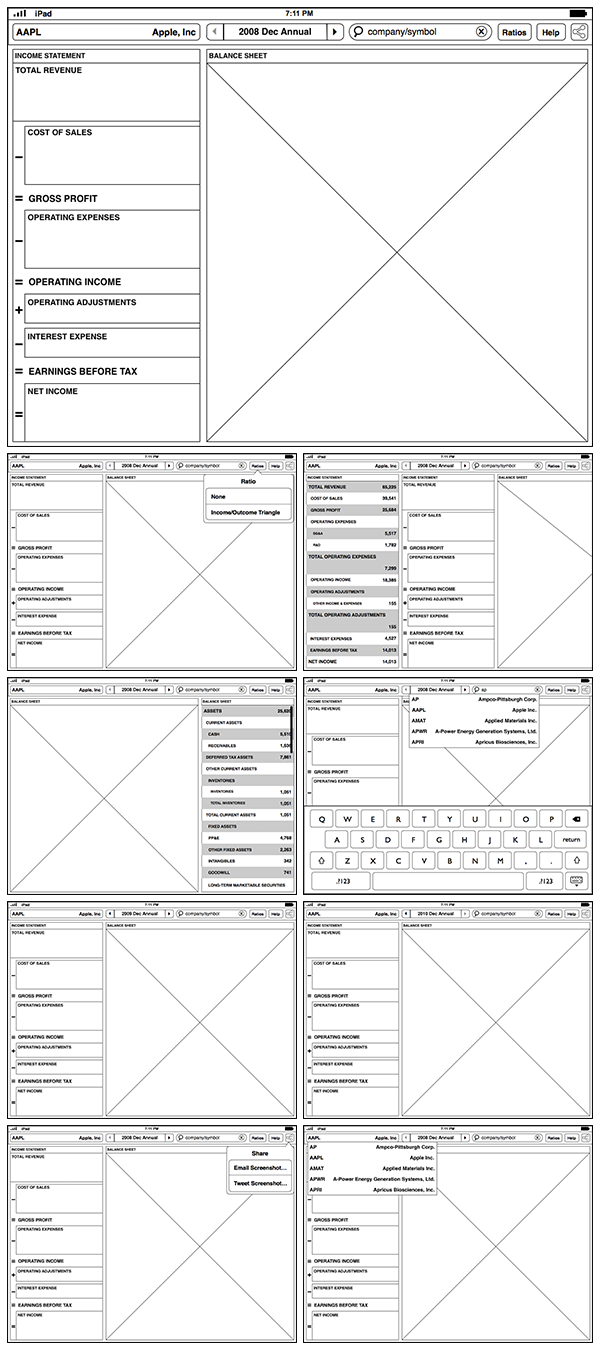
Glossary View - Tap on any section and a definition as well as that item’s current numerical amount are displayed.
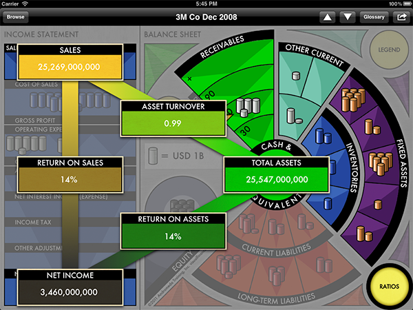
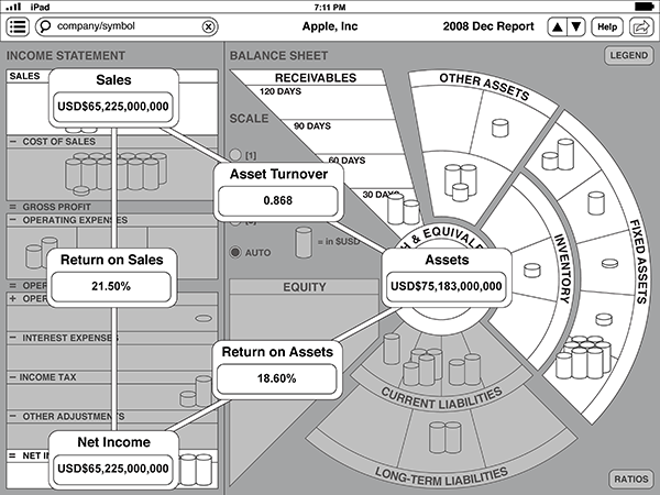
Ratio View - Tap on the Ratios button to see three major financial ratios displayed based on the current board information.
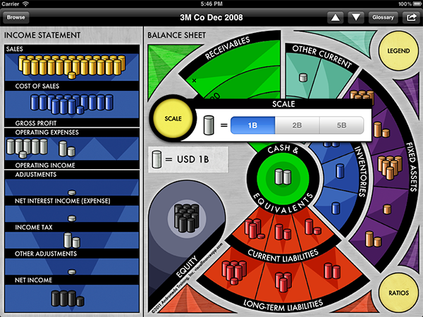
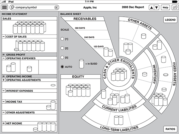
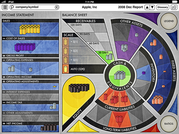
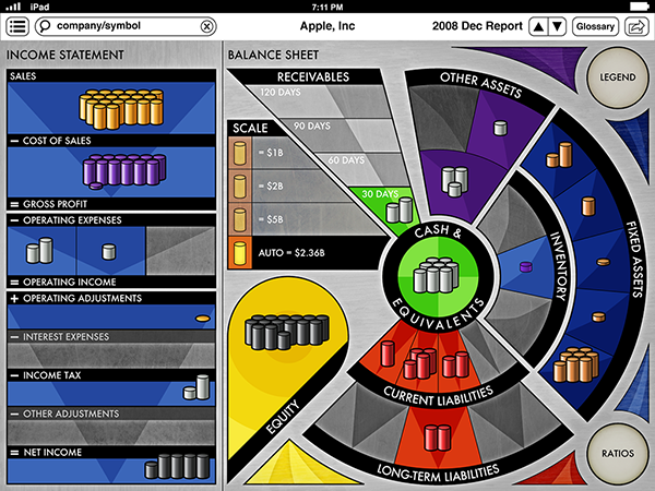
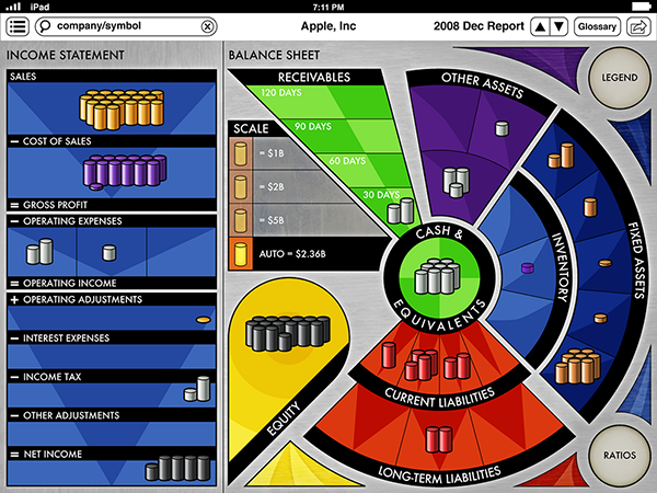
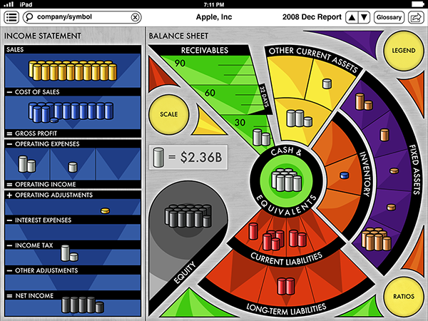
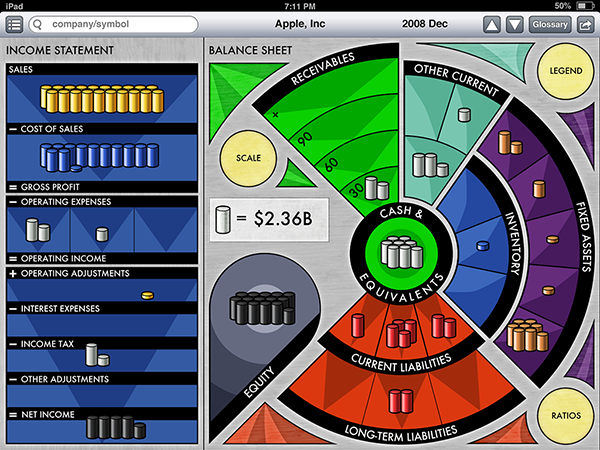
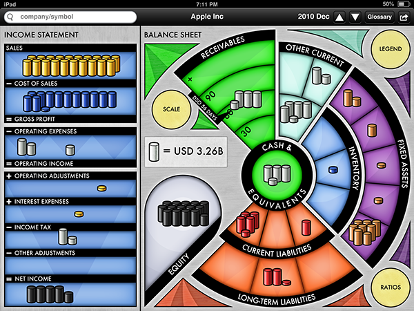
Scale View - Tap on the Scale button to change the relative number of stacks shown to get either a finer or broader view of the current board.

Browse View - Tap on browse and search for companies.
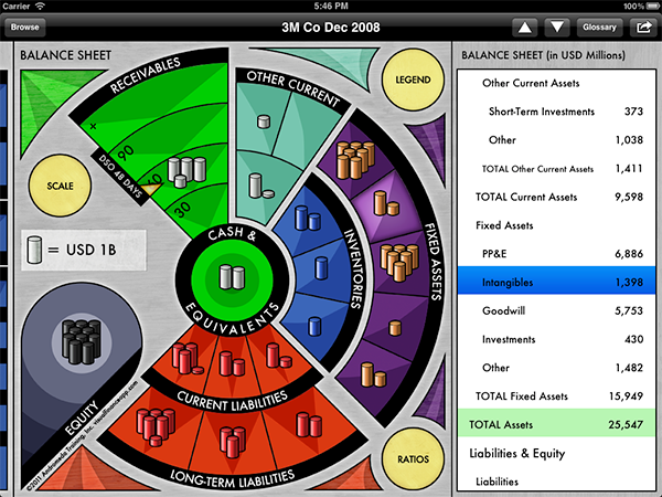
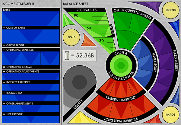
Side Table View - In normal mode, when an section is tapped on the main board it highlights and the board shifts to the left or right to display the table view adjacent to the part of the board viewed with the tapped item highlighted on the list.
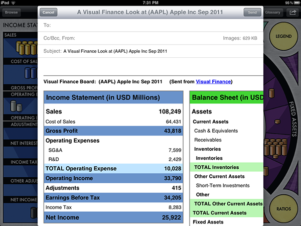
Share View and Table Email Attachment - Tap the share button and the app takes a screenshot of the current board and attaches it as well as an HTML table with all of the captured board’s details so users can send it to a friend. Not shown: the Legend button displays a list of stacks types with a corresponding image.
The above screens represent version 1 of the app. If you’d like to take a closer look the basic version is free, giving you access to over a dozen companies’ financial statements, including Apple, Inc. Click on the link below to visit the App Store to download a copy:
Visual Finance on the App Store
Visual Finance on the App Store


