Fraher Architects
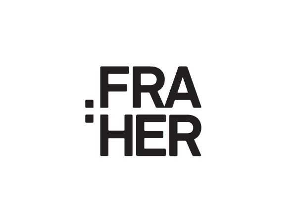
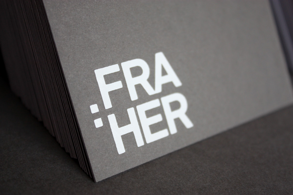
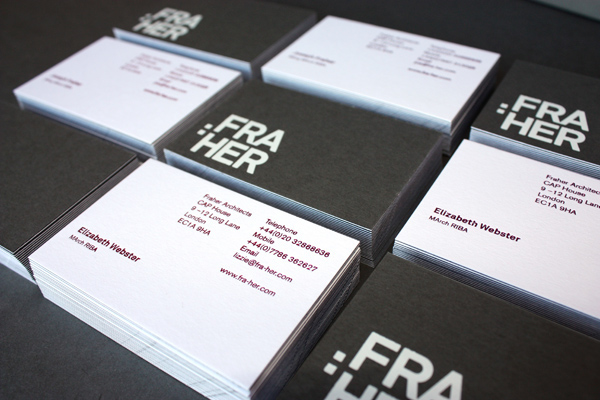
We were approached to create a new identity, stationery, branding materials and a new website for this startup architecture partnership based in London. An unusual surname Fraher, meant that the two partners Joseph and Elizabeth decided to split the name to make it easier to pronounce. Originally naming the practice Fra+Her, we decided to remove the + and instead split the name into two syllables making pronunciation simple. As a hint to the bond between the partners and a nod towards the previous marque we created a negative space + by the creation of two dots used to the left of the type in a semi colon style.
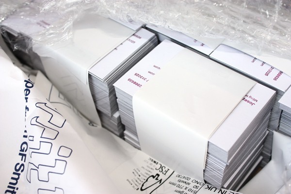
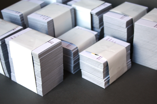
The identity is also grid based and architectural in its design and the use of the grid lines is a further graphic element which will be utilised across the new website and a variety of further print materials. The business cards below are white and fuchsia foils on duplex colourplan by GF Smith.
More on this project coming soon.
We were approached to create a new identity, stationery, branding materials and a new website for this startup architecture partnership based in London. An unusual surname Fraher, meant that the two partners Joseph and Elizabeth decided to split the name to make it easier to pronounce. Originally naming the practice Fra+Her, we decided to remove the + and instead split the name into two syllables making pronunciation simple. As a hint to the bond between the partners and a nod towards the previous marque we created a negative space + by the creation of two dots used to the left of the type in a semi colon style.
The identity is also grid based and architectural in its design and the use of the grid lines is a further graphic element which will be utilised across the new website and a variety of further print materials. The business cards below are white and fuchsia foils on duplex colourplan by GF Smith.
More on this project coming soon.