Coming soon page (website)
Teaser for www.renevella.com
As i am planning to release a brand new portfolio, it will be convenient to have a kind of teaser page, for the new design. What is even more important is that it will be possible for followers and other interested people to submit there email address, so that they will be noticed about the website launch.
Here you'll be able to read about the design proces. (when the site is online, ill' make a shout. I will run through the five main mockups, and describe design decesions for each one of them.
Here you'll be able to read about the design proces. (when the site is online, ill' make a shout. I will run through the five main mockups, and describe design decesions for each one of them.
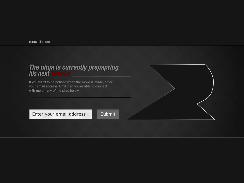
STEP 1
I would like the first sentence to draw a connection between the typography and the shape of the logo. To do this i was sure i had to use the word "ninja", but in which context i didnt knew. I brainstormed on "what is a ninja doing", and one of the clearest words that came up was "making moves". I outlined the logo with a gradient (transparent to white) to simulate movement which connects well with the main message that the site will be launching in near future. To connect the typography even more with the logo, i decided to connect the two line-details with the logo, so that it looks like part of the logo which is moving fast from left to right.
The background is dark, with a subtle pattern, and a soft light to give another dimension, and to give the viewer the impression that i pay a lot of attention to small details.
The background is dark, with a subtle pattern, and a soft light to give another dimension, and to give the viewer the impression that i pay a lot of attention to small details.

STEP 2
Here i choose to try out another pattern for the background (noise pattern) but ended up using the one in the first step. The reason for not using the noise pattern was that it didn't work that well on bigger areas for me, i think its way cooler to use it even more subtle, so i used that idea in one of the later steps.
I added a dark header and footer, to seperate the content added in the next steps. as a detail i added a one-pixel black line to give the impression that the header and footer actually overlays the main content.
Furthermore i italized the text "The ninja is currently preparing his next MOVE" as a metaphor for "moving". I used the type 'Slice n Dice' for the MOVE-part, to tell that the move is not a "regular" one, but more like "special", and thereby the special font.

STEP 3
email-submit is added here, and the background pattern from step one is reused. the form 'enter your email address has a dark inner shadow in left and top which makes it look like its a level under the main content (added dimension). The MOVE is colored with a dark red, which i change in the next step after i visited www.colorcombos.com
STEP 4
I felt there was something wrong with the dark red, it didn't really hit the spot. So i went to 'colorcombos' and find the right combo for the ninja :) i picked colorcombo 29. The combo left the right impression that i wanted the viewer to have through the colors (light purple changed to grey). Black for discrete, grey for stylish, purple for mystical, white for clean.
Social buttons added in the footer, with exactly the same width as the content in the middle, to draw a stronger connection between those two.
The noise pattern is here brought back to the scene in the context of the footer and the header, but only on the half part of it nearest to the center of the page, which gives the clean and crunchy finish i wished.

STEP 5 (Final Mockup)
I've added a left shadow to the MOVE-part of the typography, so it sort of 'pops out' out of the other content. The 'google' icon is customized so that it's a google + icon instead. And the idea of 'color on hover' is implemented on the social media buttons.
- Im' looking forward to realise the design of this page in browsers. (keep in touch for updates)
- Im' looking forward to realise the design of this page in browsers. (keep in touch for updates)