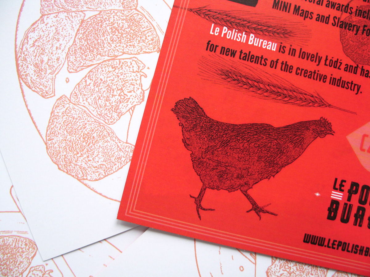
Branding for le Polish Bureau (sister interactive agency of unit9 in London) located in Lodz, in Poland.
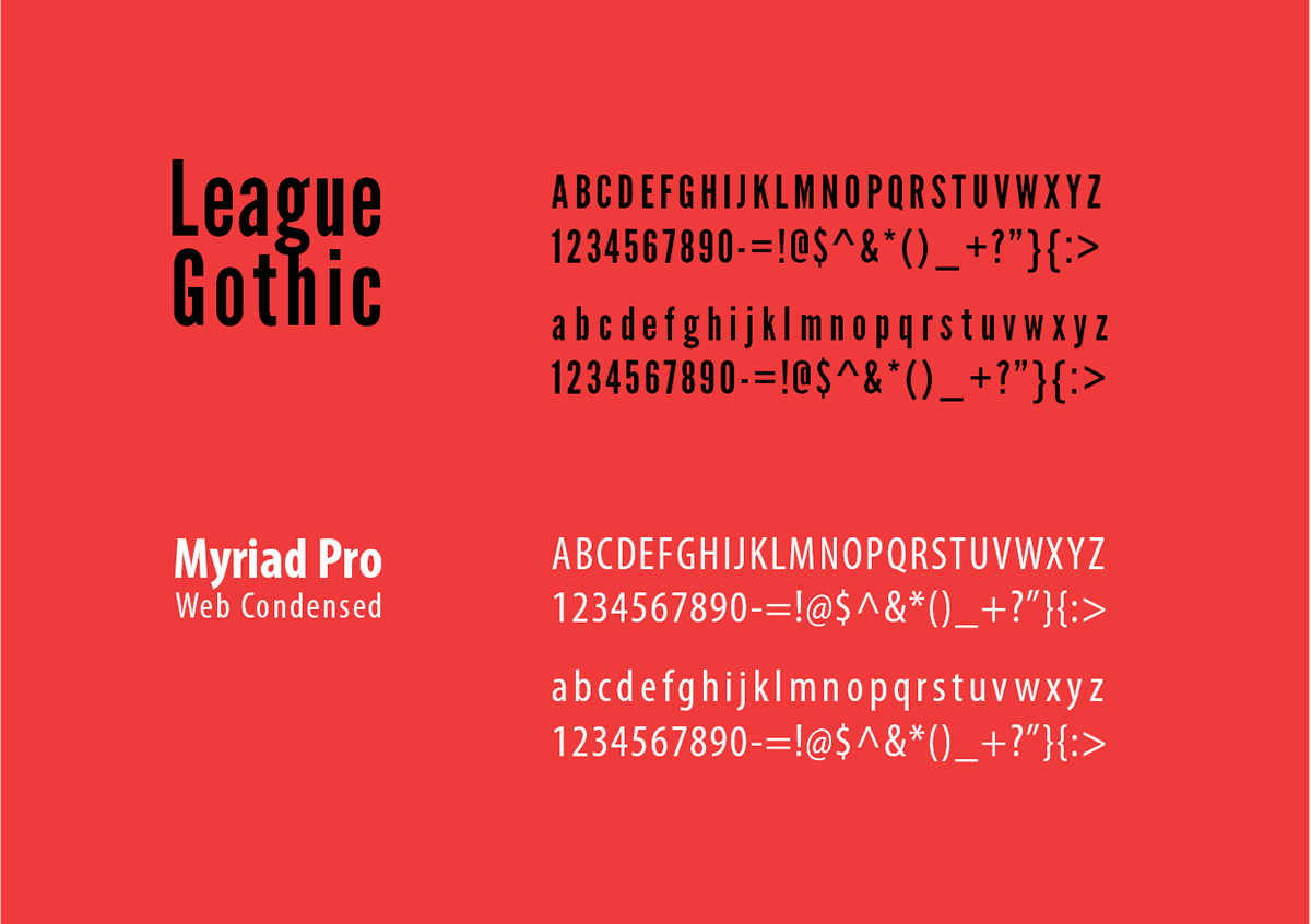
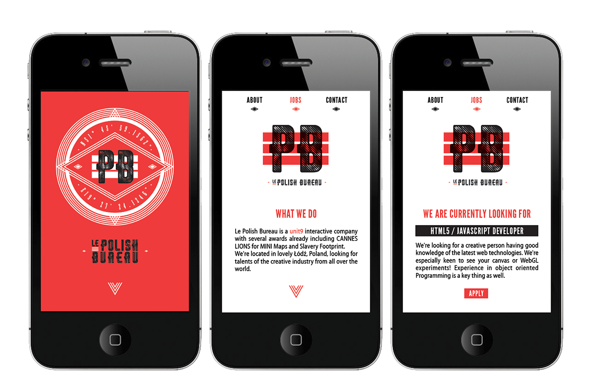
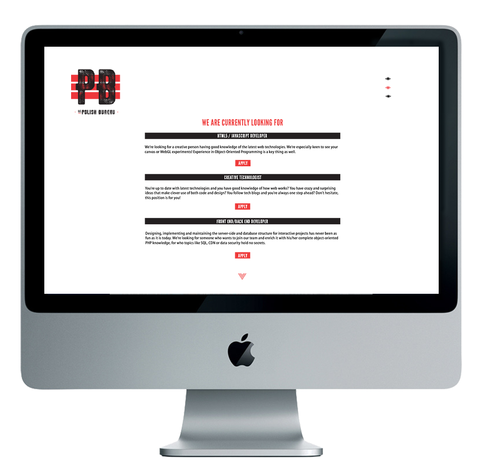
The corporate identity consists of full logo set, corporate colors, promo materials and www design for web and mobile.
The corporate identity consists of full logo set, corporate colors, promo materials and www design for web and mobile.

inspiration summary:
- white and red colors as reference to primary shades to be found in the polish flag
- rhombus shape - "rhombus" comes from the greek and means "something that spins" that comes from the verb ρέμβω (rhembō), meaning "to turn round and round". Another name is equilateral quadrilateral, since equilateral means that all of its sides are equal
- the full logo sign refers with its shape to compass defining and pointing the four cardinal directions: north, south, east and west; also contains inside geographical coordinates for city of Lodz, where the agency le Polish Bureau is located ( N51° 45’ i E19° 27’)
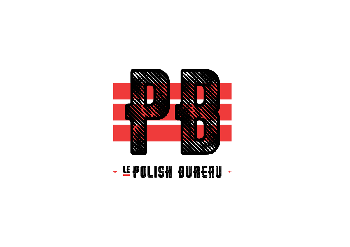
- abbreviation "PB" that brings association of chemical element - lead. Lead is used in building construction, bullets and shots, weights, as others, and also as a radiation shield. Lead has the highest atomic number (82) of all of the stable elements
- white and red colors as reference to primary shades to be found in the polish flag
- rhombus shape - "rhombus" comes from the greek and means "something that spins" that comes from the verb ρέμβω (rhembō), meaning "to turn round and round". Another name is equilateral quadrilateral, since equilateral means that all of its sides are equal
- the full logo sign refers with its shape to compass defining and pointing the four cardinal directions: north, south, east and west; also contains inside geographical coordinates for city of Lodz, where the agency le Polish Bureau is located ( N51° 45’ i E19° 27’)
- abbreviation "PB" that brings association of chemical element - lead. Lead is used in building construction, bullets and shots, weights, as others, and also as a radiation shield. Lead has the highest atomic number (82) of all of the stable elements


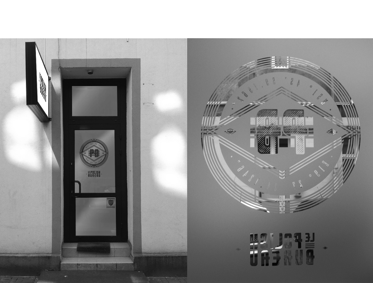
frozen glass effect - logo cut-out on the office door (outside and inside) and office boards in backyard in Piotrkowska street


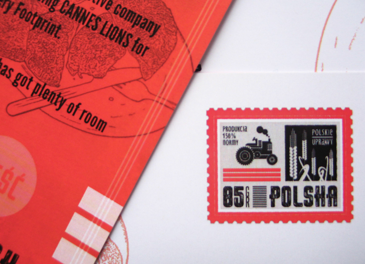
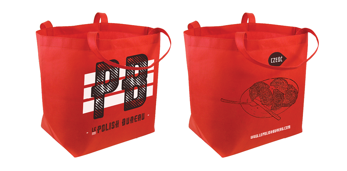
Promo Gadgets:


promo postcard prepared for Homo Digitalus conference in Warsaw organized by Lemon Sky interactive agency (October 2012)