gabetippery.com - Version 2.0
Winter 2012

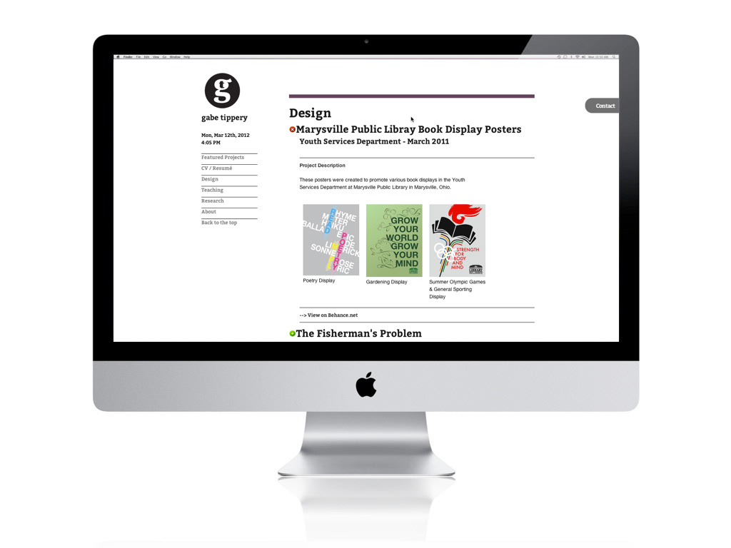
Redesigned Site - gabetippery.com Version 2.0

Original Site - gabetippery.com Version 1.0

Primary Navigation: Static on desktops and tablet devices.
Content Show/Hide Toggle: To allow for easy one-page navigation without overwhelming the user with content. Images display in "lightbox" effect via javascript.

Responsive Grid based on CSS media queries reflows content for various screen sizes.

Responsive Grid based on CSS media queries reflows content for various screen sizes - 1 column at mobile sized screens.

On mobile devices, Primary Navigation sticks to the top of screen via Javascript so that it is always present.


