About
"die konservatoren" is a german conservator-company - specialized in archeological and historical cultural assets - located in Berlin.
At the time of the formation of the company, the logo, business stationery and a website have been created.
"die konservatoren" is a german conservator-company - specialized in archeological and historical cultural assets - located in Berlin.
At the time of the formation of the company, the logo, business stationery and a website have been created.

Logo development
The logo was approached via brainstorming and many sketches. The idea was to bring the following things together:
- Time & Infinity (as the work of a conservator is a endless "fight" against the ravages of time
- Restoration
- Art & common Tools
In an early stage I've got the image of an hourglass in my mind and tired to work that out. Later in process, there was the need to integrate the different main-materials the company has expretise in. The first approach was to use different colors, but in order to create something more concise, Pictograms where used instead and where placed arround the main visual.
The following sketches shall show the evolution of the final Logo.


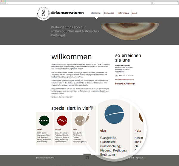
Webdesign
The website was meant to be clean and reliable. The header can be modified and equiped with differend images and colors in order to fit with the current topic and/or content. The Materials are used as standalone-Pictograms within the header and the homepage. Each material has an additional color to make it easer to distinguish between the fields of activity.
The website-development has been carried out with wordpress.
The website-development has been carried out with wordpress.