Adhesive package redesign
The project includes a redesign of series of packages of good adhesive for Technicoll company.

EN
Adhesives from Technicoll company are widely used in industry and technology. Potential buyers of this type of adhesives are both professionals and amateurs.
Due to the fact that the company hasn't built up yet a brand which is strong enough to persuade consumer to buy their adhesive because of their identity and price ranks in the middle of competitive products, the main factor, which will influence the decision to purchase the glue is the attractiveness of package.
Adhesives prices and the fact that they are used for minor repairs makes that customer decision is taken quite quickly and without getting involved. If the product passes the classification of price and quality (because of the brand), the choice is unconsciously based on first visual impressions.
Design brief:
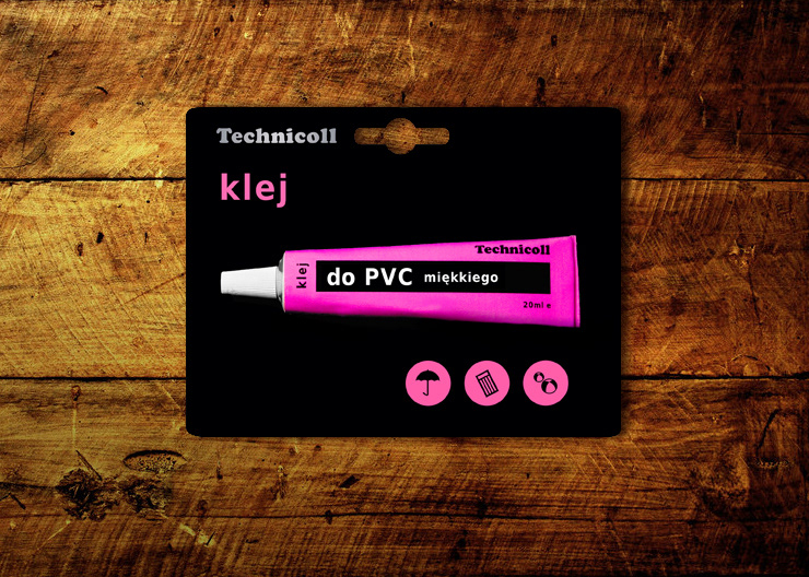
Clean, minimalist packaging exposing in appropriate hierarchy essential information which are communicated to the customer at time of purchase. Simplicity and color reduction helps to build a simple message. The minimum number of elements (eg. the tube of glue as an illustration on the package) symbolize that the adhesive is quick and easy to use, safe and reliable. Each of the adhesive corresponds to a different color. Overview of packages side by side creates a single family that stands out from the shelves.
PL
Kleje firmy Technicoll mają szerokie zastosowanie w przemyśle i technice. Potencjalnymi nabywcami tego rodzaju klejów są zarówno profesjonaliści jak i amatorzy. Ze względu na to, że firma nie wypracowała sobie jeszcze na tyle silnej pozycji aby skłonić klienta do zakupu poprzez wyeksponowanie samej marki, a cenowo plasuje się po środku produktów konkurencji, głównym elementem jaki wpłynie na decyzję o zakupie kleju będzie atrakcyjność opakowania.
Cena klejów jak i to, że służą do drobnych napraw powoduje, że decyzja klienta podejmowana jest dosyć szybko i bez zbytniego zaangażowania. Jeśli produkt przejdzie klasyfikację cenową i jakościową ze względu na markę, wybór odbywa się podświadomie na podstawie pierwszego wrażenia.
Założenia projektowe:
Czyste, minimalistyczne opakowanie eksponujące w odpowiedniej heirarchii najważniejsze informacje przekazywane klientowi podczas zakupu. Prostota i ograniczenie się do trzech kolorów na jednym opakowaniu ma budować prosty komunikat. Minimalna liczba elementów (np. sama tubka kleju jako ilustracja na opakowaniu) ma symbolizować łatwość i szybkość użycia, pewność i niezawodność. KAżdemu z klejów odpowiada inna barwa. Pod tubką znajdują się piktogramy symbolizujące materiały nadające się do klejenia. Zestawienie opakowań obok siebie tworzy jednolitą rodzinę, która wyróżnia się na tle półek sklepowych.
Adhesives from Technicoll company are widely used in industry and technology. Potential buyers of this type of adhesives are both professionals and amateurs.
Due to the fact that the company hasn't built up yet a brand which is strong enough to persuade consumer to buy their adhesive because of their identity and price ranks in the middle of competitive products, the main factor, which will influence the decision to purchase the glue is the attractiveness of package.
Adhesives prices and the fact that they are used for minor repairs makes that customer decision is taken quite quickly and without getting involved. If the product passes the classification of price and quality (because of the brand), the choice is unconsciously based on first visual impressions.
Design brief:
Clean, minimalist packaging exposing in appropriate hierarchy essential information which are communicated to the customer at time of purchase. Simplicity and color reduction helps to build a simple message. The minimum number of elements (eg. the tube of glue as an illustration on the package) symbolize that the adhesive is quick and easy to use, safe and reliable. Each of the adhesive corresponds to a different color. Overview of packages side by side creates a single family that stands out from the shelves.
PL
Kleje firmy Technicoll mają szerokie zastosowanie w przemyśle i technice. Potencjalnymi nabywcami tego rodzaju klejów są zarówno profesjonaliści jak i amatorzy. Ze względu na to, że firma nie wypracowała sobie jeszcze na tyle silnej pozycji aby skłonić klienta do zakupu poprzez wyeksponowanie samej marki, a cenowo plasuje się po środku produktów konkurencji, głównym elementem jaki wpłynie na decyzję o zakupie kleju będzie atrakcyjność opakowania.
Cena klejów jak i to, że służą do drobnych napraw powoduje, że decyzja klienta podejmowana jest dosyć szybko i bez zbytniego zaangażowania. Jeśli produkt przejdzie klasyfikację cenową i jakościową ze względu na markę, wybór odbywa się podświadomie na podstawie pierwszego wrażenia.
Założenia projektowe:
Czyste, minimalistyczne opakowanie eksponujące w odpowiedniej heirarchii najważniejsze informacje przekazywane klientowi podczas zakupu. Prostota i ograniczenie się do trzech kolorów na jednym opakowaniu ma budować prosty komunikat. Minimalna liczba elementów (np. sama tubka kleju jako ilustracja na opakowaniu) ma symbolizować łatwość i szybkość użycia, pewność i niezawodność. KAżdemu z klejów odpowiada inna barwa. Pod tubką znajdują się piktogramy symbolizujące materiały nadające się do klejenia. Zestawienie opakowań obok siebie tworzy jednolitą rodzinę, która wyróżnia się na tle półek sklepowych.