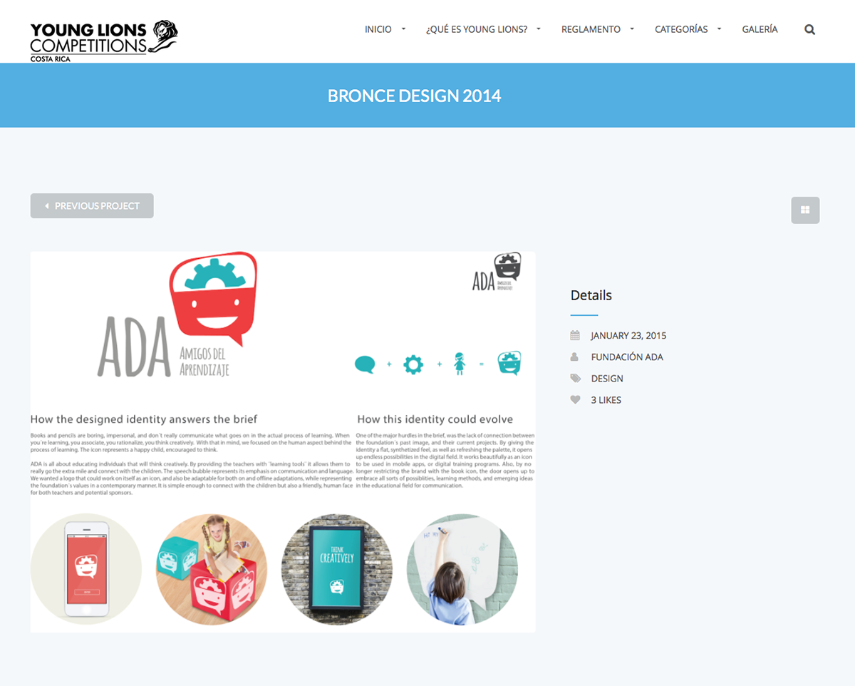
How the designed identity answers the brief
Books and pencils are boring, impersonal, and don´t really communicate what goes on in the actual process of learning. When you´re learning, you associate, you rationalize, you think creatively. With that in mind, we focused on the human aspect behind the process of learning. The icon represents a happy child, encouraged to think.
ADA is all about educating individuals that will think creatively. By providing the teachers with ¨learning tools¨ it allows them to really go the extra mile and connect with the children. The speech bubble represents its emphasis on communication and language.
We wanted a logo that could work on itself as an icon, and also be adaptable for both on and offline adaptations, while representing the foundation´s values in a contemporary manner. It is simple enough to connect with the children but also a friendly, human face for both teachers and potential sponsors.
How this identity could evolve
One of the major hurdles in the brief, was the lack of connection between the foundation´s past image, and their current projects. By giving the identity a flat, synthetized feel, as well as refreshing the palette, it opens up endless possibilities in the digital field. It works beautifully as an icon to be used in mobile apps, or digital training programs. Also, by no longer restricting the brand with the book icon, the door opens up to embrace all sorts of possiblities, learning methods, and emerging ideas in the educational field for communication.
BRONZE
Young Lions CostaRica 2014