


Visual identity & applications for the 2008 and 2010 editions
The identity of the Biennial is a somehow ethereal thing. Every edition has a different theme, title and logo, trying to elude the idea of "establishment". Still, there is a thread uniting them, and that is each edition's catalogue, and the stubborn use of DIN as a body text typeface. On the art direction level, there was always a challenge with the Biennial, the challenge to create a central visual image that is both relevant and irreverent, that is subtle without being hermetic. More info about the Young Artists Biennial here
2010 – Police the Police
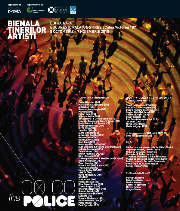
The 2010 edition poster. I used a pirated photo-stock image for its relevance to the theme (surveilance, control) as well as for the commentary value of its origin and use (downloaded from a russian blog)
The 2010 catalogue. Space and order...
...and a short, no-budget promo animation

The 2008 edition - this poster proposal was refused due to its "delicate" implications. Even an irreverent Young Artists Biennial can sometimes be a prudish virgin girl when it comes to political implications. The accepted poster was, of course, much tamer.
The 2008 catalogue. Same concept as the 2010 one: a clean, aired layout. No design tricks.


