YOURopa, an European intiative for life long learning, tasked me with a brief to develop a logo that represented the brand aesthetic. In order to convey the clients vision of a European "connectivity", I developed the primary logo as a star which is parallel to the stars represented on the European flag.
An integral factor was to highlight the "play-on-words" that is presented in the clients brand name. To do this I disconnected the two elements of the word using bold to accentuate the first part of "YOURopa", also providing a message of unity within the clients brand.
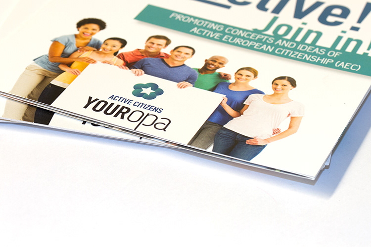
After my success with the clients brand identity, I was asked to design the companies information packed. As with the logo, I wanted to bring the notion of interconnectivity by using the visual medium of people as a literal personification of the logo.

/ LOGO DESIGN
/ FOLDER front side

/ FOLDER inside

/ FOLDER inside

/ FOLDER inside

/ FOLDER back side
