Дизайн этикетки шотландского виски – "Celtic Cross"
Celtic Cross, что в переводе с английского означает – кельтский крест – один из древнейших символов тех времён, когда на отдельных территориях Европы жили и властвовали народы кельтов. Как известно, кельты были одними из самых воинственных народов этого региона, в жестоких боях им не было равных.
Кельтский крест (или Крест Святого Колумба), который появился в Ирландии, еще до VIII века – представляет собой равнолучевой крест в круге. Он символизирует солнце, воздух, землю и воду в единстве. Обозначает цикличность и замкнутость.
Label design for the Scotch whiskey – Celtic Cross
Celtic Cross - one of the immemorial symbols of those times when certain parts of Europe were populated and ruled by the Celts. As it is known, Celts were the most warlike people of the region; in fierce battles there was nobody who could compete with them.
Celtic Cross (or Cros Cheilteach) is an element that combines a cross with a ring surrounding the intersection. It symbolizes the sun, air, land and water in their unity. It implies cyclicity and completeness.
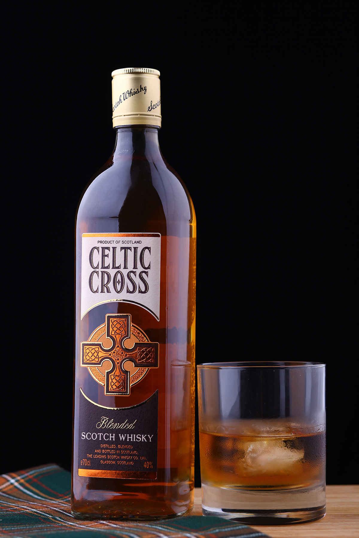

Идея тематики оформления этикетки для виски была, безусловно, сосредоточена вокруг изображения кельтских крестов. При разработке дизайна, основным стремлением было передать некую «брутальную суть» (мужественность, мощь народа и силу культуры), которая несет в себе кельтская тематика. Такой образ дополняет квадратная форма бутылки, выбранная для напитка.
The subject of idea for the whiskey label was centered on images of Celtic crosses. In the process of design development – the main intention was to convey a kind of "harsh essence" (masculinity, power and strength of the people of culture), which relates to Celtic theme. It is complemented by a square shape of the bottle that was chosen for this beverage.

В результате, был разработан дизайн оригинального, стилизованного изображения кельтского креста, который стал ключевым элементом. Особенностью этикетки является создаваемая иллюзия того, что крест размещен на самой бутылке. Этот эффект был достигнут благодаря нанесению специальной краски под цвет самого напитка.
As a result, we developed the original and stylized image of a Celtic cross, which became a key element of a whole design. Feature of the label is created the illusion that the cross is placed right on the bottle. This effect was achieved by applying a special paint in the color of the drink.


Печать этикетки произведена на типографии: Financial Papers
Фото: Кирилл Змурчук
Фото: Кирилл Змурчук
Label printing performed at printing house: Financial Papers
Photo: Kirill Zmurciuk
Photo: Kirill Zmurciuk


