[CATEGORY: ADVERTISING | YEAR: 2011]
AMBITION
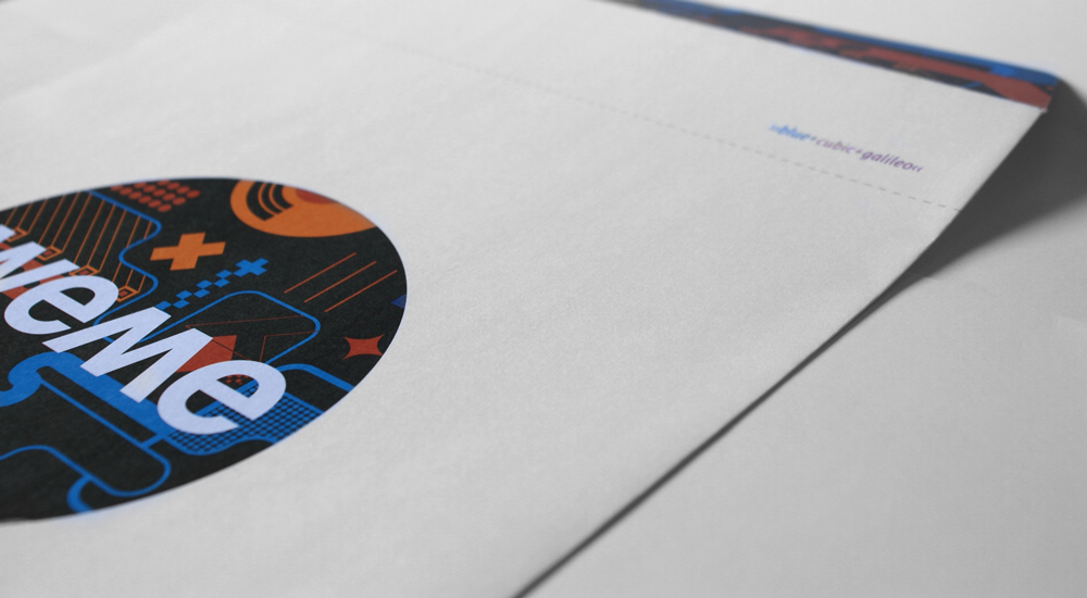
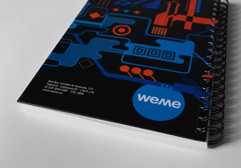
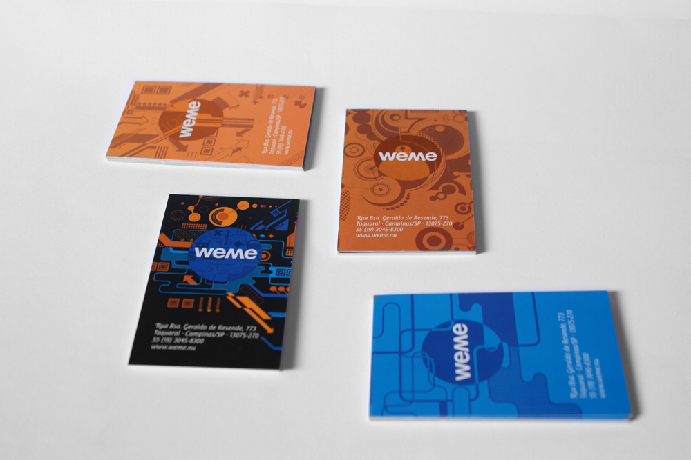
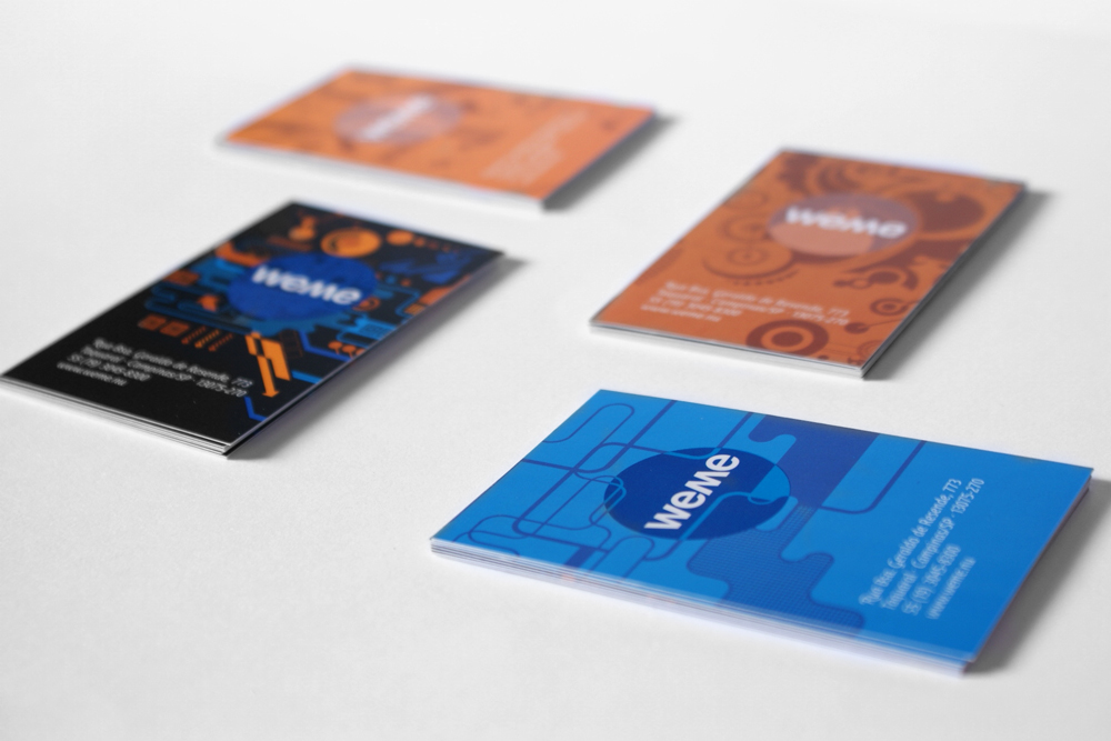
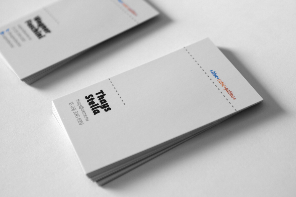
Established in 2011 as one of the largest advertising agencies of Campinas, Brazil. Weme was the result of the merger of three companies: Blue, Cubic and Galileo. The direction was made up of six partners who wanted to bring a new brand to the market without killing the three forming brands of the company. There was a common desire to communicate that although a new company Weme was still the Blue, Cubic and Galileo, only together.
ACTION
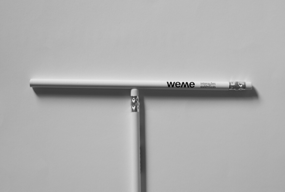
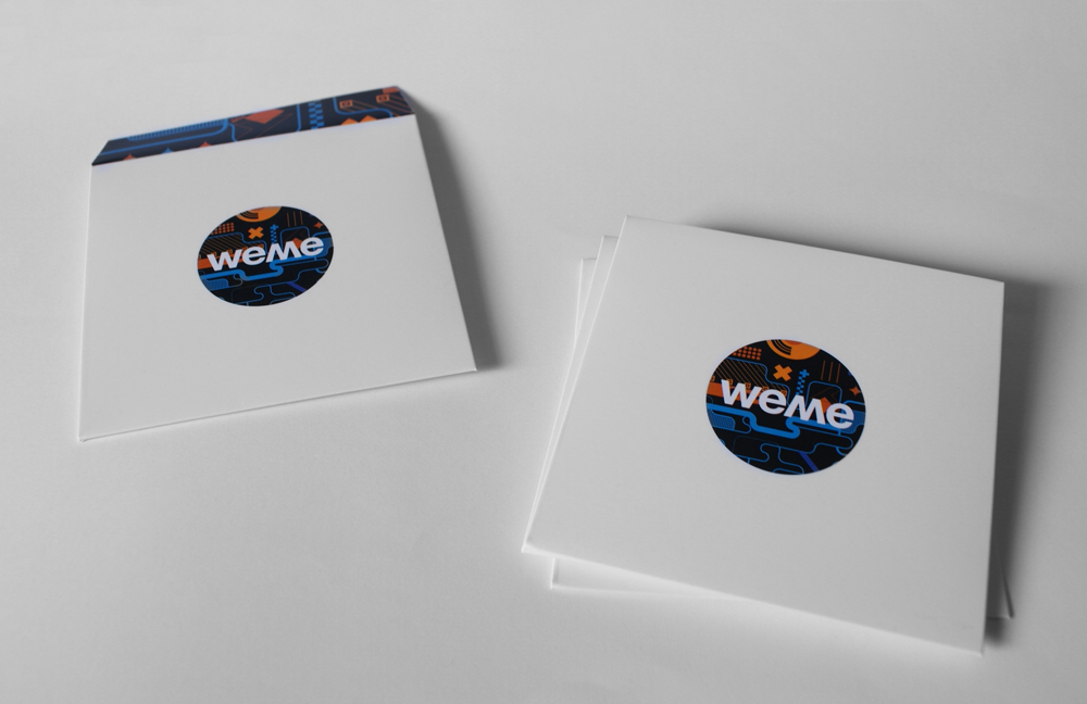
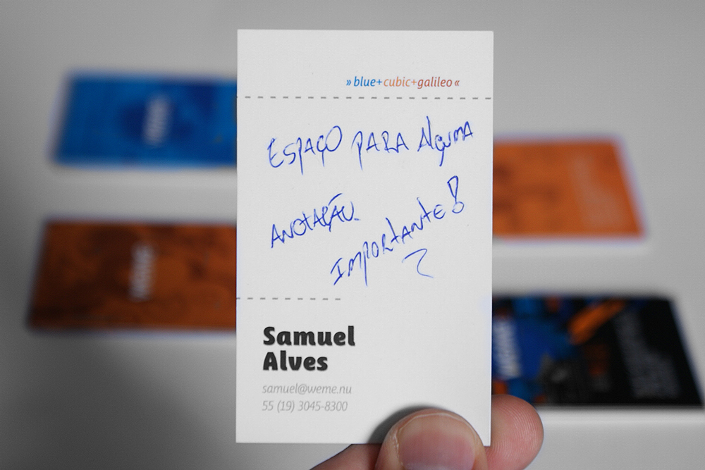
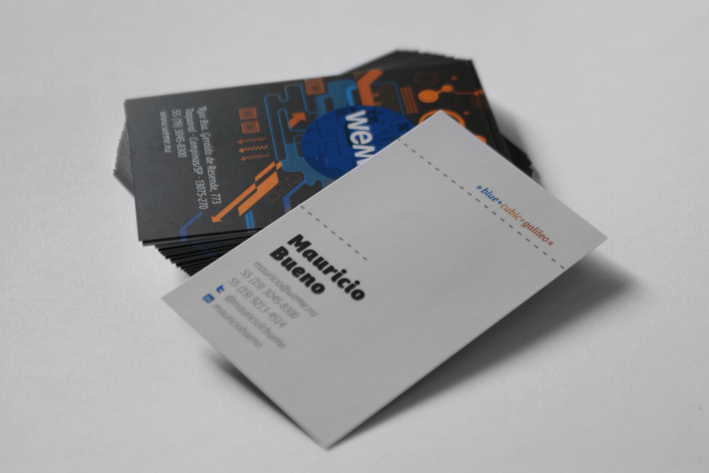
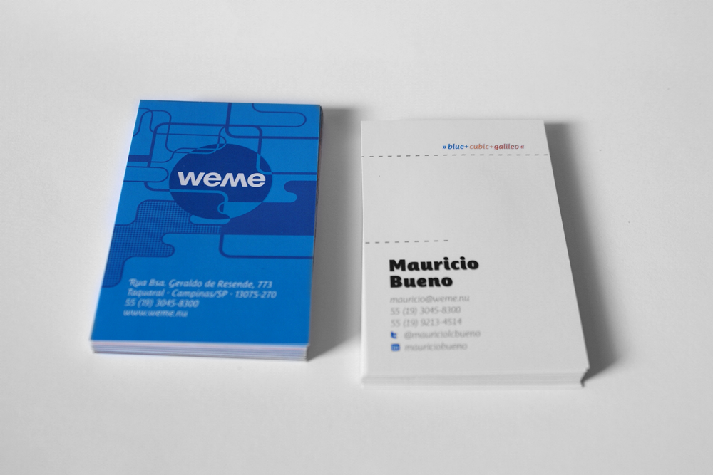
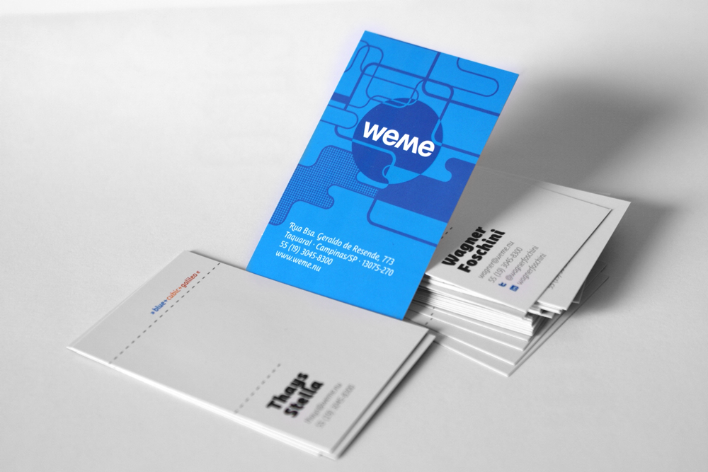
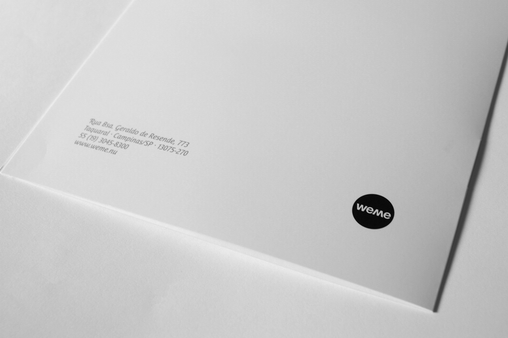
I received from Weme the name and logo finalized, and three illustrations that should be included on identity, all products of internal projects of the company. It was up to me think and design a visual identity system that could support the new brand, its logo, illustrations and still leave explicit that the three companies forming were still there. Colors, textures, illustrations and images are the base of the logo. The family of fonts used by the brand is the element that unites the identity.
IMPACT
The brand allowed Weme to settle in Campinas market and have a distinct personality from other advertising agencies. Typography functioned as a nexus for the three parent brands and brought a fresh visual appeal to brand.


CREDITS
Logo: Team Weme
Ilustrations: Thiago Dias & Thiago Luporini
Visual identity: Daniel Campos
Logo: Team Weme
Ilustrations: Thiago Dias & Thiago Luporini
Visual identity: Daniel Campos