Werysoft Logo
A refresh of the Werysoft logo
A refresh of the Werysoft logo
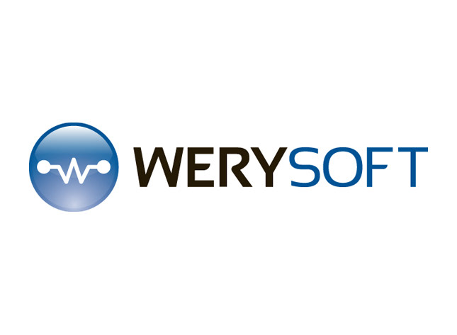
Werysoft, a company that makes software for developers, wanted a refresh of their old logo. Not a complete overhaul, just something to look more professional. One of the key quality of Werysoft is their customer service. So I want the logo to reflect a professionalism that will earn a customer's trust.
Colour
I found the original blue of his previous logo a bit harsh, so I soften it a bit. I actually tried many different colours, but the blue worked best. Blue means freedom, strengths, and loyalty. Traits that are important to the company. Plus the calming affects of the blue helps invoke trust in their customers.
I found the original blue of his previous logo a bit harsh, so I soften it a bit. I actually tried many different colours, but the blue worked best. Blue means freedom, strengths, and loyalty. Traits that are important to the company. Plus the calming affects of the blue helps invoke trust in their customers.
Logotype
The previous font used wasn't agreeable with me. It was very gimmicky and was hard to read. I used a modified free font, Sansation. It's easier to read and simple. For me the less gimmicks, the more trustworthy brand will be.
The previous font used wasn't agreeable with me. It was very gimmicky and was hard to read. I used a modified free font, Sansation. It's easier to read and simple. For me the less gimmicks, the more trustworthy brand will be.
Symbol
The client wanted the glassy look like the one found in the Microsoft logo. So I obliged him. I've tried a couple of different styles of glass, but this was the one I preferred. The stylized 'W' is obviously for the name of the company, but it also represents the connection Werysoft has with it's customers. The combination of the 'W' and glass orb makes the symbol resemble a light bulb, symbolizing ideas and technology. Presenting Werysoft as a vanguard of his industry.
The client wanted the glassy look like the one found in the Microsoft logo. So I obliged him. I've tried a couple of different styles of glass, but this was the one I preferred. The stylized 'W' is obviously for the name of the company, but it also represents the connection Werysoft has with it's customers. The combination of the 'W' and glass orb makes the symbol resemble a light bulb, symbolizing ideas and technology. Presenting Werysoft as a vanguard of his industry.