
Wedge is the singular vision of one man. Spanning decades, the design of this font took the history of the Roman letter into full consideration. Despite ultimate rejection for production into metal type, the design was realized as intended and is now released in digital form.
Noted New Zealand architect Bruce Rotherham (1926–2004) was inspired by Herbert Bayer’s "universal alphabet" created at the Bauhaus in 1927. While he admired Bayer’s pure geometry, Rotherham felt it was "virtually unreadable." The Bauhaus-inspired inclination for architectural publications to use sans serif faces provoked Rotherham to consider how a readable Roman book face might be approached using some of Bayer’s same principles of simplification, but also retracing the evolution and use of the Roman form in an analytic manner.
Bruce Rotherham spent his formative years working at his father's commercial printing business and was tuned in to typography from an early age. The Wedge alphabet was started in 1947 when Rotherham was an architecture student at the University of Auckland. In 1958, after years of development and consultation with his father, who was a master printer, Rotherham approached Monotype to consider producing his typeface for commercial release. After some back and forth with Monotype advertising manager A.D.B. Jones and typographical advisor John Dreyfus, and despite trial proofs being made, the design was politely declined for being too much of a "specialist face."
Rotherham continued to practice architecture in New Zealand and Great Britain for over thirty years. By chance, he heard the BBC radio show Science Now discussing the topic of computer typesetting. Not content to give up on Wedge, he contacted the item’s producer, Adrian Pickering, at the University of Southampton School of Electronics and Computer Science. Pickering worked closely in collaboration with Rotherham in the production of the digital version of the face. The type was shown posthumously for Rotherham in the 2009 exhibit Printing Types: New Zealand Type Design since 1870, held at Objectspace, in Auckland.
Wedge was only mentioned breifly on typography sites on the Internet, but finding the full story on Rotherham's design had remained elusive. Over sixty years after it was first conceived, Wedge is released by P22 in 2014 along with Rotherham’s detailed documentation on the font’s development and rationale.

Original Wedge ink drawing reproduction showing retouching and original variant letterforms.. Ligatures were later discarded as a "collision" spacing solution was found to make ligatures not necessary.

First trial paragraph setting by Monotype in 1958

Rotherham's application of his design principles into his entry for the Shavian Alphabet competition helped to refine Wedge design issues.
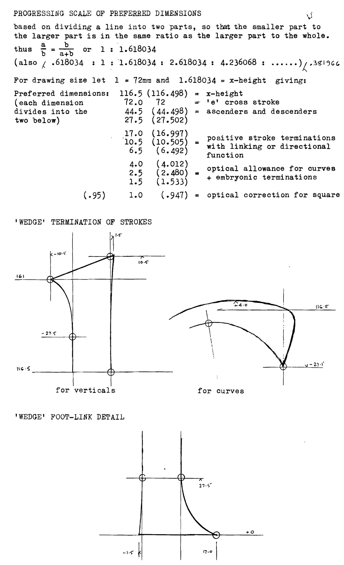
The proportions of the Wedge type were derived from the Golden Ratio and Fibonacci sequence
A full PDF rationale for Wedge can be downloaded from the Wedge webpage where the fonts can also be purchased.

