Web Design
Discovery Journeys India
Writing, creative direction, web design, editing
As one of India's leading destination management companies for over 20 years, Discovery Journeys India needed a website that matched its high quality of service and professionalism. I made this site geared toward international travel companies, where Discovery receives a lion's share of it's clients, while also aiming to generate direct customer inquires.
Outside of a few basic college projects, I had little web development experience. Certainly never on a site this massive or complex. Still, the opportunity to tackle such a daunting creative undertaking without any real guidance had me excited for the challenge.
Taking a learn-as-you-go approach, I used an unfamiliar desktop publishing program to design page layouts aimed at being easily navigable to the user. I then populated each page with details on over 120 unique accommodations, 30 itineraries, and 12 festivals, all involving extensive independent research and choice wording.
After completing the mock-ups for the site, I met half-a-dozen times with an independent web development company to help turn my designs into code. Because nothing in India is as easy as it should be, I needed to provide step-by-step directions detailing how each page should function and reign in "creative liberties" being taken with the design.
I'm very pleased with how the site turned out, given the resources and time I had.
The site has been slightly altered since I left in March 2012, but still retains a great majority of the design elements I implemented.
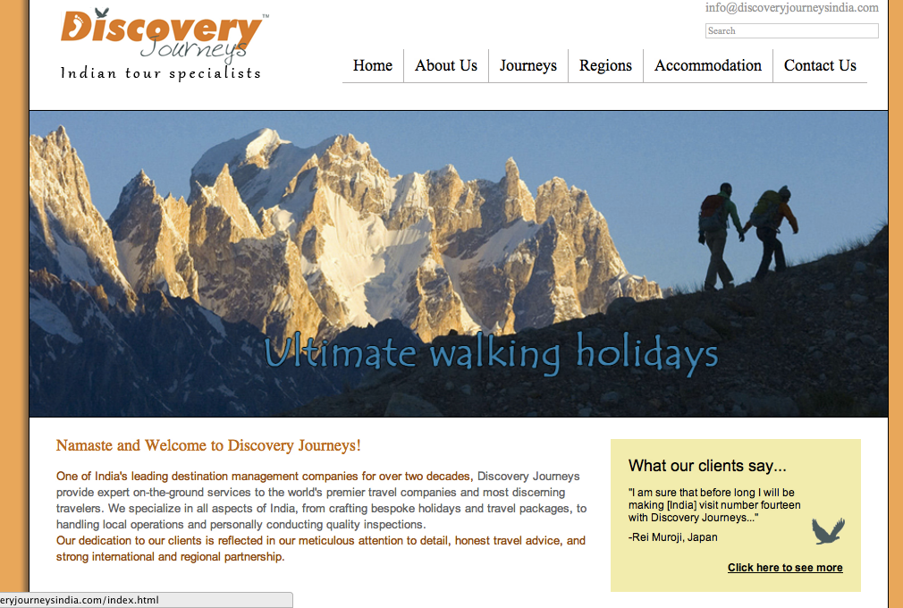
We wanted to capture viewers' attention from the get-go with a dynamic photo slideshow. Although not apparent in the photo, each image uses Flash to slowly zoom in on the photo, giving it a more exciting presentation (i.e. Ken Burns effect). We introduced the company with a short description and included client testimonials on the right to establish instant credibility.
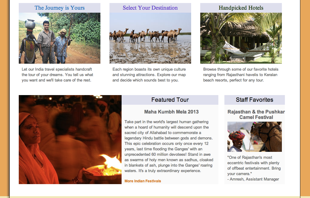
The three main boxes were created to provide another interesting way of accessing the content available on the navigation bar. As a creator of tailor-made tours, it was essential we bring users to the personalized tour section (The Journey is Yours). We also wanted to lead users to our interactive India map where they could click where they wanted to go (Select Your Destination). Discovery Journeys also differentiates itself by providing detailed hotel descriptions and wanted to highlight that competitive advantage on their homepage (Handpicked Hotels). The last two boxes (Featured Tour, Staff Favorites) were implemented to showcase two tours simultaneously with "Staff Favorites" adding a personal component to the recommendation. Click to visit site...
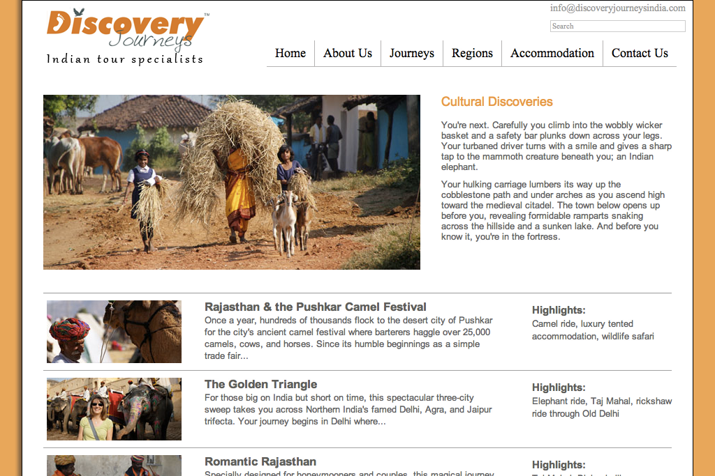
Simplicity was of prime importance when we were designing the site. Located under the "Cultural Discoveries" group of itineraries, this page cleanly presents key information with eye-catching photos. Text and other links were kept to a minimum to encourage users to click through each tour and not overwhelm them with added elements.
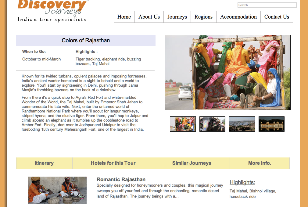
On each individual tour page we sought to convey all necessary information in a clean and easy manner. The top section conveys all the important information about the tour: a brief description, and a dynamic slideshow. At the bottom we placed tabs where users could click for more details about the tour, including a day-to-day itinerary and information on when local festivals occur. We also included relevant hotels and similar journeys to encourage greater exploration of the site and highlight Discovery's expertise on India travel.
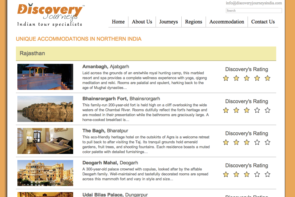
When clients travel to India, they come as much for the country's high-end hotels and luxury services as they do for the Taj Mahal. Since accommodation is of such great importance, Discovery wanted to list their most well-reviewed hotels that they've done business with for years. Organized alphabetically by region, state, then city, this list serves as a helpful guide for businesses and clients alike. The company also implemented its own personal rating system to give clients a better idea of the hotel's level of quality.
In addition to the design and writing, I came up withadding "Discovery's Rating" as I believed it would give the company added clout and credibility having dealt with these hotels before.

When writing the descriptions for over 120 unique hotels, I relied heavily on consumer reviews and independent accounts. I styled the hotel layout to match that of the itinerary pages for consistency. I also added "What our experts say" to lend credibility and personality to the writing.

One of the most difficult pages to write and design, I went through several drafts of the company description to blend my writing with that of the company's long-time copywriter. After a week, we came to a solution that combined both styles and pleased all parties. Near the bottom, I collected and shortened some of the best client testimonies to link to from the homepage. For the Discovery Difference, I outlined seven key advantages of doing business with the company, which I based on competitor research and company analysis.
Social Media
I began managing companies' social media accounts as early as 2009 when I launched Wisconsin Public Radio's Facebook fan page. Since then, I've led the charge on two other companies' first forays into social media, most recently working with a multi-million dollar Indian company.
Wisconsin Public Radio
Social media management of Facebook, Twitter, and Youtube accounts
The site has come a long way since I first created it three years ago (especially with Facebook's new Timeline). During the initial stages, I populated the site with never-before-seen photos of hosts, holding contests inviting audience participation, and asking questions about the direction of WPR that garnered dozens of responses. I also linked the company's fan page with the handful of other WPR fan pages and coordinated events with their Twitter account. I later served on a social media panel, detailing the importance of reaching out to listeners through this medium.
Click to visit site
Click to visit site

Discovery Journeys India
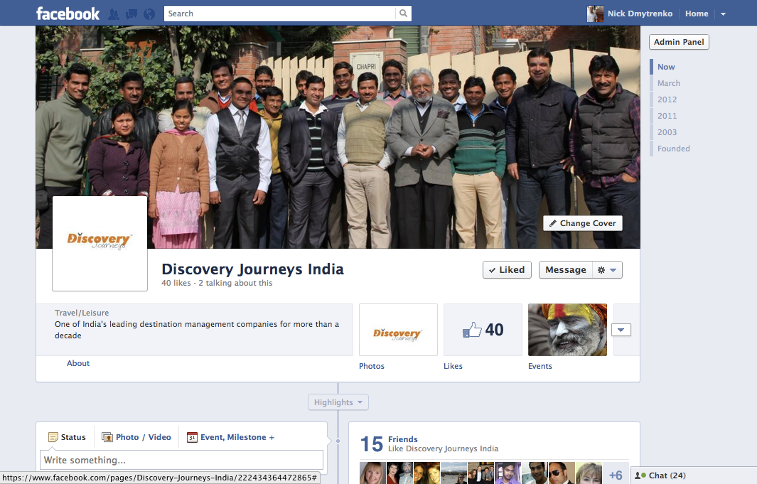
Before launching Discovery Journeys India's new website, I helped jump-start the company's Facebook page. Using articles from the monthly newsletter, I created events for upcoming India festivals, uploaded photos taken during my travels around the subcontinent, released India travel news, and updated fans on the progress of the company's new site.
Newsletters
Discovery Journeys
Writing, editing
While working for Discovery Journeys India, I produced a half-dozen monthly newsletters geared toward travel companies and tour operators. Each month I'd research and write articles on luxury accommodations, upcoming festivals, and the latest travel news.
Whenever possible, I wrote from my experience traversing the subcontinent and personally visiting the hotels.
Whenever possible, I wrote from my experience traversing the subcontinent and personally visiting the hotels.


Banner Ads
Edgewood College: Mock Campaign
Copywriting
In order to show-off Edgewood College's personal approach to learning through an impersonal medium, we displayed pictures of real students and faculty interacting with each other. The writing is fun and cleverly plays off common online terminology while showing real-life interactions.


Adidas: Mock Campaign
Copywriting, creative direction
I came up with these adidas banner ads to play off shoes being something you “love." Having the banner ads resemble dating site links displays adidas shoes in an unconventional format. People would be puzzled and interested in the design because it is not what they expect from a shoe advertisement. The text humorously plays off common dating phrases in a way that ties back to adidas shoes.

The design of the ads remains consistent with the “personal ads” format. The background is the inside of a faded newspaper and there is a red circle aroundthe shoes. The adidas symbol is colored red to resemble a heart. These small touches poke fun at online dating and add humor.

