


1995 - today
My career started as a pre-press technician, working for a man who is an avid fan of technology. He would buy me books on this new trend called the internet to have me make web sites. I studied HTML and learned to code by hand because there were no WYSIWYG editors at the time, just a simple text editor. You had to find and download a few utilities to manage and format image files because Photoshop didn't handle JPEG or GIF files.
When I did start using WYSIWYG editors they were useless because they polluted the document with "junk" code and made it a misery to read the code after you had used them on a file. They're still a pain, they don't ever keep up with technology, they can't preview files in anything but simple HTML correctly. They do have the advantage of coloring the code making editing and writing easier on the eyes. Some features also facilitate and shorten production time. I find the site management tools very convenient. I still prefer to code by hand.
These images span a 10 year plus career as a graphic designer who did a smooth transition from page layout for print to code web pages. I learned about suggested maximum page file totals and stuck to it. I learned about content not being static and not displaying in the same manner. A web browser window can be resized, how does my layout react to that? I consider the variables such as platform, operating system, browser model and version, screen resolution. It's a shame how most web masters don't always seem to take those things into consideration. Not everyone has the biggest screen on the market, nor the fastest internet connection. In fact in Canada less than 3% of the population has DSL according to my research.
So have a stroll down memory lane and I'll try and remember all the back-end that was involve for each site!

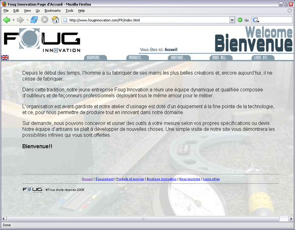
This is the index or home page for the Hotel's site. I had to create the blue skies for this photograph, couldn't get a nice day of weather to take pictures! This was my first PHP template site. I created navigation and modules for separate sections in the page to reduce transfer times. The client only had 56K modem access! I kept transfer times down by only getting the banner, navigation and footer once, only updating the page content while clients navigated through the site.

The most time consuming task of this job was registration to as many travelling portals I could find in Europe, mostly France. I also took care to register the site in Google local maps, the Yellow Pages and Tourism Quebec website listings.

The owner had promotions for local construction site workers who would get discounts for long period room rentals.

The reason this site is no longer online, the business was sold and I was asked by the new owner to delete the content to avoid confusion. They transformed it into another business.

This is my current project, convert this block into a fluid design and keep the file size total within reason, I LOVE challenges! This is quite tricky and time consuming, but I'm a pro at creating tiles and working with the "Sliding Doors Effect" and DIV layering. I try and not create a tag soup in the process.

This was the site for the advertising agency where I spent the majority of my designer career. I gave the choice between French and English, Flash or DHTML. The Flash version loaded the language from external text files, and more variables than a watermelon has seeds!
It had sound effects, sound loops and dynamically loaded content. It took me several months to create.
It had sound effects, sound loops and dynamically loaded content. It took me several months to create.

This was a micro-site promotion for a contest. I added a banner to an already existing site which would link back to our on site Red hat servers where we had setup a database driven lottery ticket into which we incorporated the capacity to spread out the prizes over the period of this contest (I think six months). We wanted to be sure the software didn't distribute the winning in the first week!
We combined data mining to collect information on the players in order to get contact information for further solicitations by the client. We filtered client access by cross referencing phone number and email to limit participation to one household. The prizes were pretty big!
We combined data mining to collect information on the players in order to get contact information for further solicitations by the client. We filtered client access by cross referencing phone number and email to limit participation to one household. The prizes were pretty big!

Second frame of the above banner. It was a simple Fireworks gif animation.

This was the main page to the micro site for the contest. Clients filled out a form and the software would randomly choose from a week's worth of inscriptions to pick a winner.

This was my first real challenge as a designer, I had never before worked on a site that contained PHP. At that point I was working with Golive and it didn't include anything but the most rudimentary of compatibility. These guys were the real deal, programming sites for financial institutions and e-commerce before it even began to get off the ground. Now you can Google shopping cart and there are more GPL packages than you can throw a stick at!

I am proud of the fact that I was addicted to fluid design even back then! No Divs back then, just a lot of crazy tricks with tables embedded in other tables. It was tricky to get them to work in all the browsers. Everyone was out to be innovative and push new technologies on the client. Now it's a bit harder for them to impose things because when they get too pompous, they get a cold shoulder from users. There are many good and stable browsers. IE is no longer king of the hill.

This was my second experience with a CMS. I used phpWCMS from Germany. I picked away at it until I squeezed a template out that didn't look anything like the default or the ones supplied by other enthusiasts. Again didn't know much about PHP or mySQL so it was a decent challenge to sift through several hundred PHP files. Thank God for a friendly forum!

I again managed to fan dangle a fluid design into the template system, which again was a major challenge for my skill set at the time. I had a three layer header, background, foreground and middle. This was before I knew how to use DIVs, but layers have been a functional and compatible part of CSS for quite some time. I also had the challenge of finding and incorporating hacks for the transparent PNG image which IE doesn't quite handle from one version to the next. At that point in time IE was the major player so I had little choice in getting it to look good in all version.

A fully fluid layout, with three layers in the header, the wavy hills in the background, the logo justified left and the section image (the compass here) justified right.
A little company specialized in machining metal parts with CNC mills. Again a fluid design. I am now working on a PC running windows and the whole Adobe suite! Much cheaper than a Mac, but so prone to viruses, trojans, instability and so unfriendly!


Pope Jean Paul II memorial site. I spent several weeks researching to create rich content. Finding as much information that I could about the man. My first experience as a content writer and editor. It was like going back to college to do a research paper. This is the landing page.

Almost a redundancy this is a second landing page. The whole site is again fluid layout.

As you can see, I didn't skimp on content. Links to all my sources, footnotes etc.

My partner in this enterprise was Eric J Hughes an entrepreneur of long standing and an accomplished artist as well.

It would be insane to publish all the designs I spit out for this client. We re-vamped the site design every season over a period of 8 years! The agency would create promotional material for several medias, print, radio and the internet. I was not always responsible for the design, but was the sole integrator for the agency. They would occasionally hire freelance programmers for migration of our projects to as many platforms that were available at the time. Mac/Linux/Microsoft all in parallel.

I really had fun chopping up huge Photoshop files to reduce them to 75k! I was rarely able to achieve this number but I always kept it in mind and would never get above 300k.

Another data mining operation targeted at gathering information in order to establish a way to manage inventory nationaly with the contents of forms filled out by contest participants. Again a lottery.
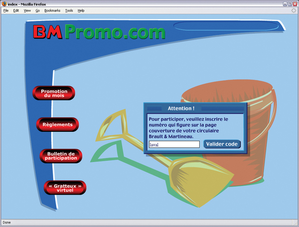
Login forcing client to enter a code printed on the flyers establishing accurate data collection by region. Cross media refrencing at it's best. When the client entered information in the form we knew from the login code that they couldn't falsify data. Contests sometimes draw the attention of somewhat unethical individuals who think they can beat the system in order to greater thier chances at obtaining a prize. You wouldn't believe the amount of bogus form content we got. This helped reduce it as well as cross refrencing adress, phone and email.


This is the imported Flash file within the main Flash document. The little green lottery ticket was linked to a data base in order to prevent the odds of all the prizes being distributed within the first day of the contest.

I attended a rock show in Montreal and played photographer. I shared the photos on this site for a few months.


