Witloof, Maastricht, the Netherlands
My vision of the concept and design of Witloof was prompted by a visit to the cities of Antwerp and Ghent. The striking thing about Belgian cafes and restaurants is the often incongruous mix of styles and interior elements. You get the impression that everything has been built up bit by bit over the years, and that all sorts of bric-a-brac has been added. I did not want to translate this too literally to the new interior of Witloof. I came up with my own interpretation, in fact combining three interiors that typify Belgian cafes and restaurants.

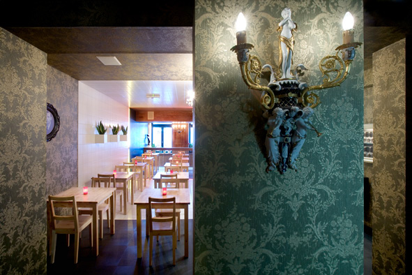
The entrance area resembles a log cabin in the Ardennes, a farm or a country shed.The next section is decorated with white tiles and has a neat metropolitan character, conjuring up memories of typical old chip shops. The rear section of the restaurant is the Salon, with its green and old baroque style wallpaper and a floor of Namur stone style floor. The division between the entrance area and the tiled section is marked by a red neon strip, symbolising the dividing line between the Flemish and Walloon provinces of Belgium, or between the countryside and the city, a division that is still keenly felt in Belgium. The red neon strip is also a typical Belgian feature along streets of establishments where ladies offer their services. On the right-hand wall, there is a yellow neon strip next to the red one, which in combination with the black wall forms the three colours of the Belgian flag.
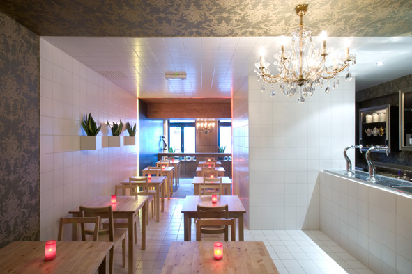
The white tiled section also features three Sansevieria plants in tiled blocks on the wall, as well as a white tiled bar. This bar has a backdrop of cupboards and shelves set in golden baroque frames. These cupboards and shelves contain glasses and bottles, looking almost like still life paintings. This area leads through to the Salon, with its baroque wallpaper and Namur stone style floor. The Salon is connected to the cellar by a spiral staircase. This spiral staircase is separated from the restaurant by a black wrought-iron gate. Behind this gate are the black doors of the lavatory rooms, with heart-shaped openings in the doors showing the red and yellow interiors of the gentlemen’s and ladies’ lavatories respectively. These also represent the colours of the Belgian flag. The doors also feature the male and female symbols in black baroque relief, and an upside-down red heart (gentlemen) and a yellow heart (ladies). These are a reference to the cut-out hearts in old toilet doors, but also represent the original symbols for men and women, originating from the astronomical symbols for the planet and the god Mars ^ (the red planet) and the planet and the goddess Venus v. One symbol represents a rudimentary phallus, while the other yellow or golden heart represents femininity or fertility as well as the holy grail (Godfried van Bouillion).

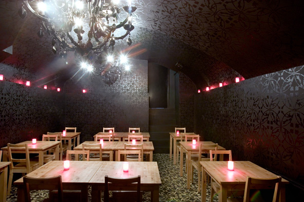
The cellar, dating from the late Middle Ages, is painted completely black, and we have laid black tiles on the floor with a neo-gothic floral motif in broken white. This motif is echoed in high gloss black on the black matt walls. You could imagine yourself in a forest at night, or in a chapel or crypt. This image is further reinforced by the black cupboards with black gloss figures of saints and a black bar or alter. In Roman Catholic Belgium, the alter and the bar were often not far removed from each other, and also have an affinity with each other, not only in a formal sense but also in a conceptual sense. Both have produced much inspiration and contemplation in Belgian culture, and this is the reason for their prominence in this space.
images: Arjen Schmitz ©

in 2010 the basement was redesigned for the 5-year anniversary - image: Arjen Schmitz ©
