WATERSHED // part 2 // VOLVER SIN VOLVER
We were asked to develop the image for Watershed: a multidisciplinaryproject articulated in a series of artistic events, exhibitions, residencies,and cultural exchanges between the north and south of Europe; specifically thecities of Barletta and Margherita di Savoia, located in Southern Italy’s ApuliaRegion, and the cities of Rotterdam, Antwerp, and Stockholm.
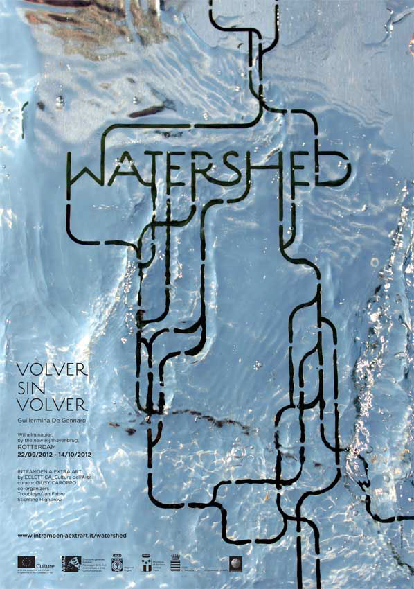
Knowing that in every city something new will be happening we firstdeveloped a general identity for Watershed, which will then be interpreted witha specific visual inspired by the artists’ interventions or the locationhosting the event.
The typeface used for this project is Estilo, a very elegant ‘30s styleheadline font designed by Dino dos Santos. The typeface was modified to createthe structure of a hydrographic basin, thus “watershed,” a sort of conceptualmap representing the interconnectivity between the underlining theme of waterand the artists and the cities that will host their works.
This image was created for the nostalgic installation “Volver sin Volver” by Guillermina De Gennaro installed in the port of Rotterdam.
DETAILS:
Designers: L-ABLE (Pamela Campagna + Thomas Scheiderbauer) and QB(Carla Palladino + Ed Testa)
Client: Intramoenia Extrart–Eclettica cultura dell'arte
Size: 70 x 100 cm
Printing Process: 4-colour offset printing