This is a part of my final project on college.
Volosko is a small town where I come from, it has beautiful architecture and people, with nice restaurants and lots of tourist potential that isn't being used. The main problem is that the town is actually just a part of one bigger town near by, which has it's branding strategy that just can't work with Volosko.
Volosko doesn't have any identity and has no branded public signalization, which was my project.
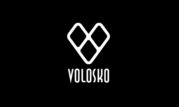
My concept was based on several things, and the final result is this abstract looking V made of three rhombus.
There are three because Andrija Mohorovičić which was born in Volosko had discovered the Mohorovičić's discontinuity which consist of three parts - crust,moho and mantle.
They are organized in a "V" to form the first letter of Volosko, and finally, they are outlined, to look like a pattern of a fishing net, because Volosko was mainly fishermen village.
The rhombus are also connected to old slavic mythology and the colors are significant to the town.
Volosko is a small town where I come from, it has beautiful architecture and people, with nice restaurants and lots of tourist potential that isn't being used. The main problem is that the town is actually just a part of one bigger town near by, which has it's branding strategy that just can't work with Volosko.
Volosko doesn't have any identity and has no branded public signalization, which was my project.
My concept was based on several things, and the final result is this abstract looking V made of three rhombus.
There are three because Andrija Mohorovičić which was born in Volosko had discovered the Mohorovičić's discontinuity which consist of three parts - crust,moho and mantle.
They are organized in a "V" to form the first letter of Volosko, and finally, they are outlined, to look like a pattern of a fishing net, because Volosko was mainly fishermen village.
The rhombus are also connected to old slavic mythology and the colors are significant to the town.

SIgn

Logo

Logo BW
logo BW negative

Aligned horizontaly

Construction
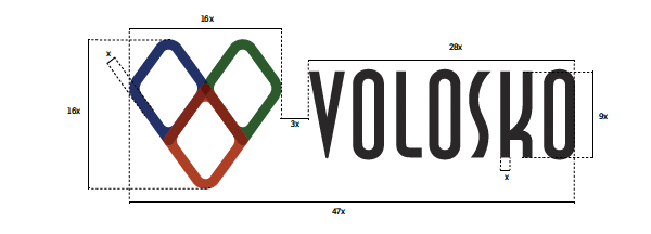
Construction of a horizontaly aligned version

Necessary empty space


Memorandum and business card

Colors used.

Welcome sign

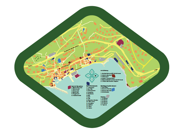
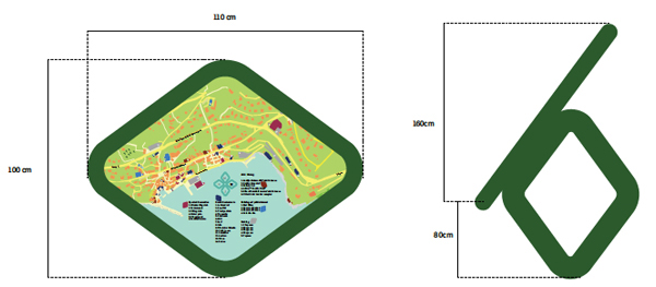
City map


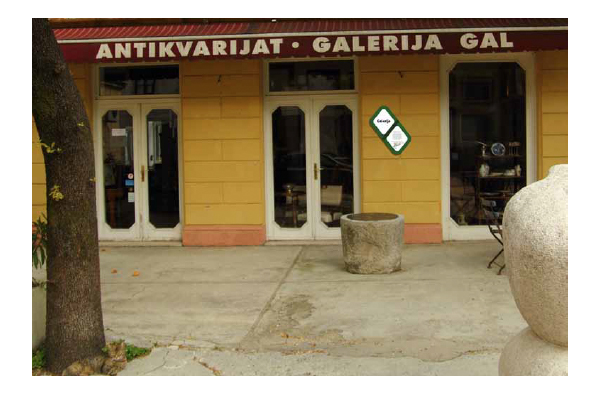
Info panel

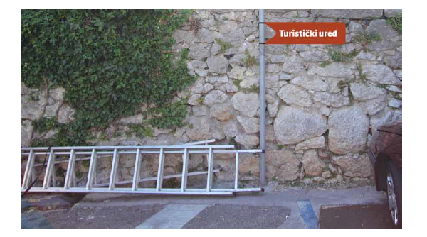
direction sign
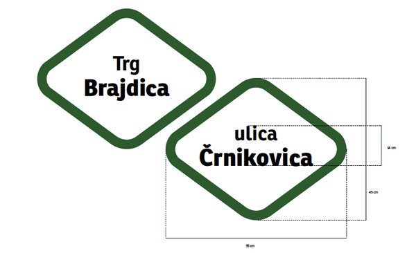
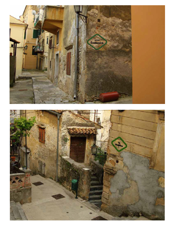
Street and square names
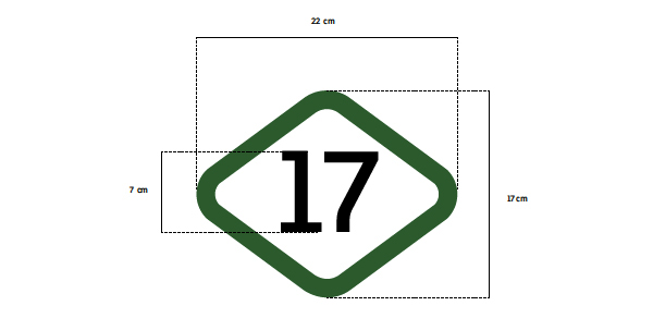
Street numbers


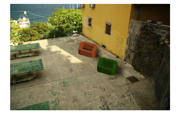
Bench.

3D mount for direction signs
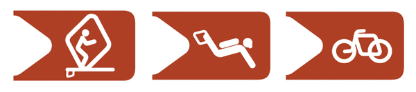
Recreation symbols


The whole PDF document (in Croatian).
