


User experience for a school library
This was a major project we had in one of my classes at uni, where we were to design a proposed set of pictograms, a pocket map, as well as a wayfinding system for the library at Deakin University.
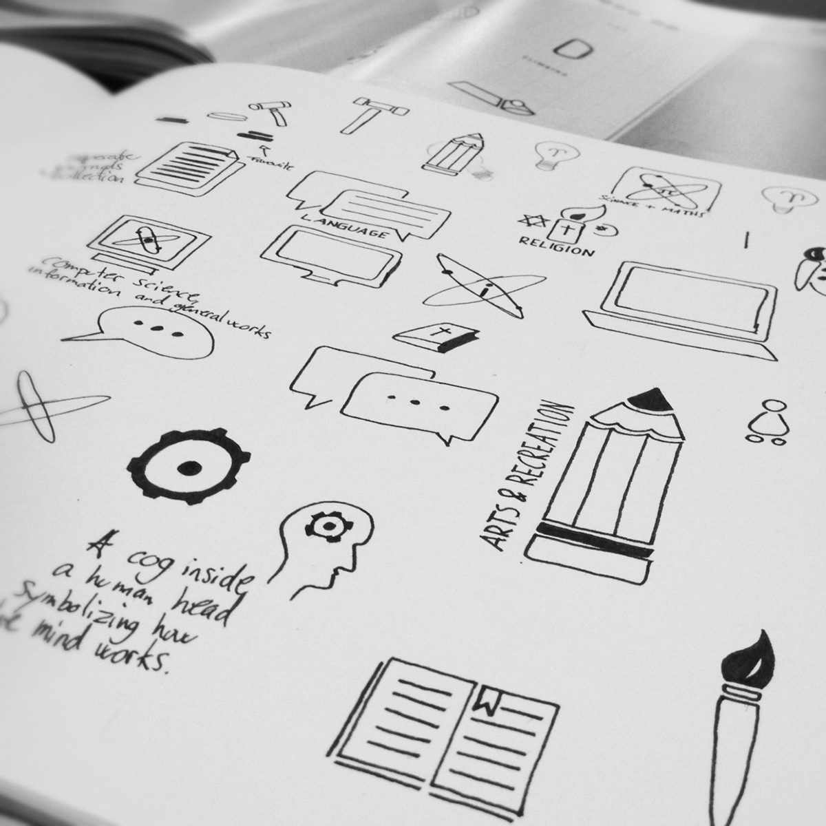
By only using positive and negative space the background of a pictogram will always vary, always change, and in a way renew itself every single time. That way it constantly interacts with the user as well as the area where it's used.
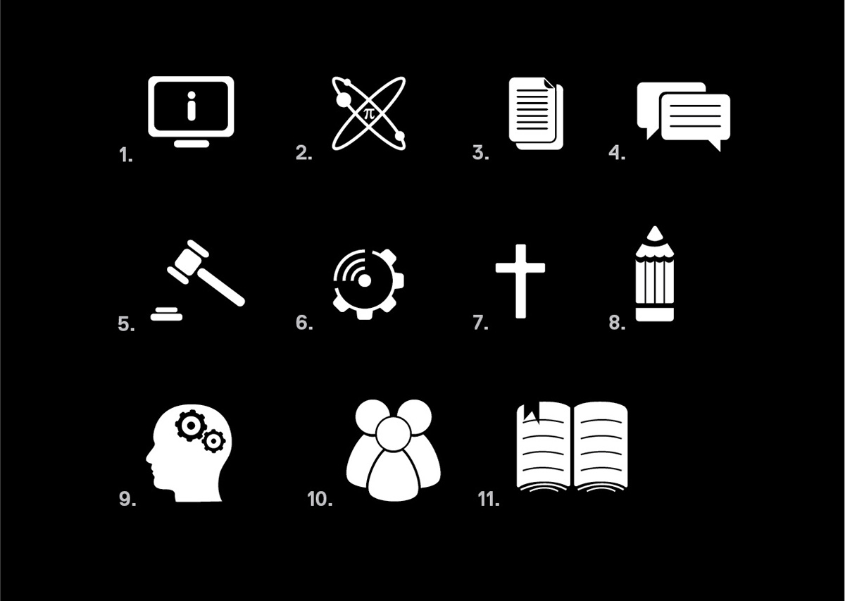
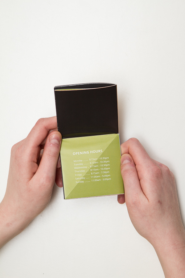
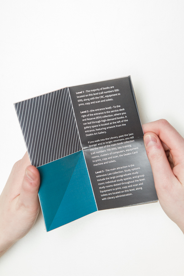
1. Computer science, information and general works. / 2. Science and mathematics. / 3. Seperate journals collection. / 4. Language. / 5. Law. / 6. Technology & applied science. / 7. Religion. / 8. Arts & Recreation. / 9. Philosophy & Psychology. / 10. Social Sciences. / 11. Literature.
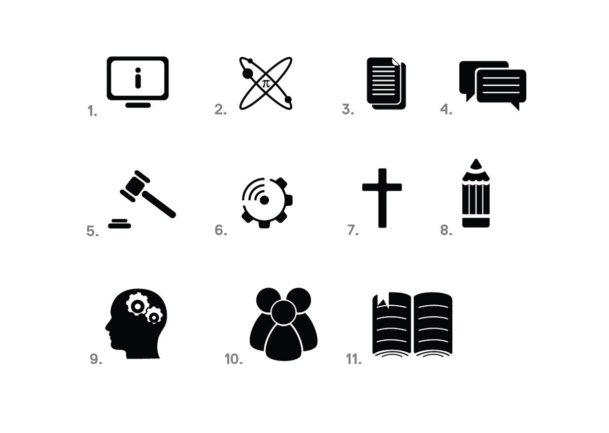
1. Computer science, information and general works. / 2. Science and mathematics. / 3. Seperate journals collection. / 4. Language. / 5. Law. / 6. Technology & applied science. / 7. Religion. / 8. Arts & Recreation. / 9. Philosophy & Psychology. / 10. Social Sciences. / 11. Literature.
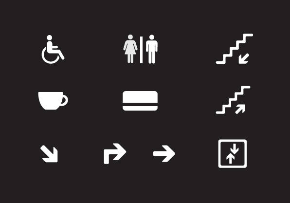
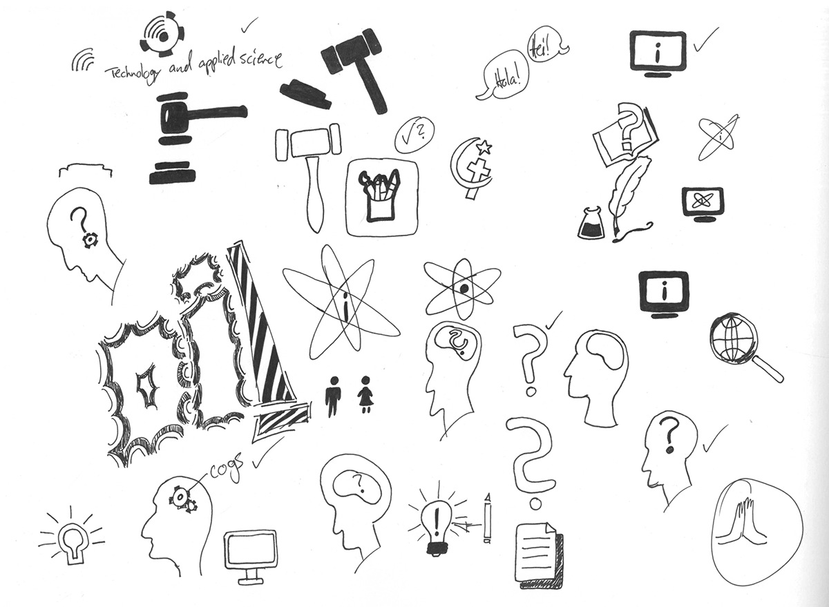
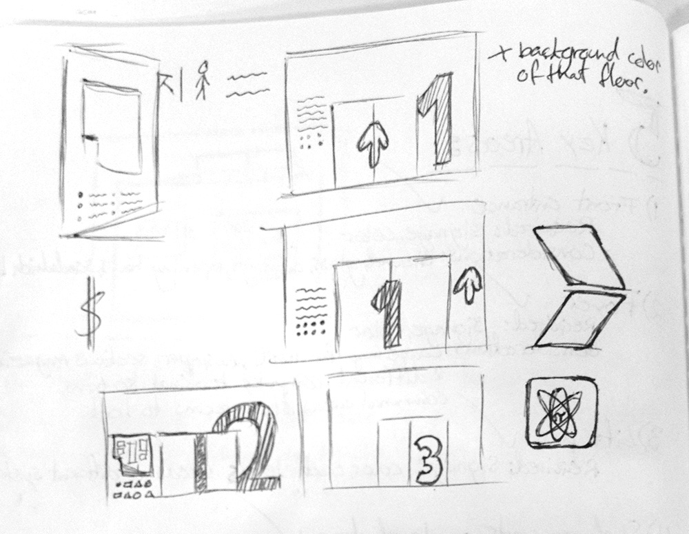
Additional pictograms.
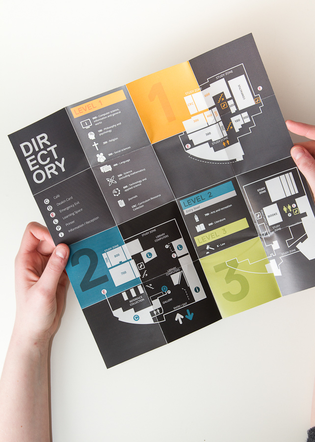
Pocket map

Wayfinding system
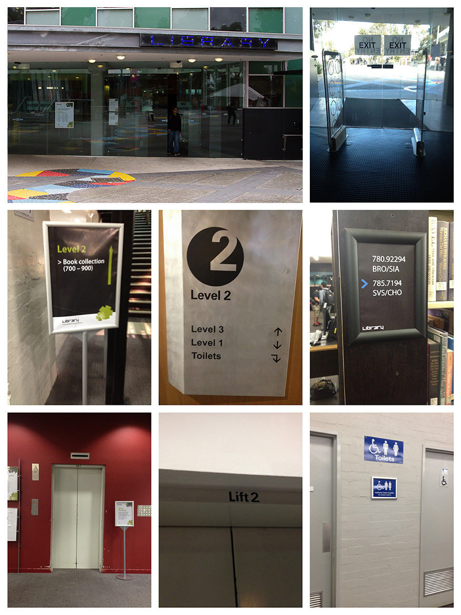
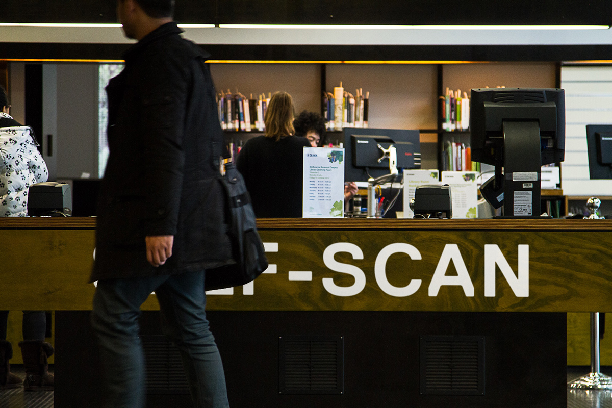
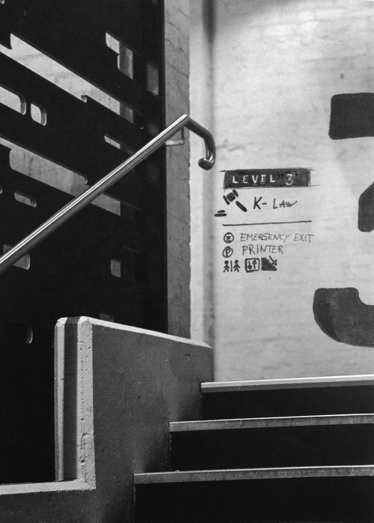
The problem with the current wayfinding situation at Deakin Library is that it feels too temporary. They consistently lean on small sheets of paper to be eyecatching and get the message across to the user. The construction of the building, and the architecture however, is not temporary, and therefore such a system is a very ineffective way of communicating with the students.
Below are some examples of the current wayfinding system.
Below are some examples of the current wayfinding system.
A library isn’t just a place you go to borrow books. It’s a place where you study, talk to friends, meet new people, find new joys in life, new interests, new hobbies. It’s a place where students spend large amounts of their time. In short, it’s a place where you want, and need, to feel at home.
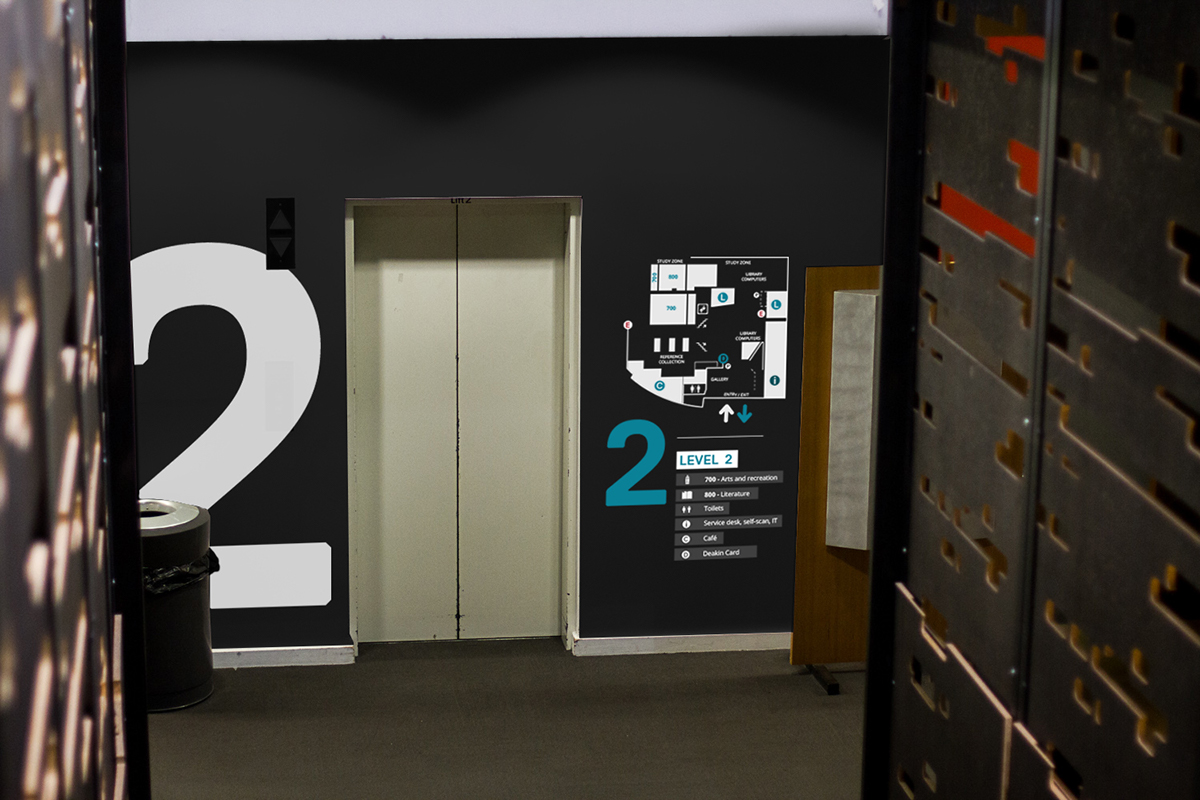
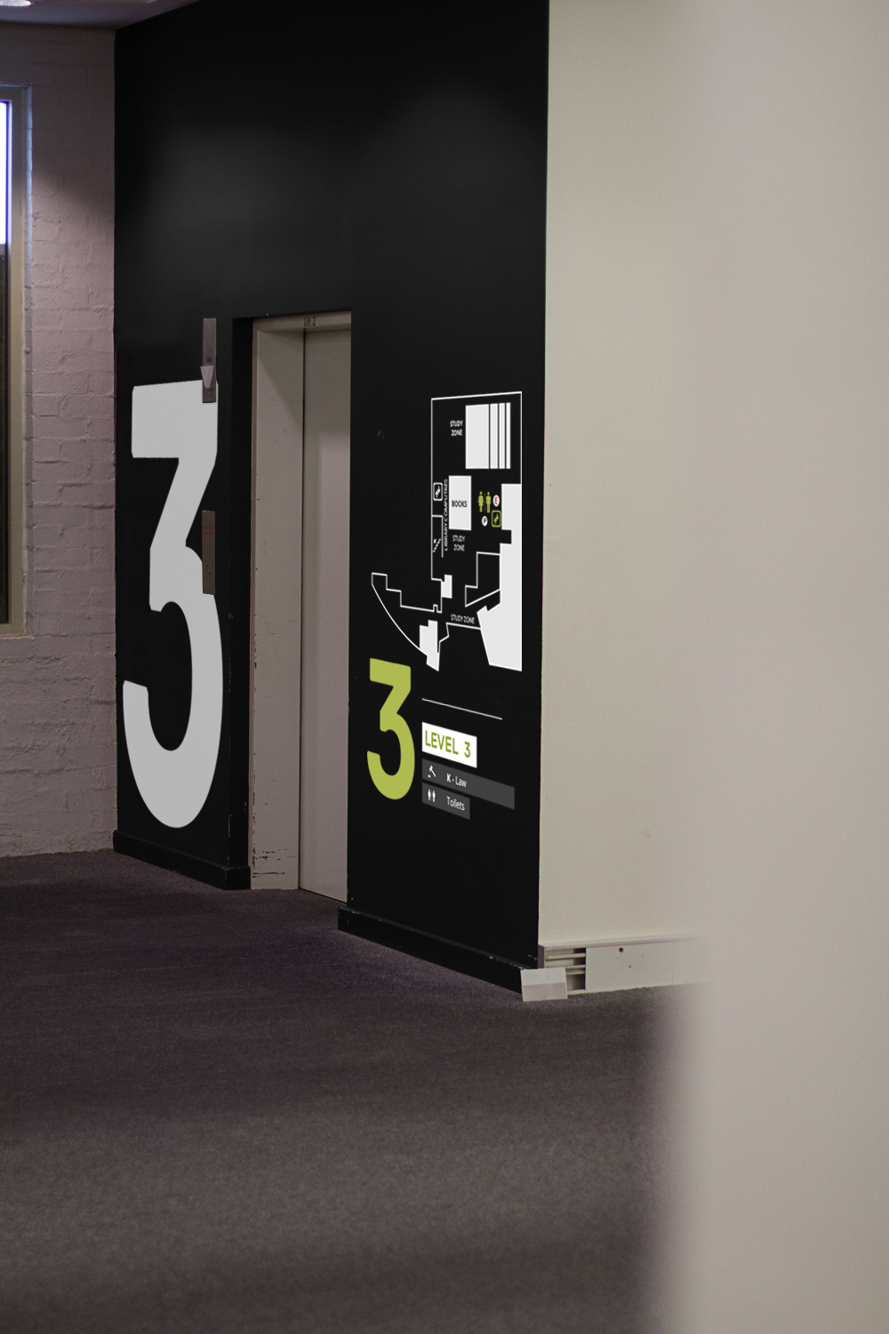
This is my proposal.
This is my proposal.
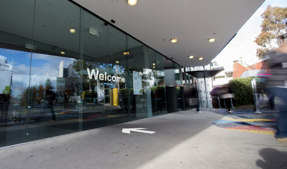
On entrying the library you're greeted with the text "Welcome", and when exiting it says "See you soon"

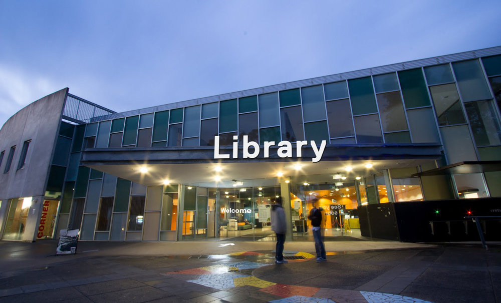
Entrance.
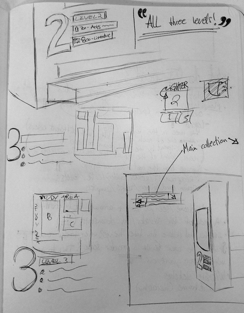
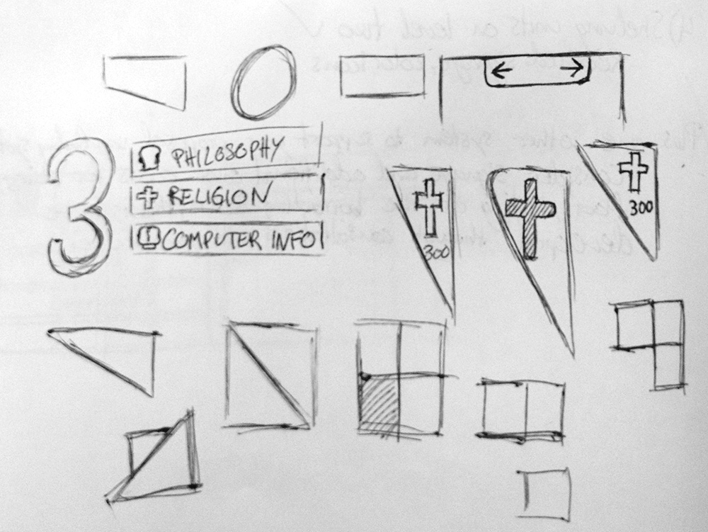
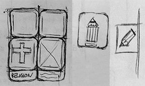
Sketch of the directory that can be seen in the foyer, as well as on the lift passes.
My concept is very much based on as being as user friendly as possible. Because of this I’ve used rounded edges in just about every part of my design, showing flexibility and kindness.

Foyer.
On the left you have the directory for the entire building, and dead centre, hanging from the ceiling you see the directional signage. On the far right you can see the self-scan counter.
On the left you have the directory for the entire building, and dead centre, hanging from the ceiling you see the directional signage. On the far right you can see the self-scan counter.

Detail of directional signage in the foyer.
Self-scan counter.
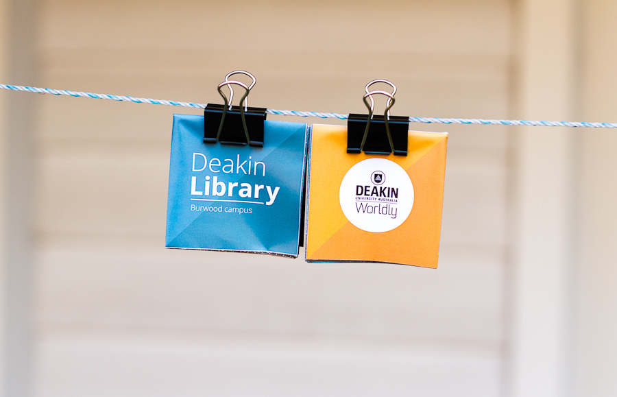
Lift passes.


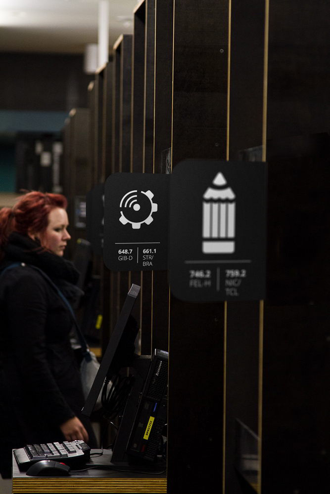
Shelving system.

A wayfinding system links different people together, even if they do not share a common language or destination, by guiding all of them through the same space with a single system of communication.
- David Gibson, 2009
- David Gibson, 2009


