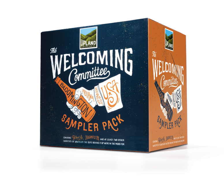
Upland Branding Campaign
The re-branding campaign is exhaustive, beginning with a new logo and branching
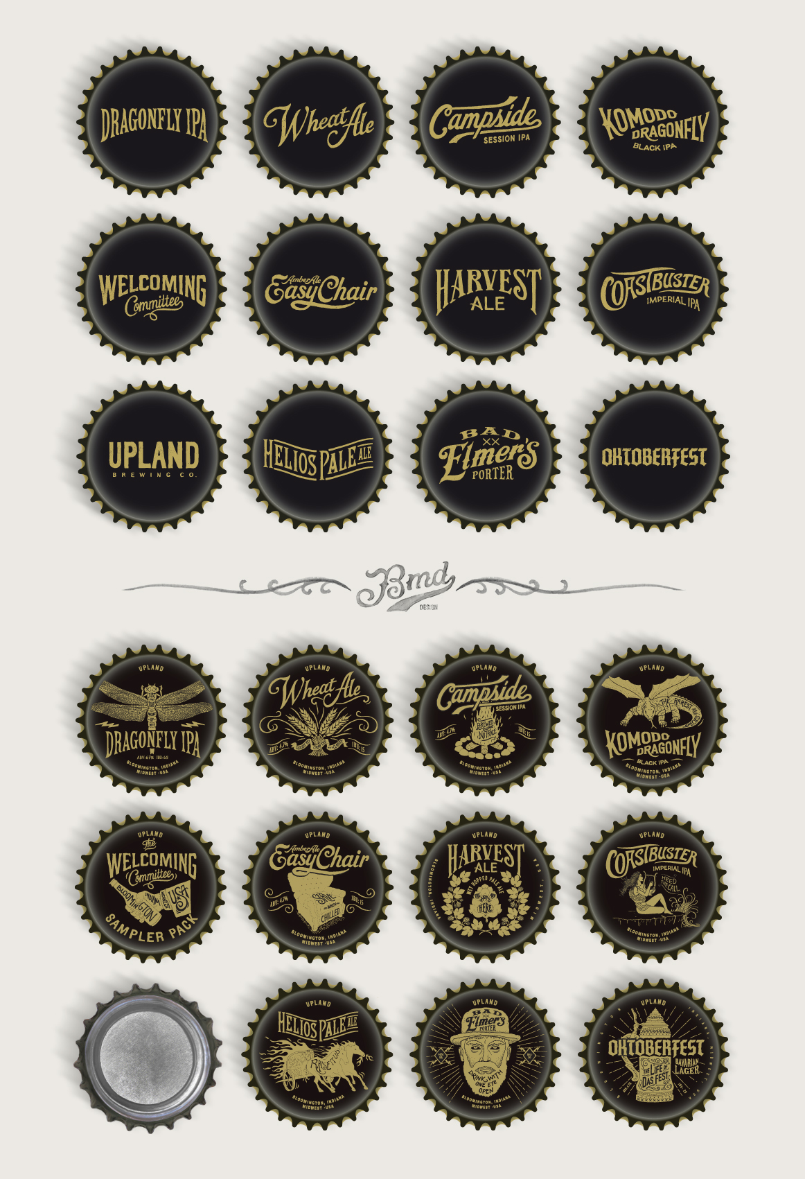
out to include new packaging for eight of Upland's most popular beers (with more likely to follow),
as well as new signage, marketing materials, collateral and even tap handles.
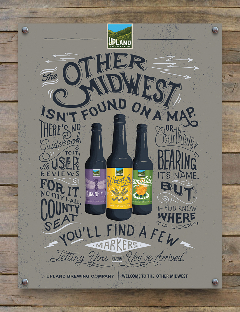
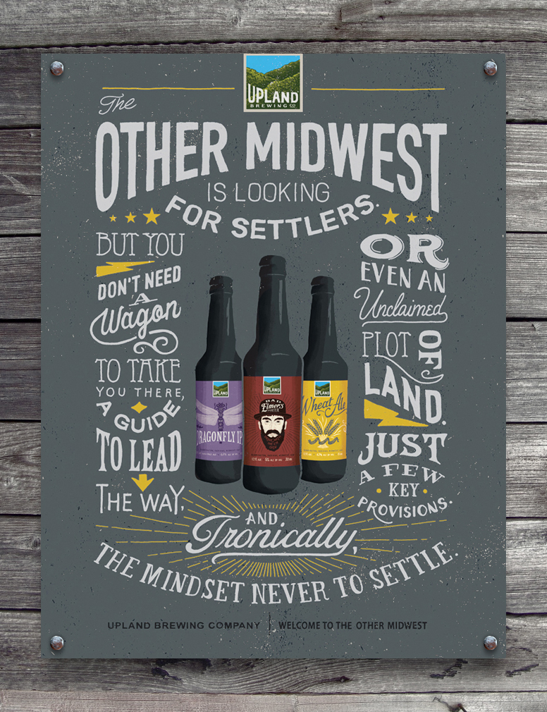
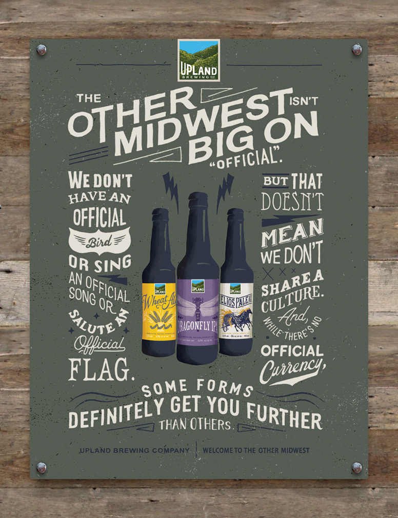
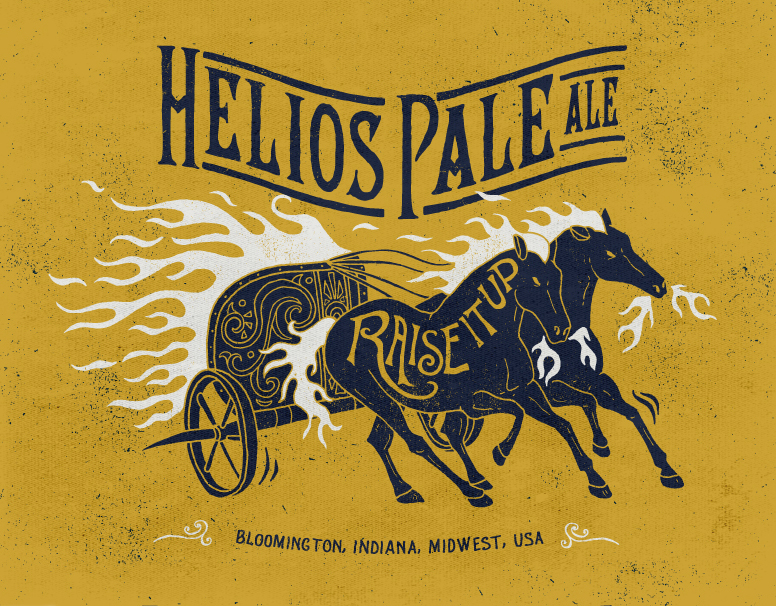
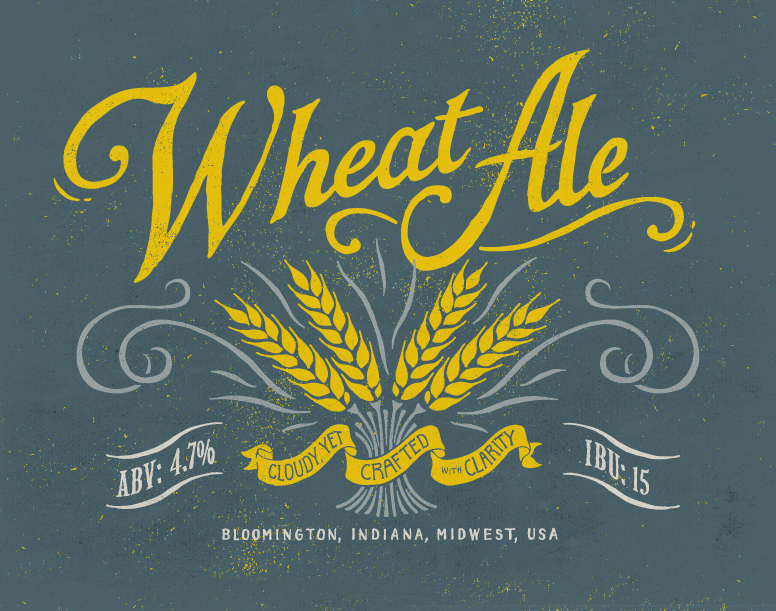
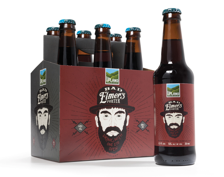
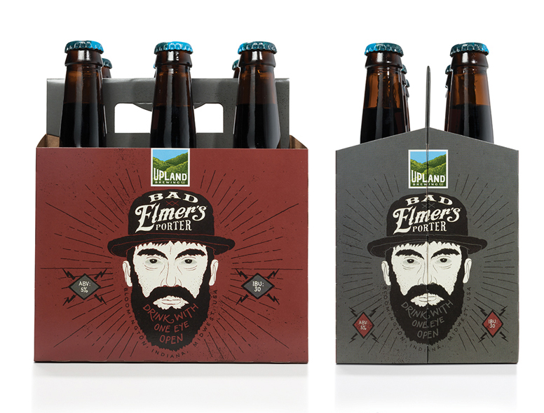
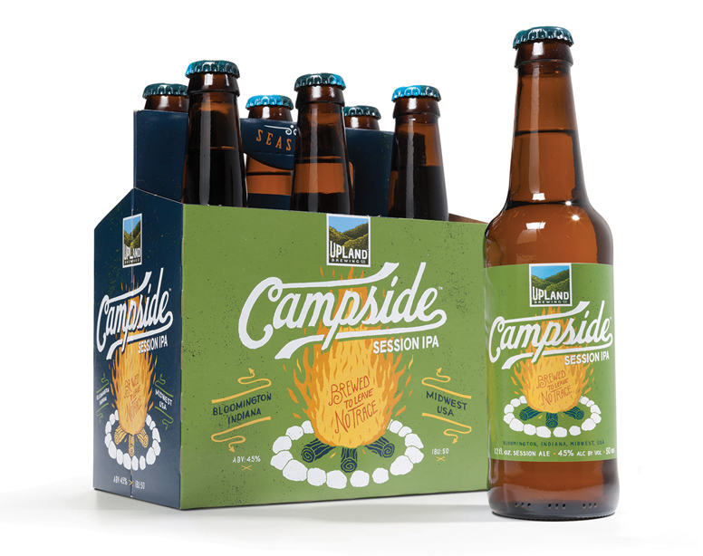
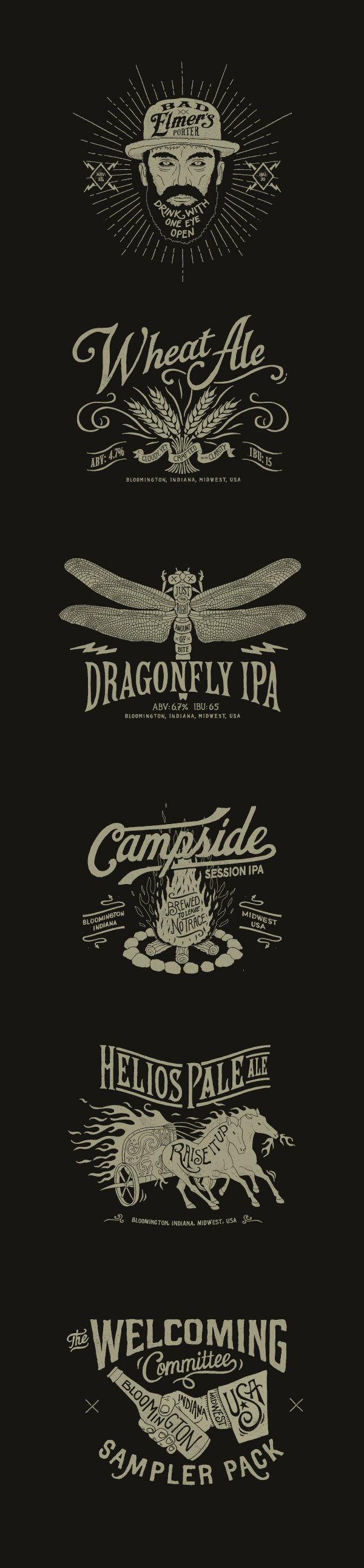
The goal of the new look was simple: to capture the quality, culture and spirit that make Upland—and its community—unique. The hand-crafted nature of the beer is reflected in the extensive use of hand-lettered
The goal of the new look was simple: to capture the quality, culture and spirit that make Upland—and its community—unique. The hand-crafted nature of the beer is reflected in the extensive use of hand-lettered
type and illustrations, whether in the distinctive hills logo, or in the packaging and related materials.
The personality of the company, meanwhile, comes through in the descriptions of each beer that
The personality of the company, meanwhile, comes through in the descriptions of each beer that
accompany the illustrations (Dragonfly IPA: “Just the right amount of bite”), as well as a longer story
about each beer on the bottom of its carrier.
Art Direction: Young & Laramore / USA


> BMD Design ON INSTAGRAM <


