
After working on the app's UI and before designing the commercial website, I was asked to design the logo for this innovating service in the French health industry.

Brief
- Reflect the app's innovative positionning: 100% online, easy-to-use, nice looking.
- Differenciate from "old" competitors, who provide "ugly" complicated services.
- Look clear & secure AND serious & professional.
- Differenciate from "old" competitors, who provide "ugly" complicated services.
- Look clear & secure AND serious & professional.
Idea
Using a sans-serif font for the "techie" look & feel.
Red being the first color associated with health, the palette was quick to define.
Simple geometric forms (simplicity to use, clear interface).
I also needed a symbol for the medical industry, that would not be stressful (unlike a syringe or a drug pill).
Red being the first color associated with health, the palette was quick to define.
Simple geometric forms (simplicity to use, clear interface).
I also needed a symbol for the medical industry, that would not be stressful (unlike a syringe or a drug pill).
Process

#1 - Sketches : playing around with characters & stethoscopes

#2 - First drafts in Adobe Illustrator: after selecting a clean, fun, sans-serif typeface (Droid Sans)
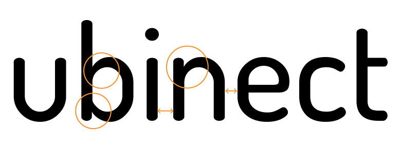
#3 - Raw text before the vector version: kerning is needed. I also edited two characters individually (the b and the n) to have a more regular stroke weight (on the shoulder) and get rid of the stem endings.
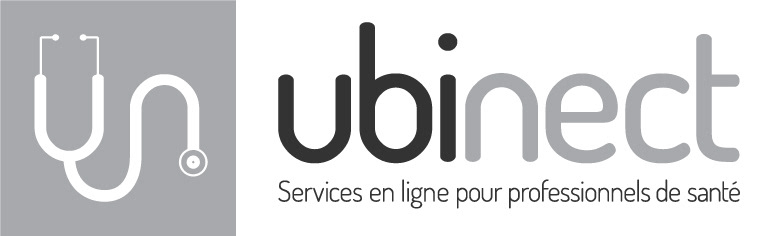
Final result: all the work was done in grayscale to ensure that it would render on black & white prints.


