

Trump Gothic
Designed by Canada Type
When it was published by the Weber foundry in 1955, Signum became an instant classic. Less than one year later, the Czech foundry Grafotechna released Stanislav Marso's Kamene, a reinterpretation of Signum. The differences between the two were quite subtle in most forms, but functionally proved to offer different levels of visual flexibility. Marso changed a few letters, most notably the wonderful a and g he added, and also made a bold weight.
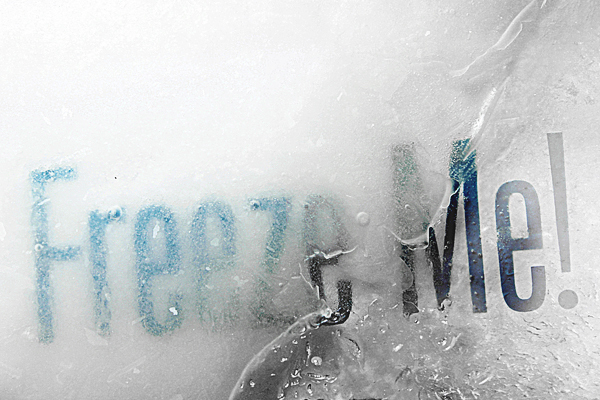
Trump Gothic West is a revival of Trump's original Signum, but in three weights and italics for each. Trump Gothic East is a revival of Marso's Kamene, but also in three weights and corresponding italics.
In the 1950s the popularity of Signum in Western Europe and Kamene in Eastern Europe was mostly due to their tremendous appeal and functionality in poster design and other large applications. But in this information millennium, types like these are a necessity because of the large amount of information they can set in little space. These are the kinds of types that gave newspapers some breathing room and allowed them to go beyond the three- or four-letter headline and into the world of teasers made of comprehensible sentences. Goodbye "Hoffa Missing!". Hello "Where is Jimmy Hoffa?".
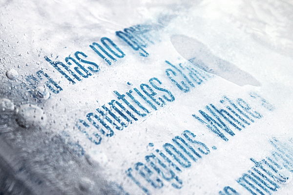
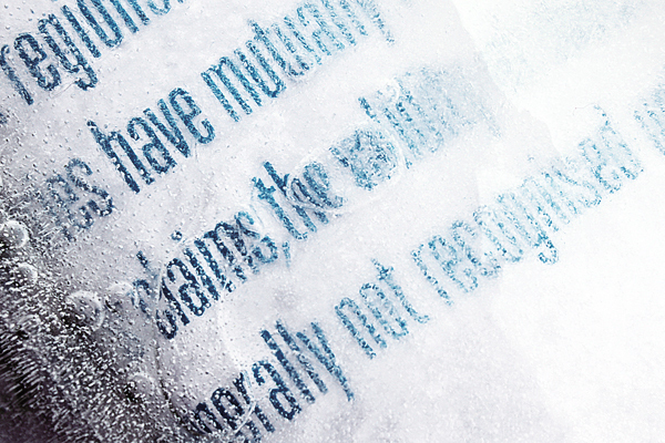
Available in all common font formats, both variations of Trump Gothic are very useful in design situations where economy is a concern, as well as in small print applications, such as event tickets, legal notices. The Trump Gothic types are also very suited for film/movie credits of all sizes.


Designed by Karl Frankowski
A modern classic. Augustus is a hefty sans serif that combines classical humanist elements and precise geometry. With racehorses and typography, lineage is everything, and Augustus is from good stock. Karl Frankowski paired the charisma of Morris Fuller Benton’s Eagle Bold with the flair of Zuzana Licko’s Dogma. The trained eye will detect a sprinkling of 19th century wood type in there as well. He named Augustus after Augustus Gloop, that alarming glutton of a child infamously expelled from the Chocolate Factory.
Five years is a maddening amount of time to spend developing a single-weight typeface. That is how long it took one Karl Frankowski to release his first commercially available typeface and the attention to detail really paid off.
Augustus is now a complete international character set with a gang of whipped alternates. A half decade ago, however, it was 26 uppercase letters designed for a one-off poster. After hundreds of rounds of refinement, the rationalist that lives deep inside surfaced, and he developed a less flamboyant form for broader applications. It should be noted that this is no story of compromise. In the years since he began Augustus, the opentype font format took hold, which enabled him to retain the original swash characters as stylistic alternates. Augustus is available in OpenType format for Macintosh or PC.
Designed by Travis Stearns
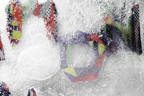
A.M. Cassandre produced the typeface Bifur for Peignot in 1929. Bifur broke from rigid typographic forms by combining Art Deco principles of obsessive geometry with the line and stroke of letter forms. Skute picks up Cassandre's spirit and carries it onward in hand set fashion. Skute Pro is an extension of our free version, Skute, a hand-set font constructed modularly using a cache of basic geometric shapes and lines. They combine in rhythmic overlaps, creating a diverse palette of combinations for headlines and other short type setting jobs. Skute Pro allows the user to add or subtract forms from the letters (through grouping) so even further elaboration and extended letterforms are possible. We encourage Skute Pro to be used imaginatively in a relaxing, positive environment. Just have fun with it!



Designed by Tonalcase
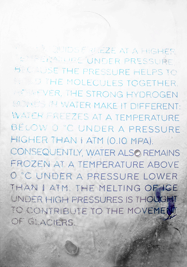
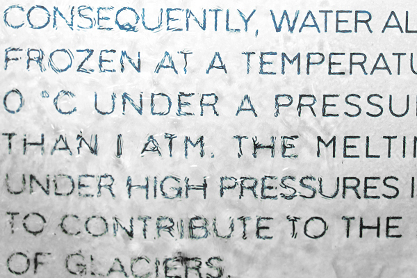
Lodgecode functions as a geometric sans, but evokes more warmth. Corners are softened to provide a tactile, worn-in feel, while still maintaining a polished appearance. Lodgecode lends an understated simplicity to small settings, such as stationery and interface typography, but reveals more character above 24 points for a range of uses.


