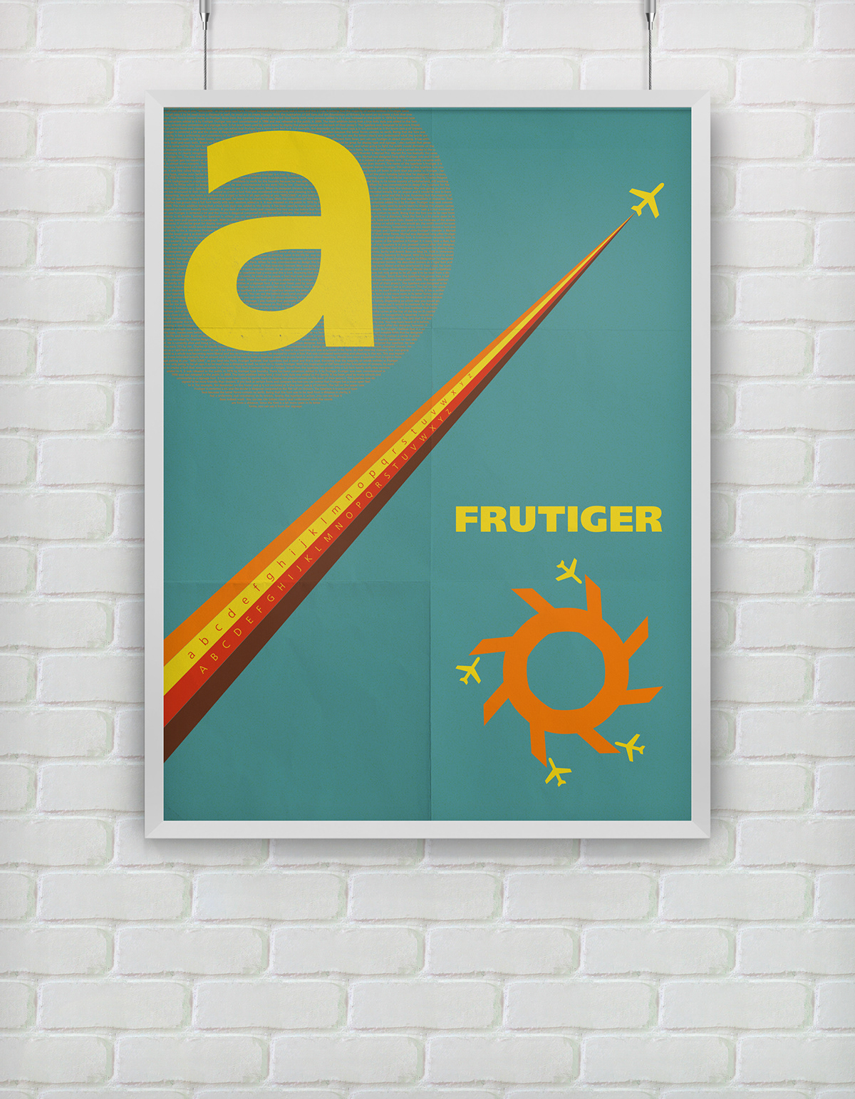
Below is a typography poster that reflects the typeface Frutiger. I chose to go with a minimalist approach to reflect the characteristics of the typeface. This typeface was used primarily in airports and was created in the 70's. The colors that were chosen reflect the time period the type face was created in. The upper case letter Q was overlapped and created this unique shape that reflects an airport terminal from an aerial perspective.