This series of typographic installations were placed around the AUT Art & Design campus to raise awareness and act as platforms for discussion about sustainability in design. Each installation was made from a different material and touched on an area of student life that could become more sustainable. Each message directly correlated to their behaviour while providing them with an alternative. Each message was created through my own observations and routines as an AUT design student. Although each installation differed in location and material they were visually linked through typeface, layout, composition and the use of the asterix symbol.
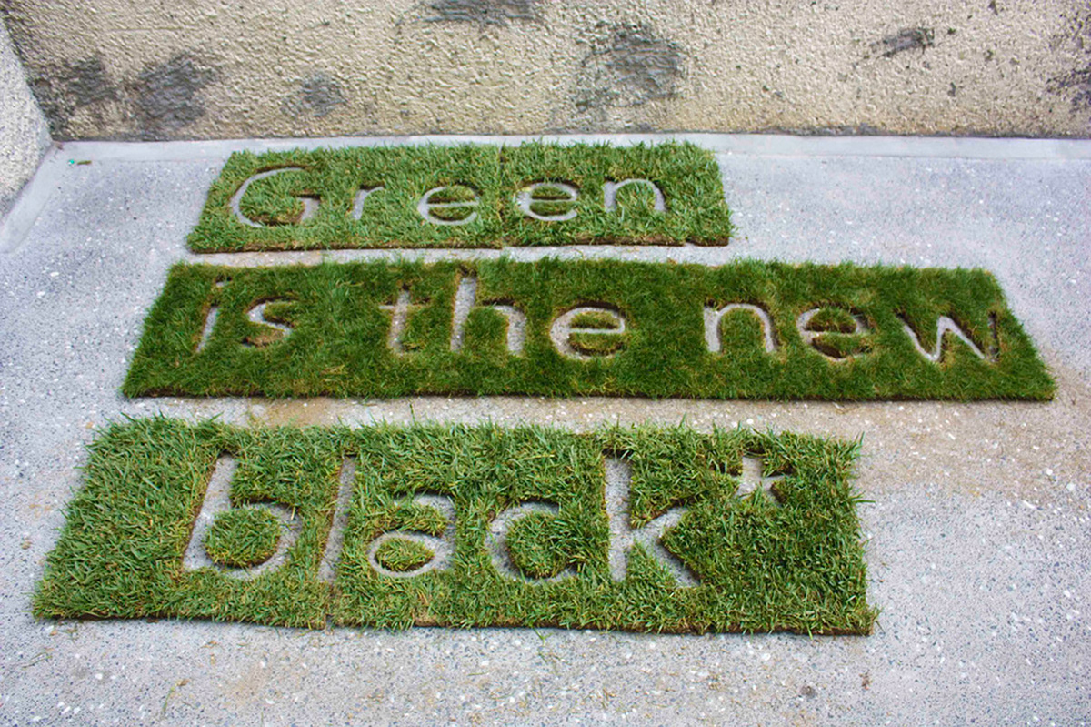
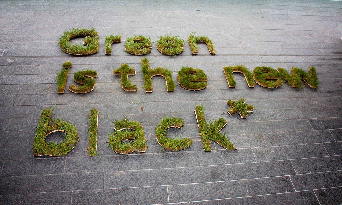
Green is the new black* was the overarching message in my installations. Showing students that sustainabe practise is the new trend to embrace and it also became a discussion point amongst students who passed it.
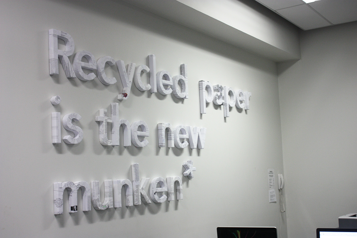

Recycled paper is the new munken* was an installation created entirely out of waste paper collected from the AUT Design computer lab. It was placed above the printer to show students how much they are wasting. It encourages students to recycle their waste paper and to consider recycled stocks when choosing paper for projects rather than using the popular trendy stocks all the time such as munken.
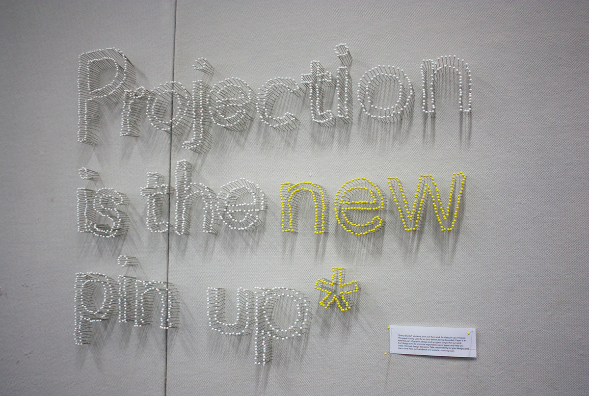
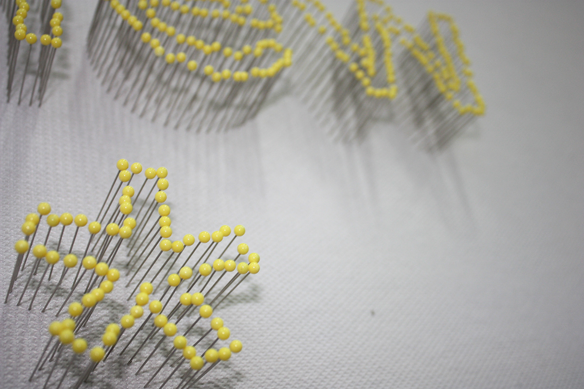
Projection is the new pin up* was an installation created to show students there are alternatives to printing and pinning up their work for class critiques. Using the projectors to display work would mean less paper wasted each week.


