Mint
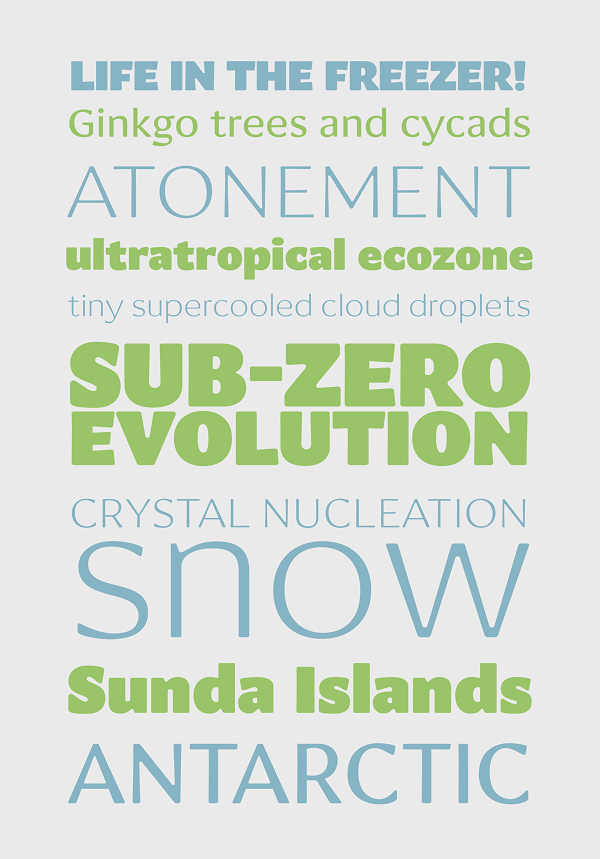
A legible and smooth, stressed sans serif font
A legible and smooth, stressed sans serif font
An experiment in sans-serif legibility, Mint takes the idea of emancipating the black forms and white counterforms to a logical extreme. In some areas, the white is more active, spilling over and eating into the black, and in other areas it follows the ductus created by the black contours. This creates a tension and sharpness between the foreground and the background. Mint's overall tone is crisp and refreshing, and slightly subversive.